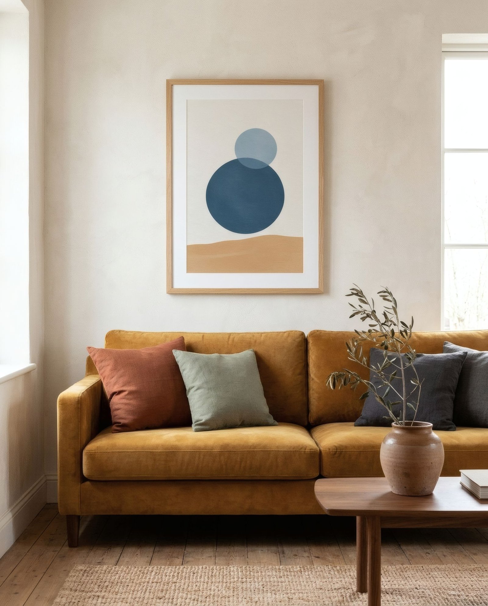
Buying a colourful sofa is a small declaration of intent. Against the safety of grey and oatmeal, a bottle-green, petrol-blue, mustard, terracotta or dusty pink sofa says that somebody in this house has made a decision. And because the sofa is almost always the biggest thing in the living room, its colour sets the tone for everything. Whatever you hang above it can’t be chosen in a vacuum: it will be in conversation with it, a few centimetres away, every single day.
Three possible conversations
There are essentially three ways to relate the art to the sofa, and all three can work.
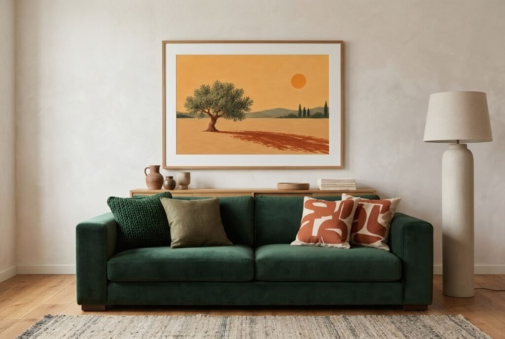
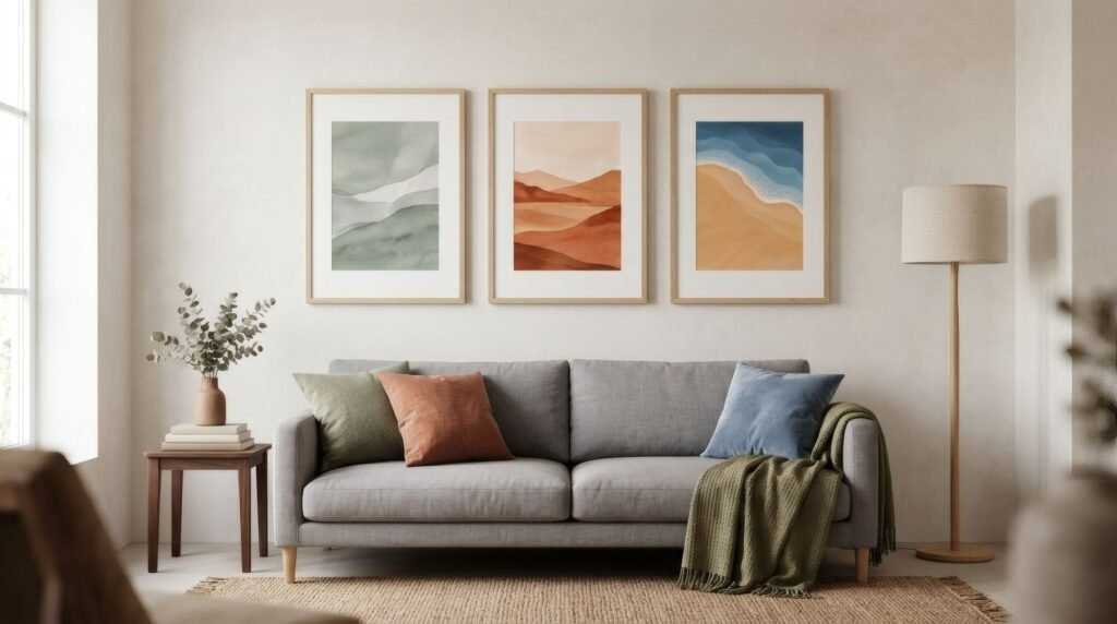
Echo. The art includes the sofa’s colour, or something close, even in a small amount. A green sofa with a print touched with olive; a blue sofa with a piece that has blue on its horizon. It’s the most harmonious option: sofa and art recognise each other and the whole looks planned from the start.
Complement. The art leans on the opposite side of the colour wheel, or on a colour of contrasting warmth. A green sofa with terracottas and pinks; a blue sofa with ochres and burnt orange. It’s livelier, with more energy. To keep it from shouting, choose muted, earthy versions of those colours rather than pure ones.
Pause. The art stays in a neutral palette, off-white, sand, stone grey, with shape or line providing the interest. The sofa is the undisputed star and the art frames it. It’s the calmest choice, and especially useful when the sofa is very intense.
By sofa colour
A few combinations that tend to work, as starting points.
With a green sofa, bottle, olive or sage, earth and terracotta tones are almost foolproof, through warm contrast. Landscapes with greens and ochres work too, as an echo.
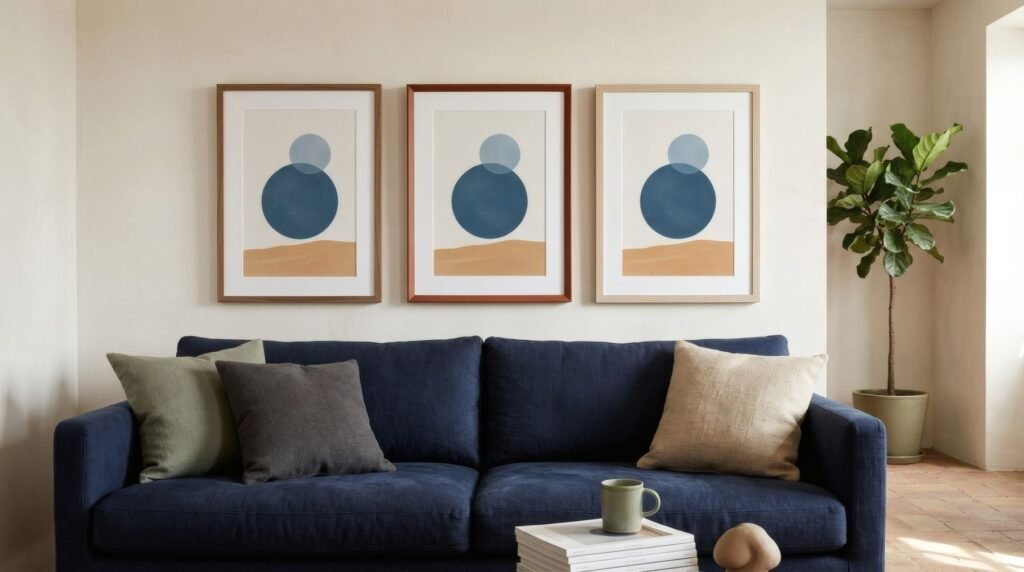
With a blue sofa, navy or petrol, ochre, sand and burnt orange give a lovely warm contrast; paler blues or greys, a calm echo. Coastal palettes sit naturally.
With a mustard or ochre sofa, muted blues and greys create balance; earth tones, a very warm, enveloping room.
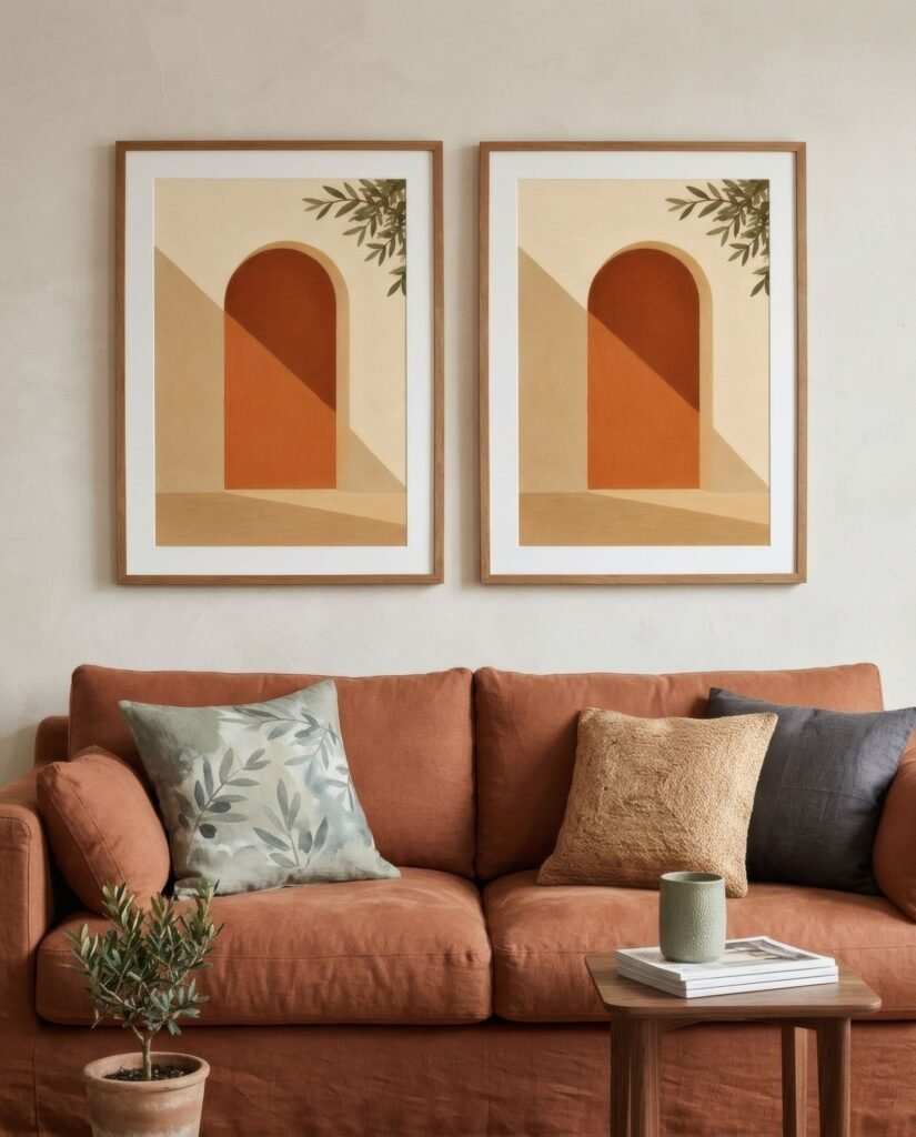
With a terracotta or pink sofa, sage and olive are the most natural complement; bone and charcoal abstracts, an elegant pause.
We cover this more broadly in how to match art colours to your room.
Proportion matters
When the sofa is a strong colour, keep an eye on how much colour the art carries. If the print has as much colour as the sofa, the two blocks compete. It works better when one of them leads: an intense sofa with a piece where colour appears in small areas, or with plenty of white or space around it. A wide mount helps provide that air.
Cushions as a bridge
Cushions are the secret ally here. Sitting between sofa and art, they can pick up a colour from each and build a bridge. A green sofa, a terracotta print and cushions that combine both tones make a coherent scheme with almost no effort. And since cushions are easy to swap, they let you tune the conversation through the seasons.
Size and height
The usual guidelines still apply: the art or grouping covering between half and two-thirds of the sofa’s width, with 15–25 cm (6–10 in) between the sofa back and the frame. With a colourful sofa, a piece that’s too small gets even more eclipsed, so don’t go under. There’s more in what art to hang above a sofa.
A daily conversation
A colourful sofa and the art above it are a pairing you’ll see every day. With a little attention to how they relate, echo, contrast or pause, the living room gains a harmony people notice even if they can’t say why.
If your sofa is green or blue, the terracottas and sands of Southern light give that warm contrast; if it’s terracotta, the sage of Quiet forms is its natural partner.
Keep reading: How to Pair Wall Art with Wooden Furniture, How to Choose Wall Art for Your Living Room and The Colour Wheel as a Tool for Looking at Art.