Visual Quiet: Giving Art Room to Breathe
In an image, what isn't there counts as much as what is. What negative space is, how it creates calm, and how to use it in a print, a mount or a wall.
Read articleEssays on how we look: colour, form, space and the presence of art at home.
In an image, what isn't there counts as much as what is. What negative space is, how it creates calm, and how to use it in a print, a mount or a wall.
Read articleThe same image, cropped three ways, tells three stories. How cropping and margins decide what we see and imagine, and how a print feels…
Read articleTerracotta, ochre, sand. Blue, teal, green. Neighbouring colours make calm harmonies. What they are, how to spot them in art, and how to use…
Read articleA row of windows, waves, columns. Visual rhythm comes from repetition and from variation. The types of rhythm, and how to spot and use…
Read articleDistant mountains look bluer, paler and softer. Artists have used that effect for centuries to create depth. What it is and how to spot…
Read articleComplementary, analogous, triadic. The colour wheel isn't just school theory: it explains why a piece vibrates or soothes, and helps you choose prints.
Read articleFrom Roman ivory tablets to the Wilton Diptych and modern art: two images read as one. What a diptych is, and how to hang…
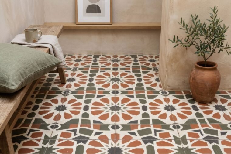
Read articleTiles, textiles, wallpaper, geometric prints: patterns appear in every culture. What we really know about how we see them, and how to use them…
Read articleSome fruit, a bottle, a table. The still life looks humble, yet keeps reinventing itself in painting and photography. Its Spanish roots and home…
Read articleA wanderer facing the fog, a woman turned to the window, a featureless figure. Why art sometimes hides the face, and what that leaves…
Read articleA blind drawing stripes across a wall, a chair's long shadow at dusk. In photography, shadow isn't missing light but form. How to read…
Read article