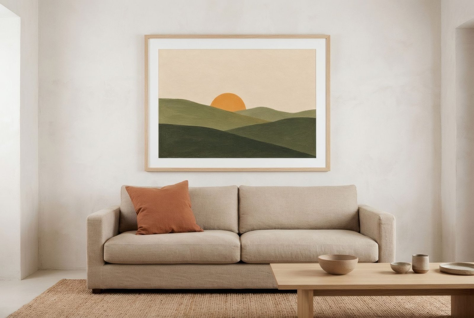
Some people choose a picture because it «goes with the sofa»; others choose one precisely because it goes with nothing at all. Both approaches can work, and both can fail. The difference lies in knowing what palette your home already has, and what role you want the art to play within it. Should it join the conversation with harmonious colours, or bring the contrast the room is missing? You do not need to be an expert in colour theory to decide. You need to look at the room a little differently and know three or four basic relationships between colours.
First, read the palette you already have
Before thinking about the art, sit in the room and notice which colours actually make it up. Look beyond the walls to the floor, the large furniture, the textiles, the timber, even the view from the window. Most rooms have a dominant colour, usually walls and floor; one or two secondary colours, perhaps the sofa, rug or curtains; and a few small accents in cushions, objects or books.
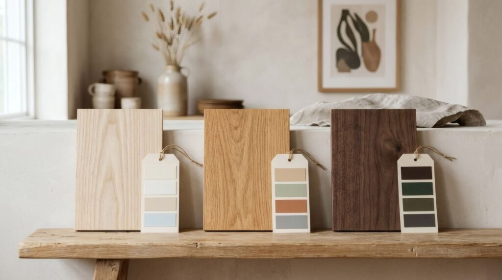
A useful trick is to photograph the room and look at the image very small, or with your eyes half closed. Details disappear and only the broad patches of colour remain. That is your real palette, and it is often different from the one you thought you had. Many homes their owners describe as «white» turn out, in the photo, to be a mix of sand, honey-coloured wood and grey.
Notice the overall temperature too: whether warm tones (yellows, oranges, reds, honey woods) or cool ones (blue-greys, pure whites, blues, cool greens) prevail. Everything else builds on this reading.
The route of harmony
Harmonising means choosing a work whose colours belong to the same family as the room’s. It is the calmest option and the one that lasts best, because the art settles into the space rather than competing with it.
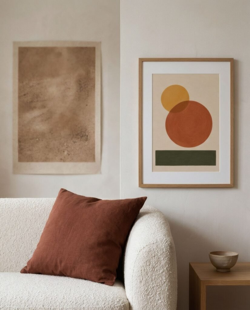
There are two ways to do it. The first is monochrome: a work in several shades of a colour already in the room. In a living room of sands and beiges, a print in lighter and darker sands with a little toasted brown adds depth without leaving the range. The effect is very serene, although the work needs enough light-and-dark contrast not to merge into the wall.
The second is neighbouring colours, those that sit side by side on the colour wheel: terracotta, ochre and mustard, or blue, teal and green. A work in colours neighbouring the room’s feels harmonious but richer than monochrome, because it brings variation without tension.
The route of contrast
Contrasting means bringing into the work a colour the room does not have, to give it energy or balance. It is the liveliest option and, carefully measured, can be what makes a room memorable.
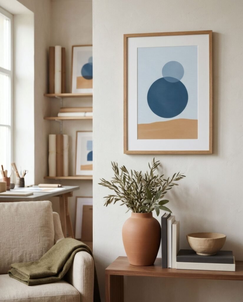
The strongest contrast comes from complementary colours, those opposite each other on the wheel: blue and orange, red and green, yellow and violet. In interiors they are almost always used in soft or earthy versions: a deep blue in a home of terracottas, an olive in a room of dusky pinks, an ochre in a space of grey-blues. The complement makes the dominant colour look more intense, the way a blue sky makes a wheat field glow.
There is also contrast of temperature, a cool work in a warm home or the reverse, and of value, a dark work in a very pale room, which anchors it, or a pale one in a dark room, which lifts it.
Contrast depends on measure. The new colour works best across part of the image, not all of it, and appearing once in the room, perhaps with a small echo.
A proportion that helps
Interior designers often use a rough guide known as the 60-30-10 rule: around 60% of a room in the dominant colour, 30% in a secondary and 10% in an accent. It is not a law, but it helps you see where art fits. If the room already has its dominant and secondary colours settled, the artwork can carry the 10% accent. If the room is almost entirely one colour, the art can supply both the secondary and the accent.
Harmony or contrast? How to decide
There is no right answer, but some questions help. If the room already has plenty of colour and movement, harmony is usually wiser, because art can bring calm. If the room is very neutral or uniform, contrast may be exactly what brings it to life. For rooms meant for rest, such as a bedroom, harmony tends to suit better. For social or transitional spaces, such as a dining room or hallway, contrast can bring energy.
And think about light. A north-facing living room with cool light welcomes warm-toned works that temper it. A very sunny room can take fresh blues and greens to balance it.
Frames and mounts as mediators
Between artwork and wall, the frame and mount act as colour mediators. A white or bone mount separates the work from a coloured wall and lets it breathe, which is very useful when the work is a contrast. A wooden frame that repeats the furniture ties the work to the room. A thin black frame crops the image crisply and makes it more graphic.
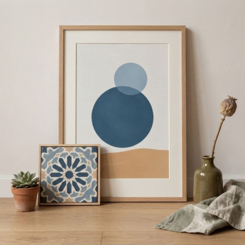
Three homes, three decisions
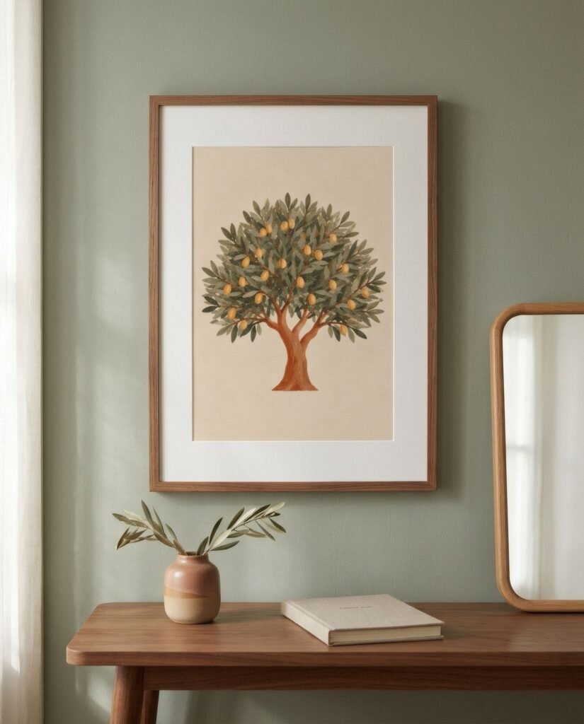
In a living room with white walls, honey oak floors and a sand sofa, a print in terracotta, ochre and sand (neighbouring colours) harmonises and warms. In the same room, a print in deep blue and sand (a soft complement) cools it and makes it more memorable. In a bedroom with sage green walls, a print in sages, cream and a touch of olive (monochrome with neighbours) keeps the calm, while one in a pinkish terracotta (a complement) would wake the room up.
Look before you choose
Matching wall art to your colour palette starts with looking closely. Once you know which colours you have and which temperature dominates, deciding whether the art should join in or contrast becomes much simpler, and the result no longer depends on luck.
If you are looking for a work to suit your palette, Bendíra’s collections are organised by colour family, from the earth tones of Southern light to the blues of Coastline, which makes it easier to find the harmony or contrast you are after.
Keep reading: How to Add Personality to Neutral Interiors, What Is Abstract Art? A Beginner’s Guide and How to Choose Wall Art for Your Living Room.