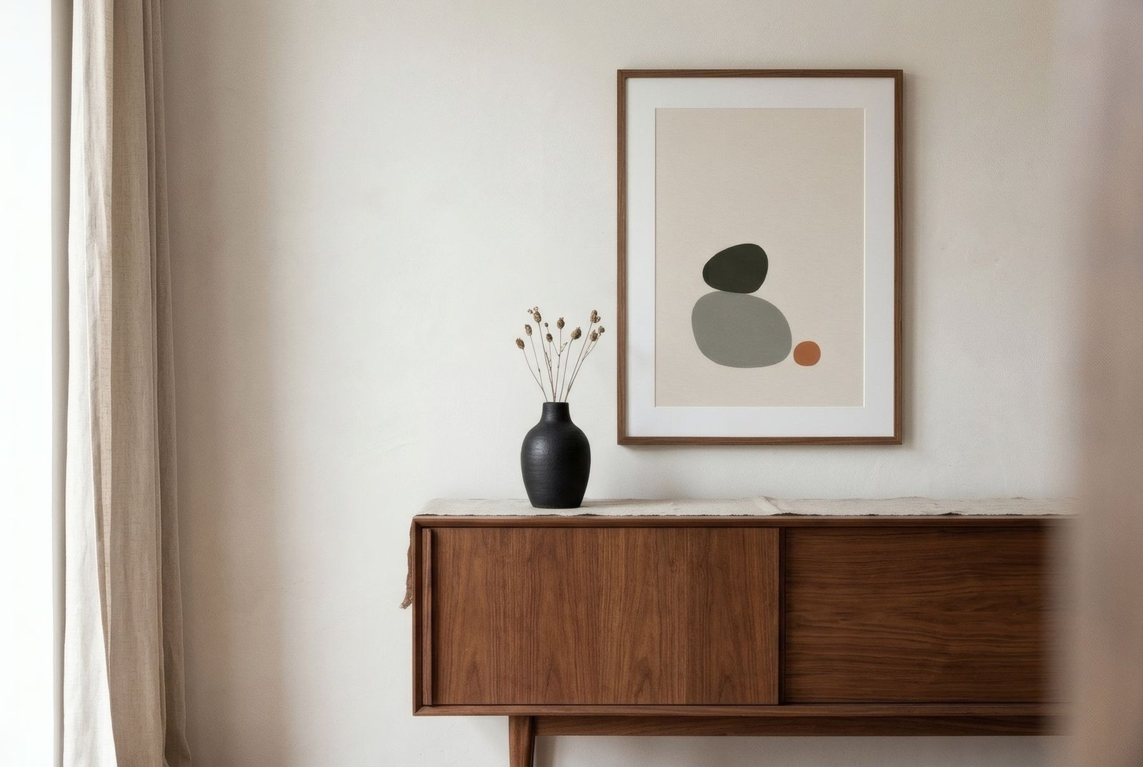
Wood has something few materials have: a colour of its own, a temperature, and a grain that changes from one piece to the next. So when a room has wooden furniture with real presence, such as a walnut sideboard, a solid oak dining table or an old pine bookcase, the art hung nearby inevitably joins the conversation. The key to a pleasant conversation is to read the wood’s depth (light, medium or dark) and its undertone (warm, neutral or cool), then choose art that keeps it company or balances it, without trying to copy it.
Reading the wood first
Not all woods are alike, and you do not need to be a joiner to tell them apart. Two things are enough.
The first is depth. Pale woods such as birch, ash, maple or natural oak bring light and lightness. Mid-tone woods such as aged oak, cherry or teak have more body and warmth. Dark woods such as walnut, wenge or stained timber give depth and a certain gravity.
The second is undertone, best seen in daylight. Some woods have a yellow or honey base, like pine or some oaks; others lean red or orange, like cherry or teak; others are more neutral or greyish, like whitewashed ash or smoked oak. This undertone affects how the colours of a nearby print look far more than you might expect.
Pale woods: room for colour
Pale woods are the easiest to accompany, because they leave plenty of visual space. Almost any soft palette works with them: dusty blues, sage, sand, muted pinks. They also take more graphic contrast, such as a print with black forms on a light ground, which gives structure to a room that might otherwise feel too airy.
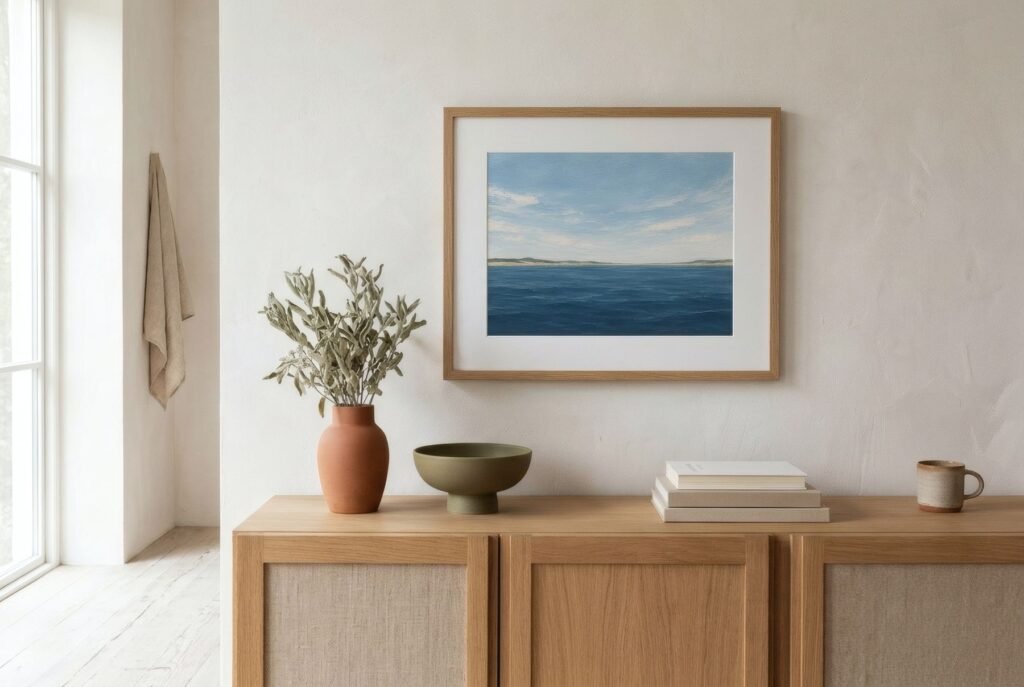
The risk with pale wood is a lack of anchoring. If everything is light, the furniture, the wall and the art, the room can seem to float. A deeper accent in the work, a terracotta or navy across a small area, or a frame a shade darker than the furniture, helps ground the whole.
Mid-tone woods: home ground for earth colours
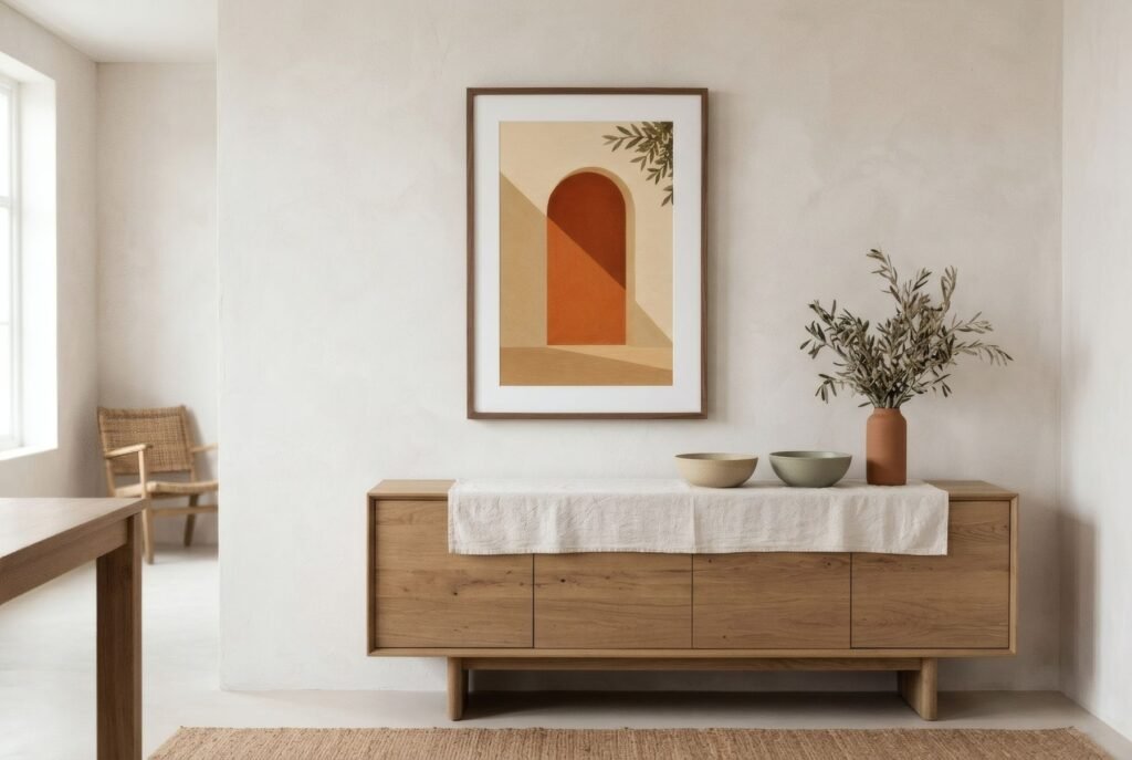
Mid-tone woods with warm undertones, such as aged oak, cherry or the teak of so much mid-century furniture, pair wonderfully with earthy palettes: terracotta, ochre, mustard, olive. It is an almost natural match, because those colours belong to the same family as the wood.
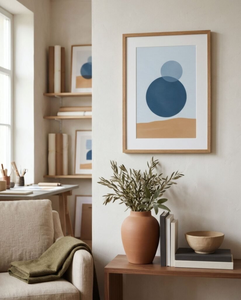
Contrast has its place here too. A deep blue or teal, complementary to the orange in the wood, creates a lovely tension when used with restraint. If you have a teak sideboard, a print with a blue circle on a sand ground may be just the piece that makes the whole corner sing.
Dark woods: bring light and air
Dark woods have presence and absorb light. Art around them works best when it brings clarity: pale grounds, luminous palettes and wide mounts that separate the image from its dark surroundings. A very dark work above a walnut sideboard can turn the corner into a dense block.
Bone, sand and stone work particularly well with walnut, perhaps with a charcoal line that echoes the furniture, as do muted greens. If you want colour, warm soft tones such as a light terracotta or ochre speak nicely to the reddish base of many walnuts.
Do not copy the wood
There is an understandable temptation to choose art in exactly the same tones as the wood. The result is usually flat: the work merges with the furniture and neither stands out. It works better for the art to pick up the wood’s tone as an echo, in a small part of the composition, and for the rest to offer something different, whether light, a complementary colour or a contrast of value.
The frame as a bridge
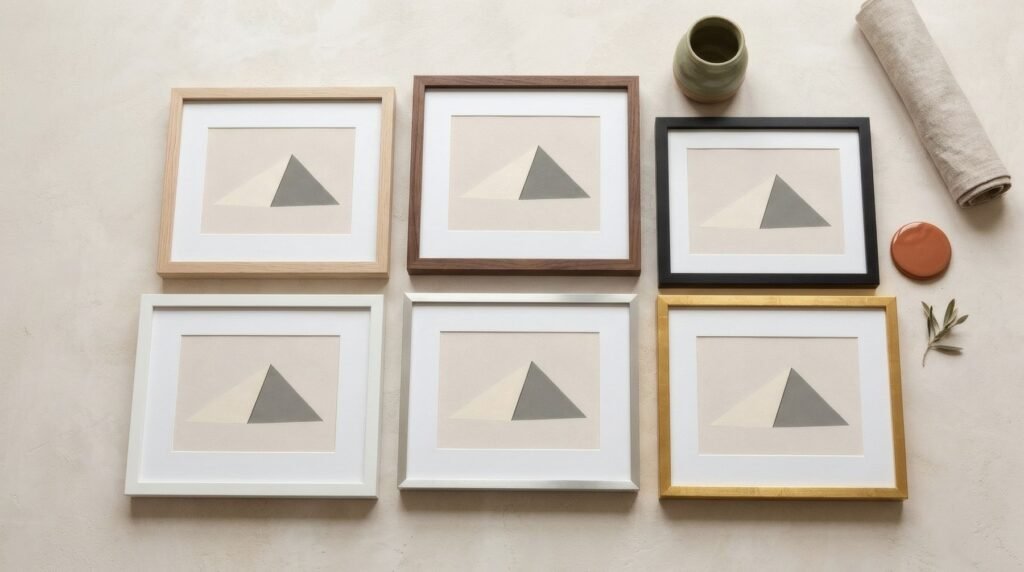
When art hangs beside wooden furniture, the frame becomes a bridge between them. There are three routes, and all of them work if chosen deliberately.
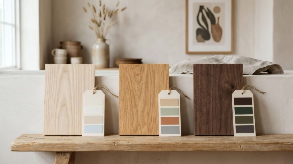
You can repeat the wood, with a frame in the same or nearly the same tone, oak with oak or walnut with walnut. It creates continuity and a considered feel, although it is best not to match exactly, because small differences in grain and colour can look like a mistake. You can contrast in depth, with a light frame above dark furniture or the reverse, which separates the work from the piece below and gives it more presence. Or you can step away from wood altogether, with a thin black, white or metal frame that does not compete and leaves all the warmth to the furniture.
What tends to jar is a frame that is «almost but not quite» the same wood, such as yellowish oak beside greyish oak. When in doubt, choose a clear contrast or a frame that is not wood at all.
A few examples
Above a walnut sideboard, a 50 × 70 cm portrait print of a charcoal organic form on a bone ground, with a wide mount and a walnut frame, lets the work bring light while the frame repeats the furniture. Above a pale oak dining table set against the wall, a pair of prints in dusty blue and sage in slim black frames adds freshness and structure. Beside a mid-century teak bookcase, an abstract in terracotta, mustard and a small blue circle, in a natural oak frame.
Wood and art, a good match
Wood and printed art understand each other well, because both are materials we take in up close: the grain in one, the paper and ink in the other. Reading the wood’s tone and deciding whether the art will echo it or offset it is the first step towards a corner that works.
If your wooden furniture has warm tones, Bendíra’s Southern light collection brings together prints in terracotta, sand and olive that sit naturally alongside oak, cherry and teak.
Keep reading: Scandinavian Wall Art Ideas, Earth-Toned Interiors: Choosing the Right Art and Mid-Century Modern Art: Shapes, Colours and Influence.