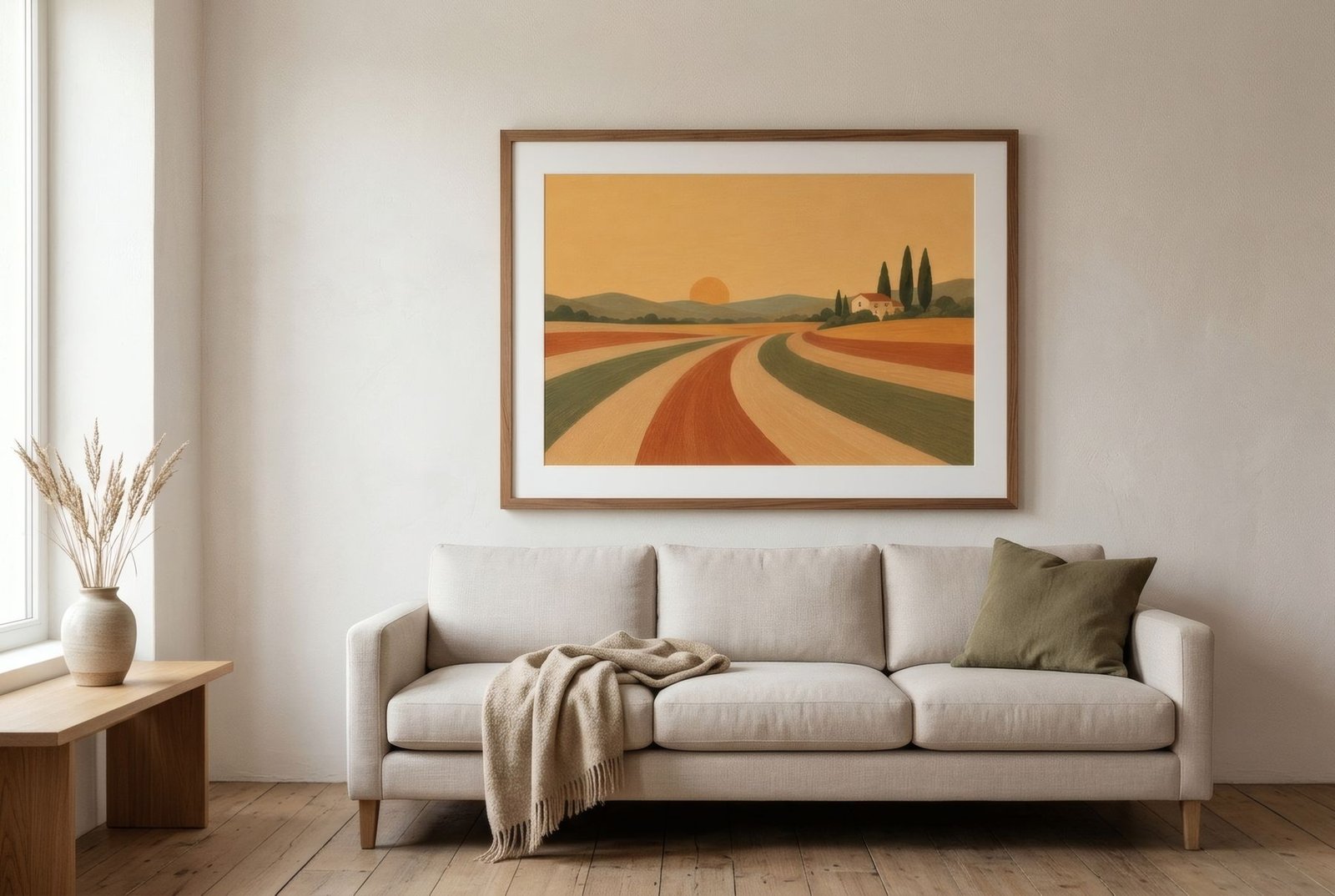
Choosing living room wall art goes better when you start with measurements and leave the image for last: note the width of the furniture beneath the wall, decide between one piece and a group, and only then think about colour and subject. When a living room feels slightly off, the cause is rarely taste. It is usually proportion: a print that is too small for the sofa, or hung so high that it seems to belong to the ceiling.
What follows is a practical sequence. It works whether you are filling a blank wall in a new flat or rethinking a room you have lived in for years.
Decide which wall matters
Most living rooms have one wall that carries the room. It is usually the one behind the sofa, or the first thing you see when you walk in. That wall can take a confident piece. The others often look better with something quieter, or with nothing at all. A room where every wall competes for attention tends to feel busy rather than considered.
Before choosing anything, look at what the wall already contains: a radiator, a switch, a window set off-centre, a television. These elements are part of the composition whether you include them or not. Art that ignores them can look crooked even when it hangs perfectly level.
Get the scale right
The most reliable reference point is the furniture underneath. A widely used rule of thumb is that art, or a grouping of art, should span roughly half to two-thirds of the width of the sofa or sideboard below it. Treat it as a starting point, not a law.
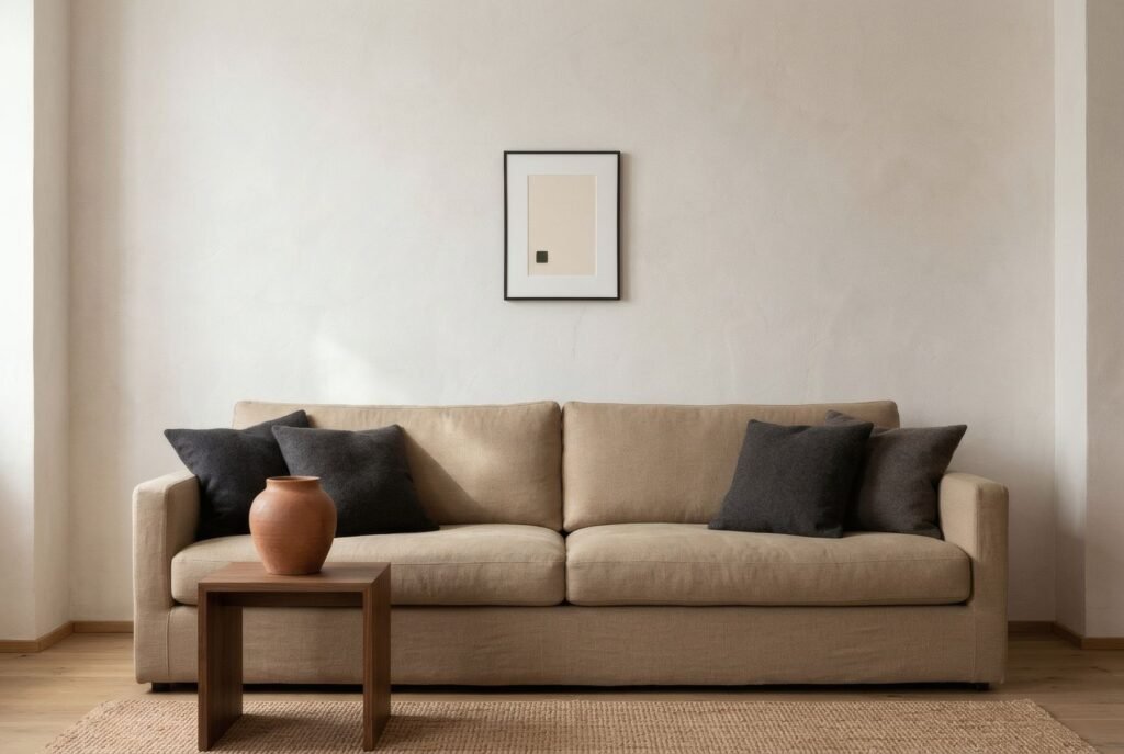
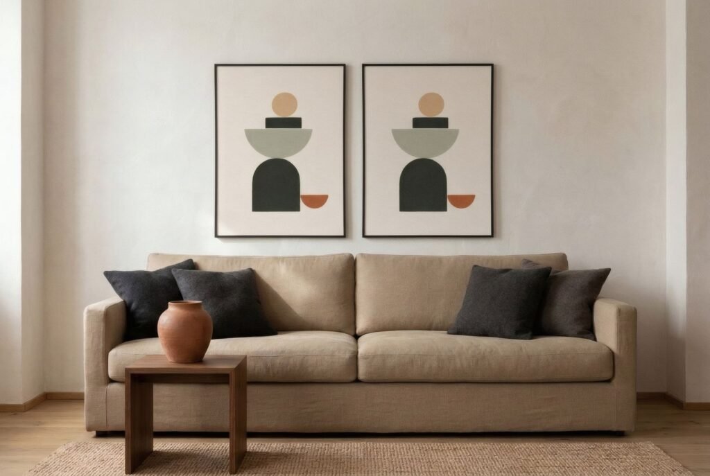
In practice:
- A 200 cm (79 in) three-seater: a single piece around 100–130 cm (39–51 in) wide, or a group whose total width, frames and gaps included, covers the same span.
- A 160 cm (63 in) two-seater: around 80–105 cm (31–41 in). One framed 50 × 70 cm print will look small on its own; two side by side with a 6–8 cm gap sit comfortably.
- A 120 cm (47 in) sideboard: 60–80 cm (24–31 in) of visual width. A portrait-format piece centred above it, or a landscape piece a little narrower than the unit, both work.
Going too small is far more common than going too big. A single A4 print above a large sofa reads like a postage stamp on an envelope. If a large piece is out of budget, group several smaller ones so that together they reach the right width. Our guide to creating a gallery wall at home covers how to plan one.
Height and spacing
Two measurements settle most living rooms:
- The gap above the sofa: about 15–25 cm (6–10 in) between the top of the backrest and the bottom of the frame. Less than that and the art seems to rest on the cushions; much more and it floats away from the furniture.
- Centre height on an open wall: where there is no furniture beneath, many galleries and interior designers place the centre of a work at around 145–155 cm (57–61 in) from the floor, roughly the eye level of a standing adult.
Low ceilings usually call for bringing the whole arrangement down slightly. High ceilings do not call for hanging higher. If the wall looks empty, go larger. For specific situations, see how high to hang pictures.
Colour: echo or contrast
Art does not need to match the cushions. It helps more to choose one of two strategies and commit to it.
Echo. The artwork picks up one or two tones already present in the room, such as the oak of a floor, the oatmeal of a linen sofa or the glaze of a ceramic lamp, and repeats them at a different intensity. This is the calmest option, and it tends to age well as other things in the room change.
Contrast. The artwork introduces a colour the room does not yet have, usually in a modest area of the image: a burnt terracotta against stone-grey walls, or a deep blue in a room of sand and cream. Used once, it brings energy. Repeated across several pieces, it starts to fight the room’s calm.
A quick test: take a black-and-white photo of the room on your phone. If the art disappears entirely, it may lack tonal contrast (light against dark) rather than colour. If it is the only thing you can see, it may have too much.
Light changes everything. North-facing rooms cool colours down, and warm ochres hold up better than blue-greys, which can turn flat. In a bright south-facing room, saturated colours become more intense, so a little goes a long way.
One piece, a pair or a group
The choice depends mostly on the character of the room.
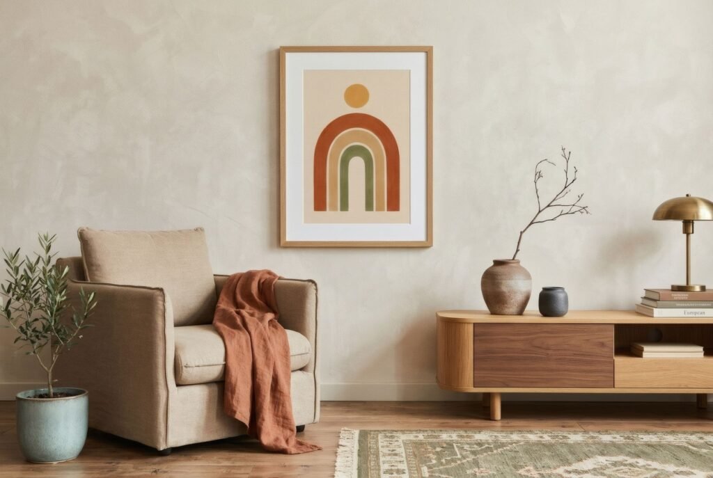
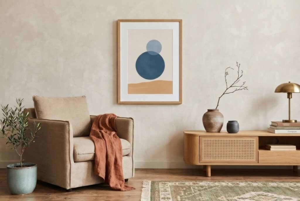
- One large piece gives focus and calm. It suits living rooms that already have a lot going on, such as full bookshelves, patterned textiles or a busy rug, because it offers one broad, quiet surface.
- A pair brings order and symmetry, and works especially well centred over a sofa or console.
- A group of three or more feels more personal and lets you mix formats, but it needs a shared thread, whether a palette, a frame finish or a subject. Without one it reads as accumulation.
If you are unsure, start with fewer pieces. Adding a second print in six months is easy. Patching a wall full of holes is not.
Style: read the room, not the label
Rather than trying to name your style, look at materials and lines. A room of pale wood, linen and rounded forms usually welcomes soft abstraction, organic shapes or fine botanical drawing. A room of straight lines, metal and cooler tones often suits geometry, structured composition or black-and-white photography.
Everything does not need to come from the same movement or the same decade. What matters is a common thread: a recurring colour, one family of frames, or a shared horizon line across the pieces.
The frame is part of the decision
A frame changes both the perceived size of a work and its tone. A slim natural wood profile supports the image without imposing itself. Matt black sharpens edges and suits graphic work. A generous mount adds breathing space and helps a medium-sized print hold a bigger wall. When combining several prints, a single frame style is the simplest way to make different images feel related.
Check whether a print is sold framed or unframed before you plan your measurements. A frame and mount can add 4–15 cm (1.5–6 in) on every side.
Test before you drill
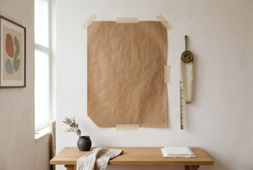
Cut paper templates to the exact size of each frame, using kraft paper or old newspaper, and tape them to the wall with low-tack masking tape. Leave them up for a day or two. See how they read in morning and evening light, from the sofa and from the doorway. It costs almost nothing and prevents most mistakes.
Common mistakes
- Choosing the image before the place. You end up forcing a piece onto a wall that was never right for it.
- Hanging too high. Especially common in rooms with tall ceilings.
- Scattering small pieces across every wall. Concentrate on one wall and let the others rest.
- Forgetting about reflections. Glass opposite a window can turn a print into a mirror for half the afternoon.
Bringing it together
The right piece rarely dominates a living room. It looks as though it has always been there. Scale, height, colour and frame are the four decisions that make that possible, and you can settle most of them with a tape measure before you look at a single print.
Once you have your measurements, you may want to see how these ideas translate into real pieces: Bendíra’s art print collections include work made for warm, unhurried living rooms.
Keep reading: How to Choose the Right Art Print Size and How to Match Wall Art with Your Colour Palette.