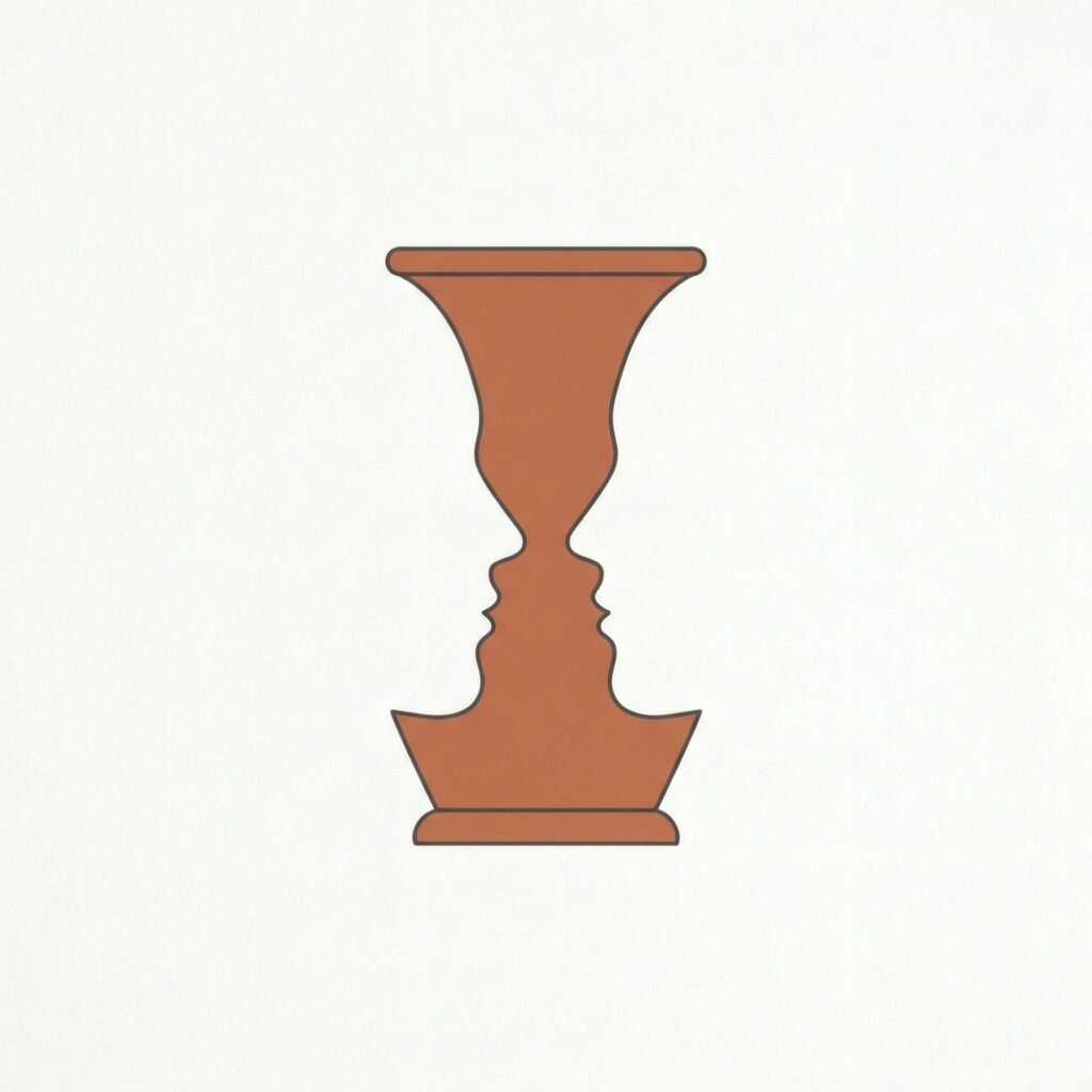
There is an optical illusion most people have seen at some point: a white vase on a black ground that, looked at another way, becomes two faces in profile. What seemed background becomes figure, and the other way round. The image, often associated with the Danish psychologist Edgar Rubin, explains very simply something essential in art: empty space is not merely the gap around things. It has shape and weight, and it takes part in a composition as much as whatever is drawn or painted. Artists and designers call this emptiness negative space, and learning to see it transforms the way you look at a work.
Figure and ground
Every image contains two kinds of space. Positive space is occupied by the main elements: a figure, object, form or line. Negative space is everything else: the background, the gaps between elements, the surface left free.
We tend to notice the positive and overlook the negative, as if it were mere support. But each defines the other. The silhouette of a form depends as much on the space around it as on its own edges. So when an artist decides how much space to leave around something, they are also deciding how that thing will be seen.
Emptiness that creates emphasis
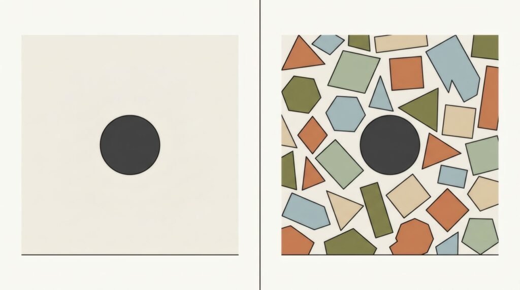
One of negative space’s clearest roles is emphasis. The more free space around an element, the more it stands out. A small circle at the centre of a broad empty ground commands all the attention; the same circle among many other shapes is lost.
Many pared-back works rely on exactly this: a single line, a form or a mark on a generous surface. The work is not «empty». The emptiness is what gives that single element its force, as we discuss in minimalist art: less is more.
Emptiness that balances
Negative space also balances a composition. A form placed near one edge can be offset by a wide area of free space on the other side. In many asymmetric compositions, emptiness acts as a counterweight, steadying an image that might otherwise seem to tip.
This interplay of full and empty is one of composition’s great resources, explored in asymmetrical composition in contemporary art.
Emptiness that lets an image breathe
Negative space also gives air. An image crammed with elements, with no gaps, can be exhausting; one with zones of calm lets the eye rest and return. That rhythm of full and empty is like rests in music: without them, the notes blur together.
An idea with many traditions
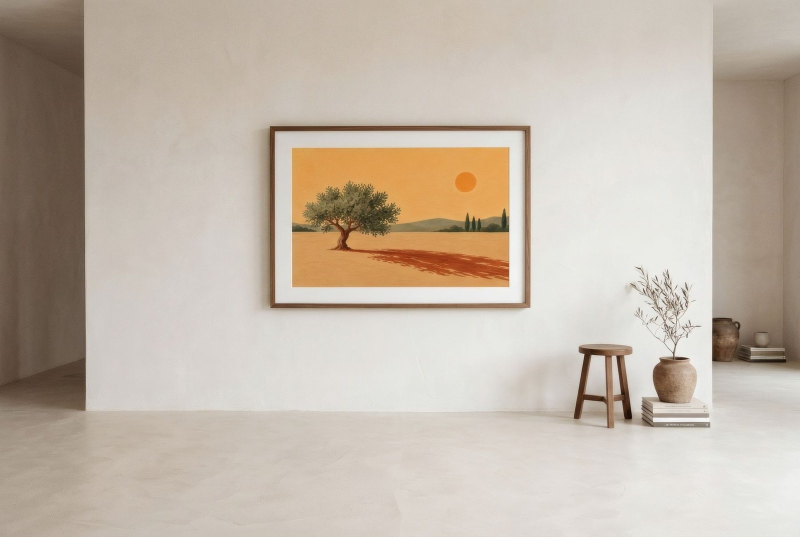
The value of empty space appears across many artistic traditions. In East Asian landscape painting, for instance, large areas of unpainted paper can suggest mist, water or sky and are essential to the work. In modern graphic design, the use of white space is one of the traits that separate a clear composition from a cluttered one. And logo design has famous examples where negative space hides a second image, like the arrow many people are surprised to discover between two letters of a well-known courier’s name.
You do not need to know these traditions to appreciate negative space, but they show it is not a recent fashion. It is one of art’s oldest intuitions.
Spotting it in a print
Next time you look at a work, try a small exercise. Instead of looking at the forms, look at the spaces between them. What shape are those gaps? Wide or narrow? Is there more empty than full, or the reverse? Where is the largest empty area, and what does it do?
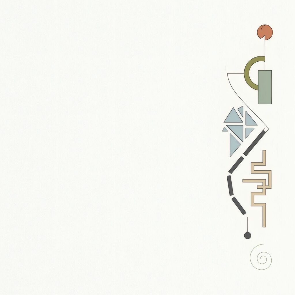
Notice too how negative space relates to the edges of the paper. A form pressed against an edge creates tension; one with air around it conveys calm. A print’s white borders, and a frame’s mount, are also forms of negative space that extend the space within the image.
Negative space at home
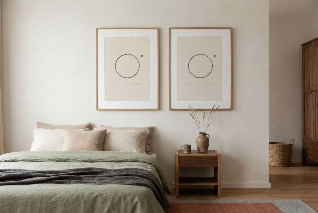
Works with plenty of negative space have a quality much valued in interiors: serenity. They suit calm, minimal or natural-material interiors, and restful rooms such as bedrooms or reading corners.
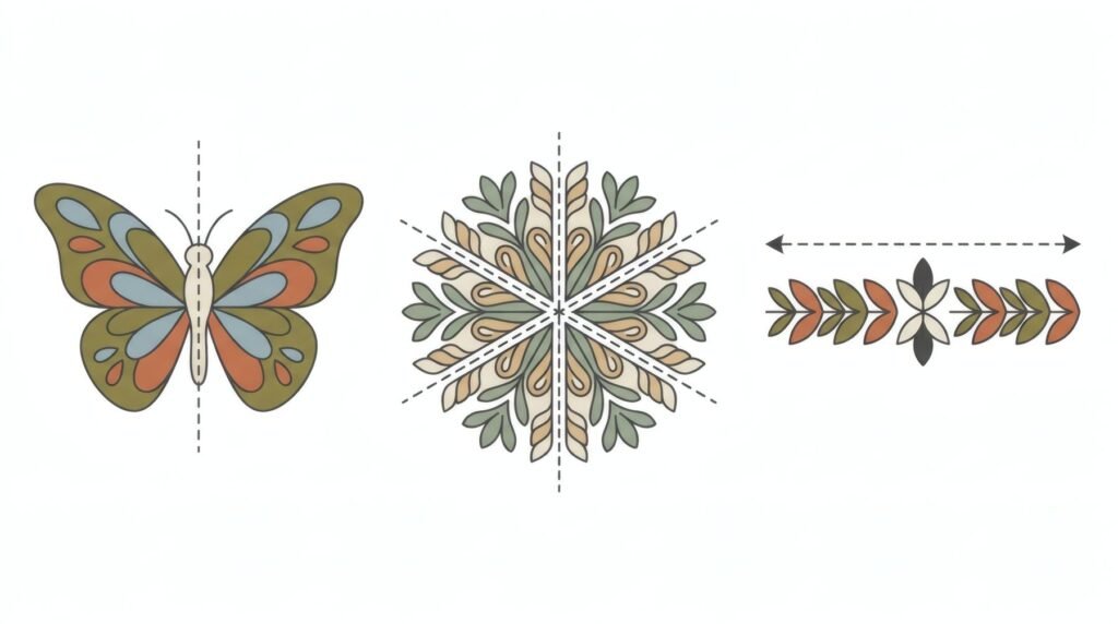
But that serenity asks something in return: space on the wall too. A print full of inner emptiness loses some of its power if squeezed between other works or hung on a crowded wall. It works best with air around it, an idea we explore in the beauty of giving art room to breathe.
The value of what is not there
Negative space reminds us of something true of art and perhaps of life: what is absent matters as much as what is present. Emptiness gives shape, emphasis, balance and calm. Learning to see it is learning to look more completely.
In Bendíra’s Quiet forms collection, negative space takes centre stage: prints of minimal lines and calm forms in which the emptiness is as much part of the work as the line.
Keep reading: Organic Shapes in Art and Design, How to Build an Affordable Personal Art Collection and Warm Minimalism: How to Decorate with Art.