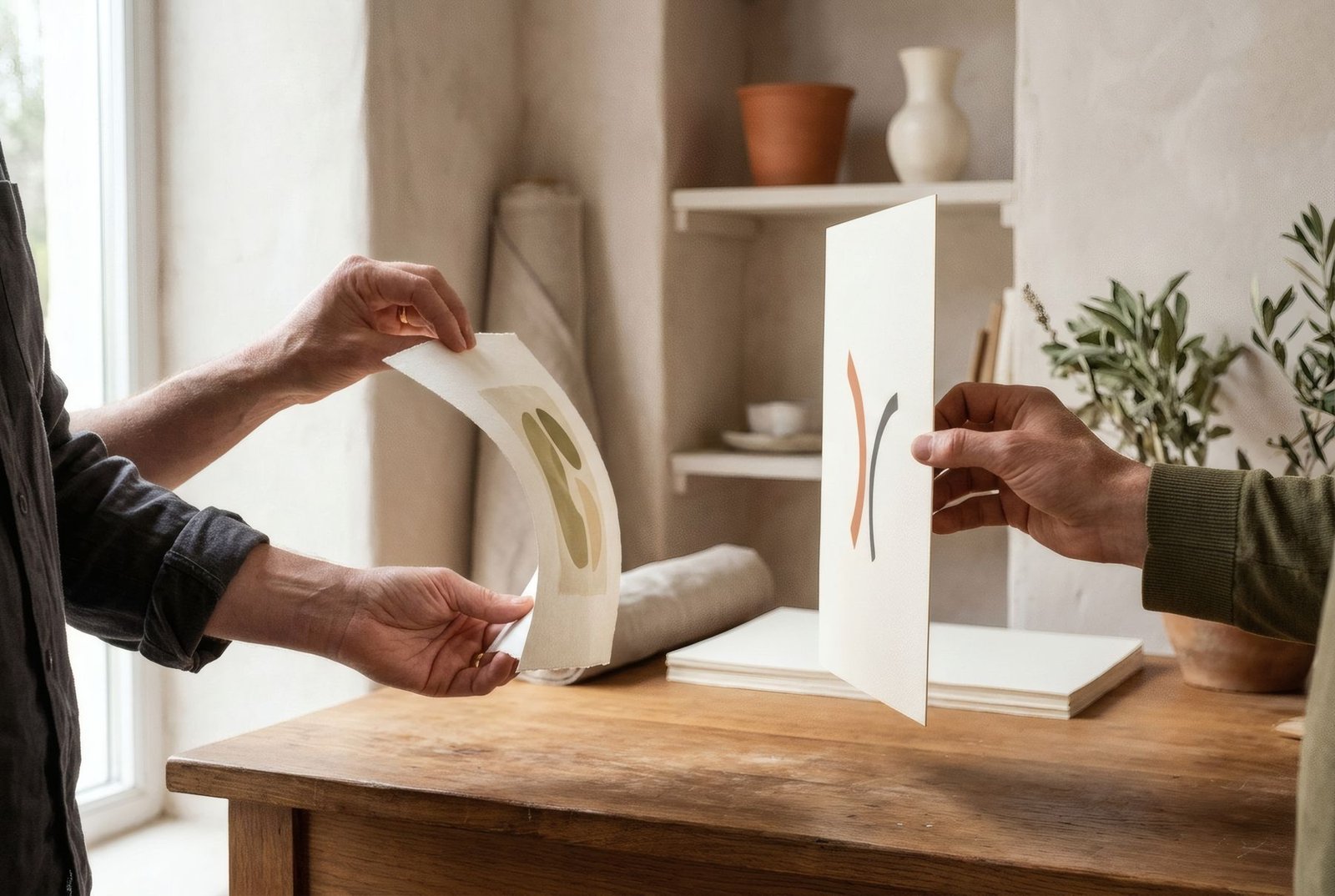
Whenever print quality comes up, paper weight is rarely far behind: «200 gsm paper», «300 gsm paper». It sounds simple and definitive, as if more grams automatically meant better paper. But weight is only one of paper’s characteristics, and not always the most important. It tells you how heavy a sheet is, not what it is made of, how stiff it is or how it takes ink. Understanding exactly what it measures, and how it differs from thickness, stiffness and texture, helps you read print descriptions better and not be swayed by a single number.
What gsm measures
Paper weight is expressed as grams per square metre, or gsm (g/m²). A square metre of 200 gsm paper would weigh 200 grams.
For reference, everyday office printer paper is around 80 gsm. Postcard card might be about 300 gsm. Many fine art papers fall between 190 and 350 gsm, though lighter and heavier papers exist for different uses.
In some countries, especially the United States, paper weight is given in pounds, using a different and sometimes confusing system. In the UK and Europe, gsm is standard.
Weight is not thickness
This is one of the most common confusions. Two papers with the same gsm can be different thicknesses. It depends on fibre density: a bulky cotton paper may be thicker than a dense cellulose paper of the same weight per square metre.
Actual thickness is measured in microns and sometimes appears in technical specifications as «caliper». It is what you feel most when you touch the edge of a print.
Weight is not stiffness
Nor does gsm alone determine stiffness, how much the paper bends or resists when held. Stiffness depends on weight but also on thickness, composition and fibre type. Heavier paper is usually stiffer, but not always proportionally.
Stiffness matters mostly in handling. Very floppy paper creases easily and can mark as you pick it up; stiffer paper holds itself and feels of higher quality.
Weight is not texture or quality
Finally, gsm tells you nothing about texture, whether smooth or grained, finish, whether matt or satin, whiteness, or whether the paper is acid-free and archival. All of those influence a print’s appearance and longevity far more than a few grams either way. We cover them in how paper changes the look of an art print.
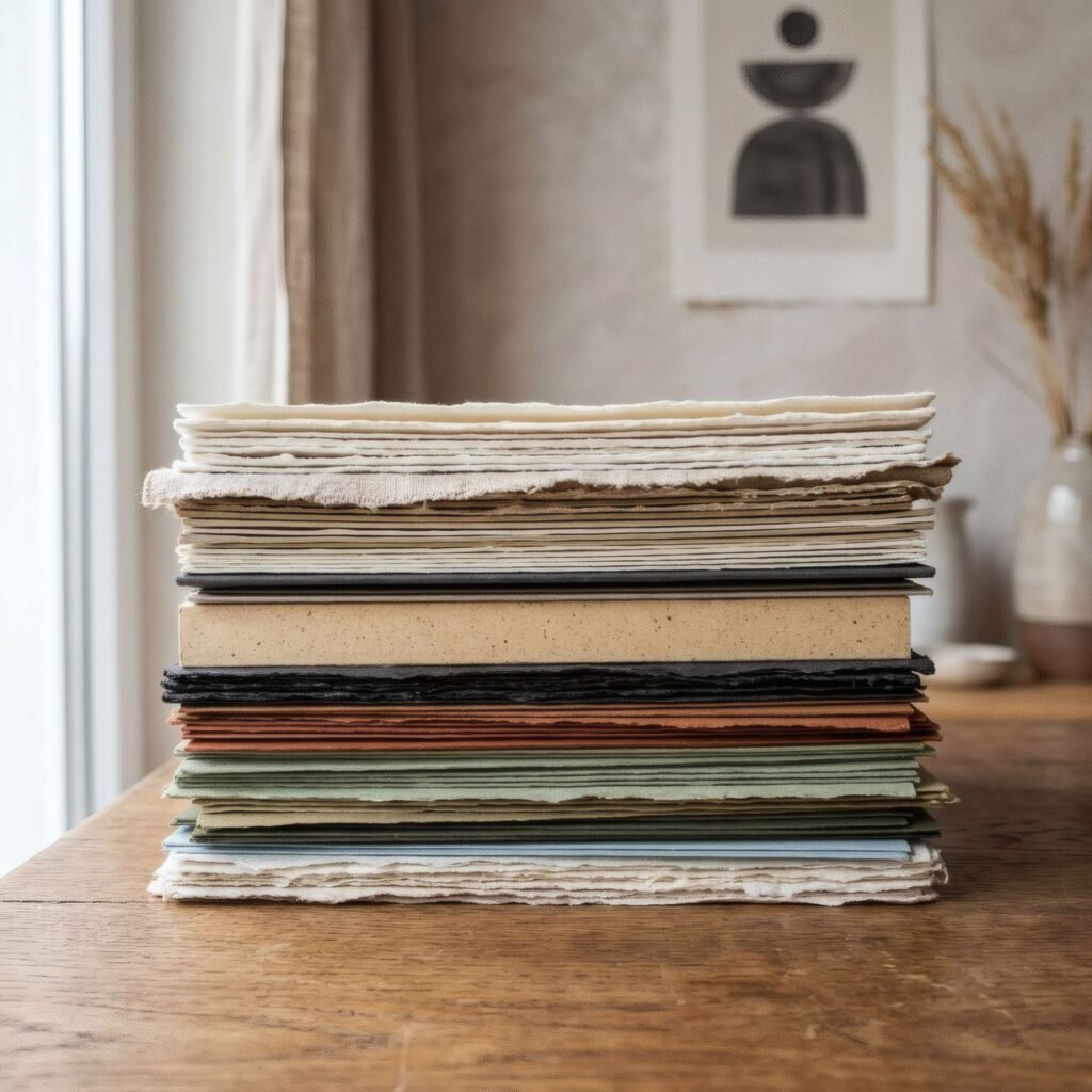
A lighter paper of good composition can be better for a print than a very heavy one of poorer quality.
What a higher weight brings
That said, weight does have practical effects. Heavier paper usually feels more substantial in the hand, stands up better to handling without creasing, ripples less as humidity changes and stays flatter once framed.
That is why art prints are usually made on medium to heavy papers. But beyond a certain point, adding grams does not necessarily improve the experience, and very heavy paper can be awkward in some standard frames with little interior space.
Reading weight in a description
If a print lists its weight, take it as useful information, but not the only information. Look too for the type of paper, its finish, texture and whether it is acid-free. If only the weight is given, it is reasonable to ask. We help you read these descriptions in how to read an art print product description.
Beyond the grams
Paper weight is a clue, not a verdict. It indicates heaviness, and with it something of a paper’s solidity, but a print’s true quality depends on many factors together: fibre, finish, texture, whiteness, the coating for ink and the care with which it is printed.
Bendíra prints are made on matte fine-art paper; each product page lists the available details about the paper, so you can judge it by more than a single number.
Keep reading: RGB vs CMYK for Art Prints, How to Measure an Art Print Before Buying a Frame and Matte vs Satin Paper for Art Prints.