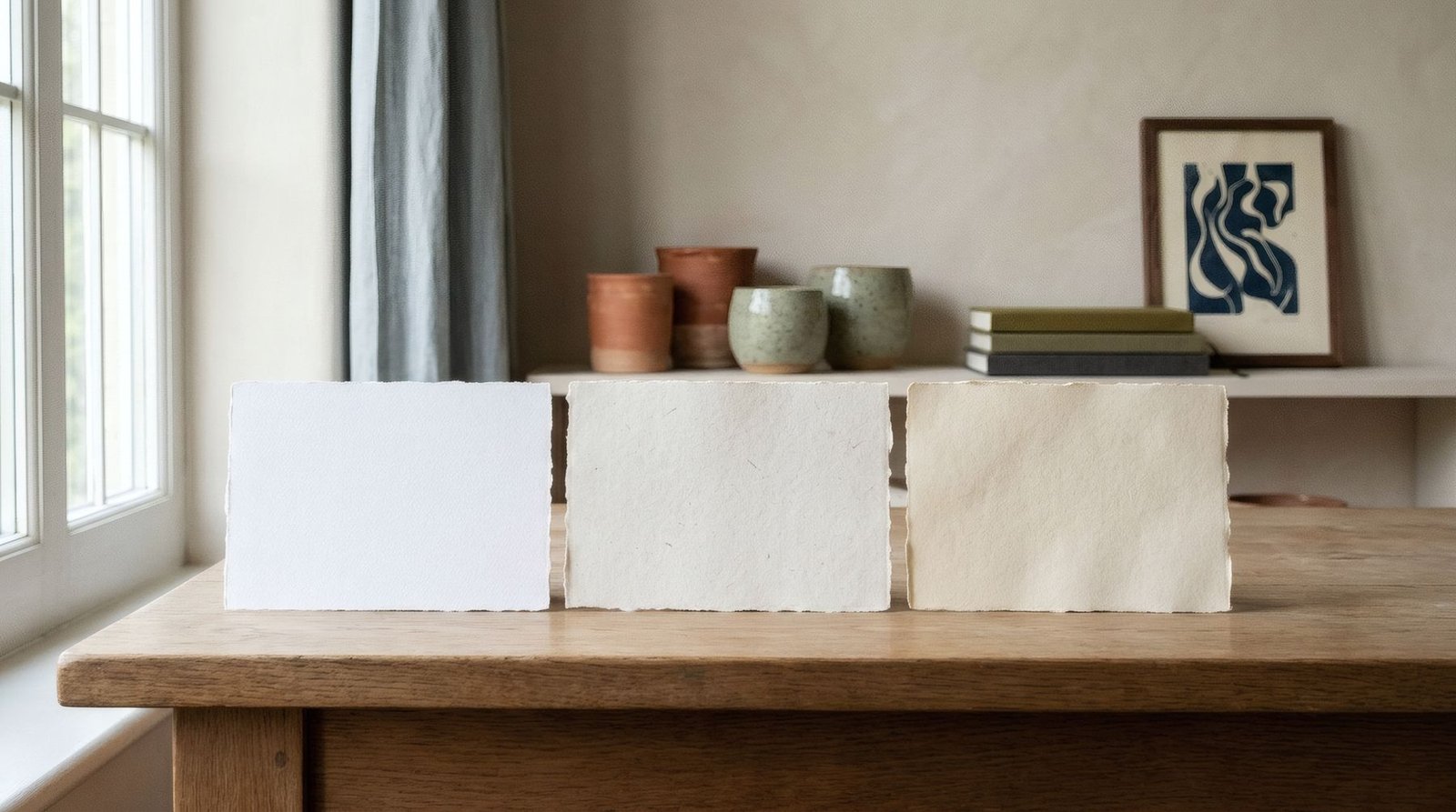
Anyone who has run a hand across a good print knows the feeling: the paper has body, a surface that is not quite smooth, a white that does not glare. And anyone who has compared the same image on two different papers knows how much the result can change. Paper is not just what an image sits on; it is part of the image. Fine art paper is defined by four qualities that shape what you see. Its texture decides how detail is perceived, its whiteness conditions the colours, its weight affects how it behaves, and its ability to take ink determines sharpness and depth of tone. Understanding these four qualities changes the way you look at a print.
Texture: from smooth to tactile
Fine art papers range from completely smooth surfaces to those with a marked grain, reminiscent of watercolour paper.
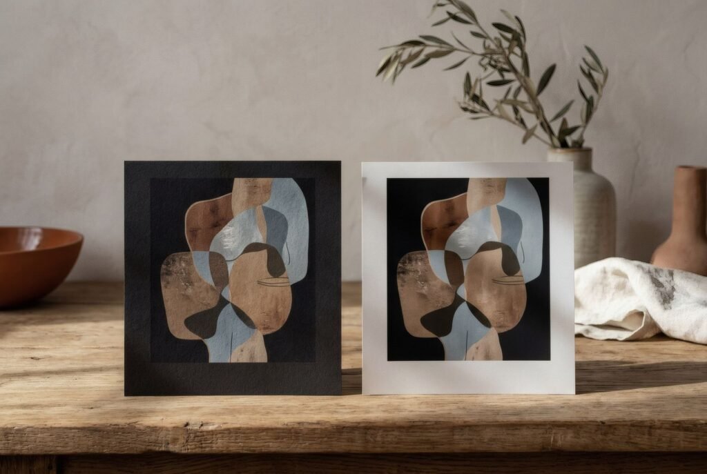
A smooth paper reproduces detail with great precision and lets the image lead; a textured paper brings physical presence and an almost painterly warmth, at the cost of softening the finest detail. Neither is better: the question is whether you want the paper to be felt or to disappear. We look at it more closely in textured vs smooth art paper.
Whiteness: not all whites are equal
It may seem a small detail, but the shade of the paper changes a print considerably, because the paper’s white is the lightest point in the whole image. Everything else is built from it.
Some papers are natural or warm white, slightly ivory or cream, bringing softness and suiting earthy palettes, classical illustration and interiors of natural materials. Others are bright white, cooler and more luminous, making colours look livelier and contrast sharper.
Many bright white papers achieve that effect with optical brightening agents, additives that absorb ultraviolet light and re-emit it as bluish light, so the paper looks whiter. The effect is attractive, but these additives can lose strength over time, especially in strong light, and the paper may drift warmer than it first appeared. That is why, in conservation printing, many professionals prefer papers without brighteners, even if their white is less dazzling.
Weight: grams per square metre
Weight, given in grams per square metre (gsm), tells you how heavy a paper is. Generally a heavier paper is also thicker and stiffer, though not always in the same proportion. For reference, ordinary office paper is about 80 gsm, while many fine art papers sit well above that, often between 190 and 350 gsm.
A higher weight feels substantial in the hand, stands up better to handling and tends to ripple less as humidity changes. But weight is not everything: a lighter paper of good fibre can be better than a heavy one of poorer quality. There is more in paper weight explained for art prints.
Composition: cotton and cellulose
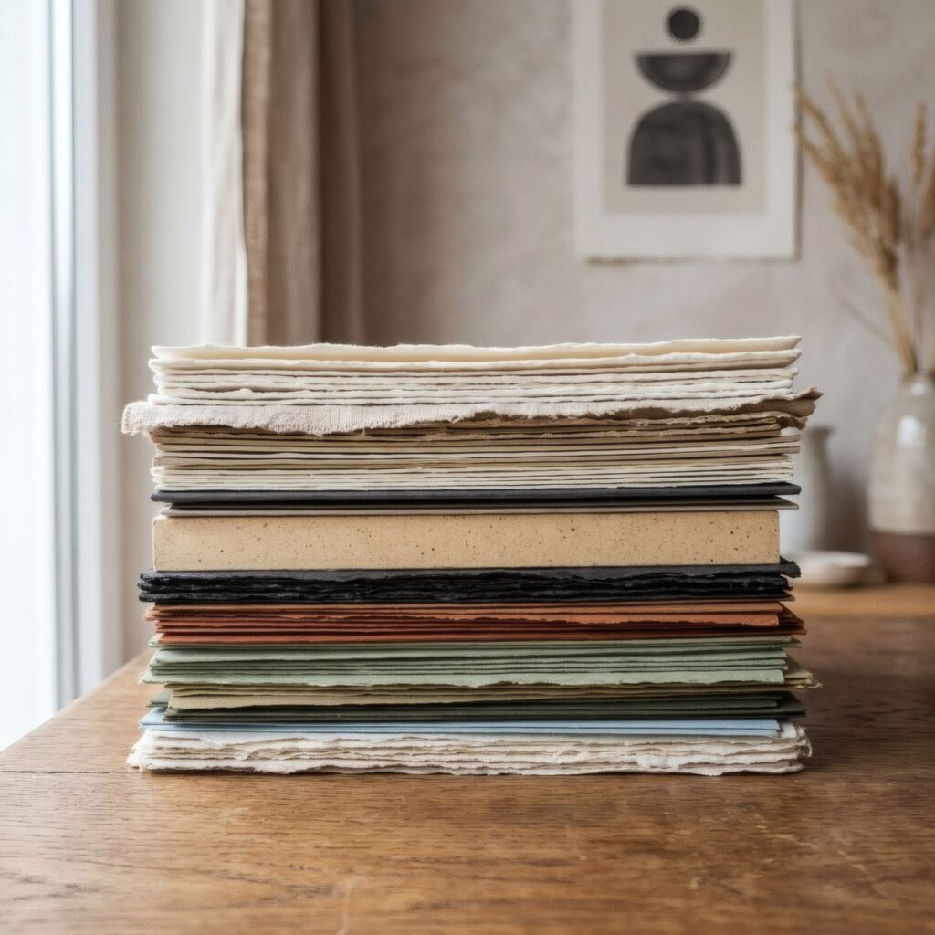
Fine art papers are made mainly from two kinds of fibre. Cotton, traditional in fine art papers, offers great strength and a soft, deep feel. Alpha-cellulose, a purified wood cellulose, allows archival-quality papers at a somewhat lower cost. Both can be excellent if carefully made and acid-free, which is the characteristic that most affects a paper’s long-term stability.
How the paper takes ink
Finally, there is the way paper receives ink. Papers for fine art inkjet printing usually carry a special coating that holds ink at the surface without spreading, allowing intense colour and crisp edges. A paper without that treatment, such as ordinary drawing paper, would absorb ink like blotting paper: colours would dull and detail blur.
The quality of that coating, together with the ink type, strongly affects the depth of blacks, the saturation of colour and the smoothness of gradients. It is one reason two prints from the same printer can look so different.
How it shows on your wall
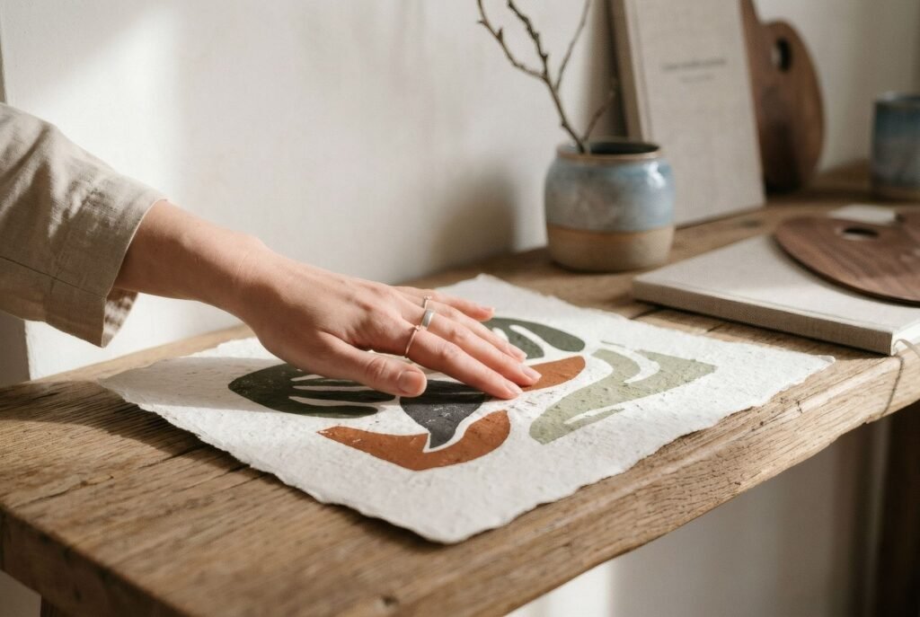
All these qualities are felt most up close and in the light of your own home. A matt, textured paper with a natural white feels warm and settles into interiors of wood, linen and ceramics. A smooth, bright white paper gives an image crispness and vibrancy, with a more contemporary or photographic air. Neither is better in absolute terms; it depends on the work and the place.
Ask about the paper
If you care how a print will look, ask about its paper: finish, texture, shade of white, weight, composition and whether it is acid-free. Together with ink type, that is the information that tells you most about its appearance and how it will behave over time.
Bendíra prints are produced on matte fine-art paper, and each product page gives the available details about the paper, so you know in advance how the work will look in your home.
Keep reading: What Is Giclée Printing and Is It Worth It?, How Digital Fine Art Printing Works and Matte vs Satin Paper for Art Prints.