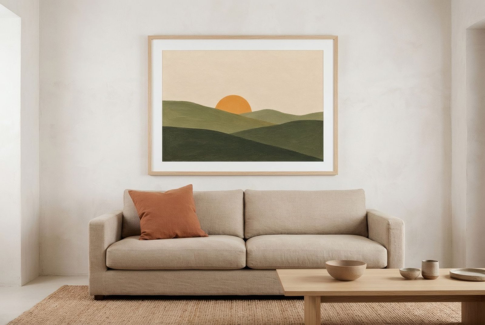
Neutral homes have an obvious virtue: they are restful. Off-white, sand, stone grey and flax make a gentle backdrop on which everything settles. But they carry a risk familiar to anyone who has toured a few show flats: they can feel impersonal, lovely but silent, as if nobody actually lived there. Art is probably the most effective way to change that. One well-chosen piece, with an accent of colour, an unexpected contrast, or simply an image that means something to whoever lives there, is enough to turn a neutral home from pleasant into personal. And it can be done without giving up the calm.
Neutral is not the same as anonymous
Choosing a neutral palette is often a sensible decision. It ages well, goes with almost anything and lets materials and light take the lead. The problem is not the palette but the absence of anything that speaks of the people at home. A linen sofa, a jute rug and sand-coloured walls can be found in thousands of homes. What makes yours different is the thing only you would have chosen.
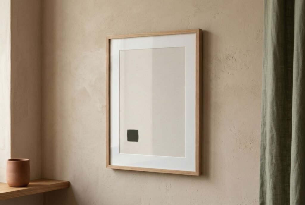
Here art has an advantage over furniture: it is far more personal. Choosing an image means choosing a way of seeing, a memory, an affinity. In a neutral home, the work on the wall has a chance to become its voice.
One accent colour, just one
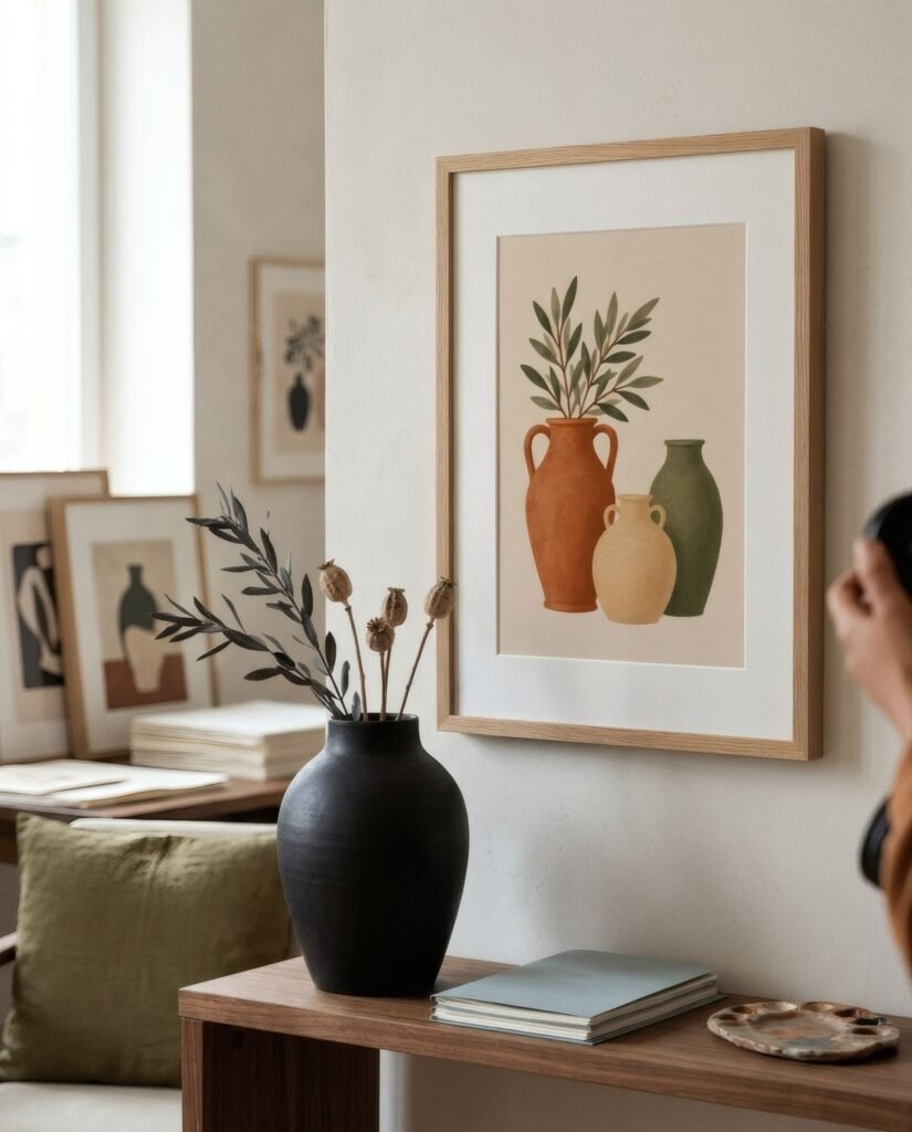
The most direct way to give a neutral room personality is to bring in colour through art. It does not take much. A work containing terracotta, deep blue, olive or a muted mustard is enough to change the temperature of the room.
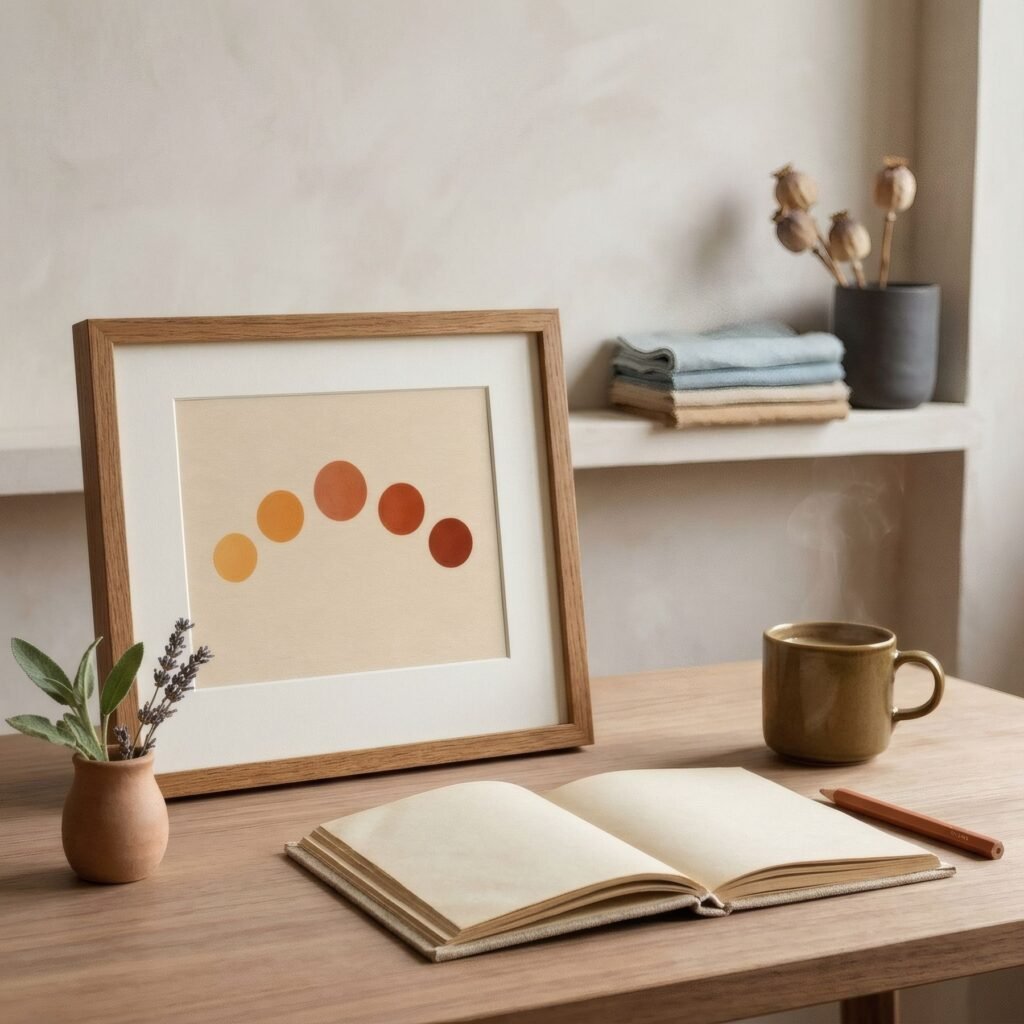
Measure is what matters. In a neutral setting colour stands out strongly, so it should occupy a modest part of the work and not repeat on every wall. A single accent, perhaps echoed in a cushion or a book spine, reads as a decision. Several different accents in one room start competing for attention and break the serenity that made the palette appealing in the first place.
Graphic contrast
Not all personality comes from colour. A black-and-white work with firm lines or bold forms can bring as much character as a vivid red. In a home of soft tones and blurred edges, graphic contrast, such as a charcoal line on a bone ground or a black-and-white photograph with strong shadows, adds structure and a certain firmness that balances the delicacy of everything else.
This works especially well in contemporary neutral homes with clean-lined furniture, and it adds personality without introducing a single new colour.
The surprise of subject
Sometimes personality comes not from colour or contrast but from the image itself: an illustration with a touch of humour, a photograph of a place that matters, a drawing of an everyday object made with affection, a typographic print with a word that means something. In a calm room, an unexpected image raises a small smile and says far more about the people who live there than any catalogue object.
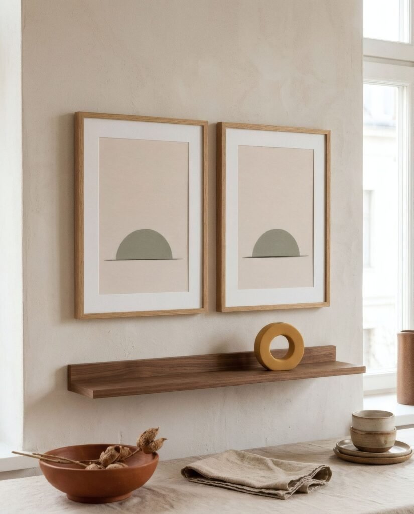
It need not be loud. The surprise can be quiet: a botanical study of an unusual plant, a map of a much-loved city, a landscape that is not the usual one. What matters is that there is a personal reason behind the choice.
Scale as a gesture
Another way to give a neutral home character is to play with size. A large-format work, bigger than you might expect on that wall, has a presence that transforms the room even if its colours are soft. It is a confident gesture, almost a statement, and works best when the composition is calm, because the scale already provides the intensity.
At the other extreme, a very small print in a deep mount, hung somewhere unexpected, above the light switch by the front door or beside a window, can be a delicate personal touch.
Texture, so calm is not flat
Neutral homes depend heavily on texture to avoid flatness: linen, wool, wood, ceramics. Art can add to that richness. A matt paper print, where the grain can be sensed, has a warmth gloss lacks. Works with visible marks or surfaces that recall natural materials do the same. We look at building depth within beige itself in beige wall art: how to add depth to neutral rooms.
A neutral living room, with a voice
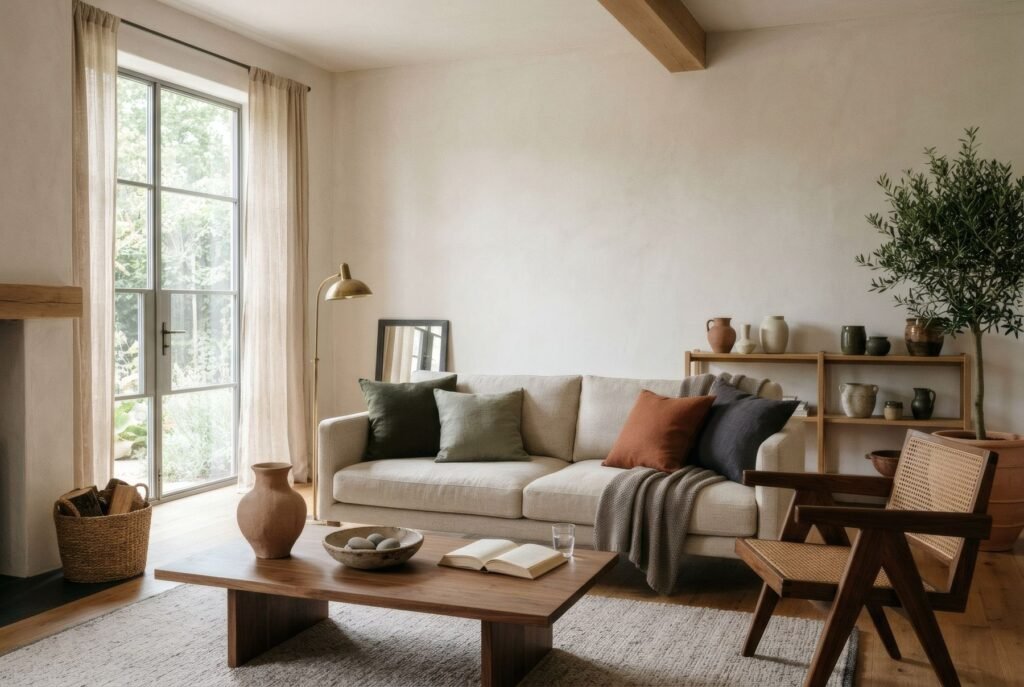
Picture a living room with off-white walls, a sand linen sofa, a jute rug and a pale oak table. So far, serene and anonymous. Above the sofa goes a 50 × 70 cm print of a low terracotta sun over olive hills. On a side table stands a small black-and-white photograph of a place someone in the house knows well, in a slim black frame. On the sofa, a single terracotta cushion. Three gestures, and the room could belong to nobody else.
Calm, with character
A neutral home does not have to choose between serenity and personality. Art allows both: a quiet palette in the background and, on top of it, a voice of its own in the form of an accent, a contrast or an image with meaning.
If you are looking for a piece to give a calm space some character, Bendíra’s collections include prints with a single accent of colour, in terracotta or blue, made to live alongside neutral interiors.
Keep reading: Mixing Abstract Art with Vintage Interiors, How to Match Wall Art with Your Colour Palette and Warm Minimalism: How to Decorate with Art.