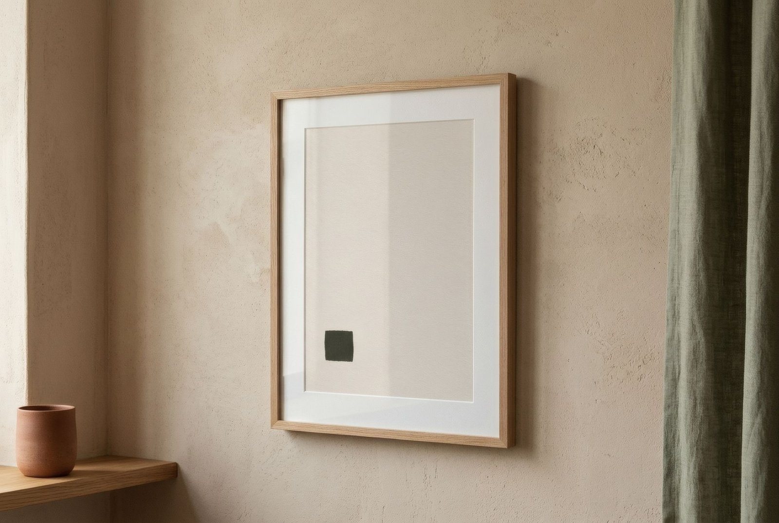
Beige has a bad reputation and good press at the same time. On one hand it is the colour of calm, of natural materials, of the serene homes that fill interiors magazines. On the other it stands for the dull and the timid. In truth, beige is not dull in itself; what can be dull is a home where everything is exactly the same beige. Sand walls, sand sofa, sand rug and, above the sofa, a sand-coloured print. Everything matches and nothing stands out. When choosing beige wall art for a neutral home, the key is not to change palette but to work within it, using three tools: tonal value, undertone and texture.
Why a beige room turns flat
A room reads as flat when all its elements share a similar tonal value, a similar lightness. Even if the colours differ slightly, if they are all equally light the eye finds no anchor points and no depth. It is like an overexposed photograph: there is an image, but no relief.
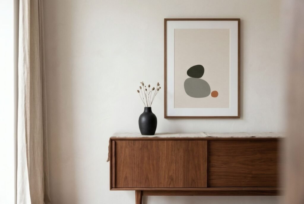
Art is the perfect tool to fix this, because it can add contrast without leaving the palette. A print need not be a different colour to add depth. It only needs to be darker, lighter or more textured than what surrounds it.
Tonal value: lights, mids and darks
The first tool is value. Within the beige family lies a huge range, from broken white and bone, through sand, flax and oatmeal, to toasted brown, camel, café au lait and tobacco.
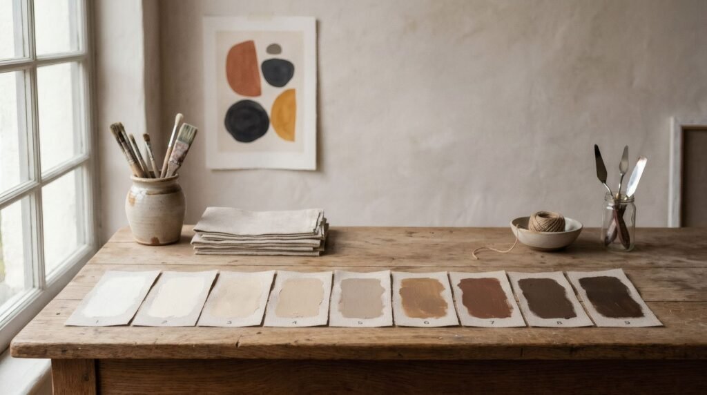
A print that spans that range, with very light, mid and some dark areas, brings immediate depth to a beige room. A toasted form on a bone ground, or a camel horizon over a gradient of sands, keeps the calm of the palette while giving it relief.
A simple test, mentioned elsewhere in this Journal, is to photograph the room and switch the image to black and white. If everything is the same grey, value contrast is missing. A work with one darker area will be what anchors the wall.
Undertones: not all beiges are equal
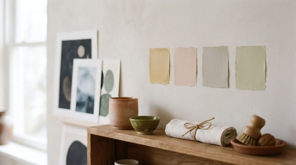
The second, less obvious tool is undertone. Some beiges lean yellow or golden, some pink or peach, some grey, some green. Seen alone they may look the same, but side by side the difference shows. A pinkish beige beside a greyish one can look dirty or mismatched.
When choosing art, identify the room’s dominant undertone, whether in the walls, the sofa or the wood, and choose works that share it or contrast with it clearly. Golden beige sits happily with ochres, soft terracottas and honey wood; grey beige with stone, sage and charcoal. Mixing undertones without intention is one of the most common reasons a neutral home feels «off» without anyone knowing why.
Texture: what you see up close
The third tool is texture. In a restricted palette, texture supplies richness. Well-resolved neutral homes almost always combine different materials: linen, wool, wood, stone, ceramics, paper. Art can add to that.
A matte paper print, where you can sense the grain, brings a tactile warmth gloss lacks. A work with visible marks, soft gradients or surfaces that recall natural materials, such as sand, stone or handmade paper, adds a layer of interest discovered on approach.
A dark anchor
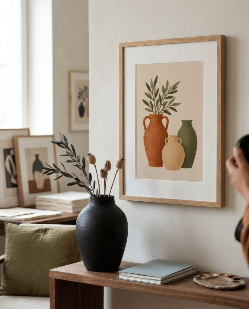
If we had to give one piece of advice for a beige home, it would be this: include something dark. Not much, but something. A charcoal line in a print, a walnut frame, a black pot beside it. That small point of darkness acts as an anchor that organises everything else and stops the room floating.
In art, it might be a fine black line on a cream ground, a tobacco-brown form in a sand composition, or a black-and-white photograph among softly toned prints.
The frame counts too
In a neutral home, the frame can supply the contrast. A dark wood frame such as walnut around a pale print creates a defined edge that gives the work presence. A thin black frame is more graphic. A pale oak frame, by contrast, blends the work into the room, which is lovely if the image already has enough contrast, but risky if it does not.
Three examples
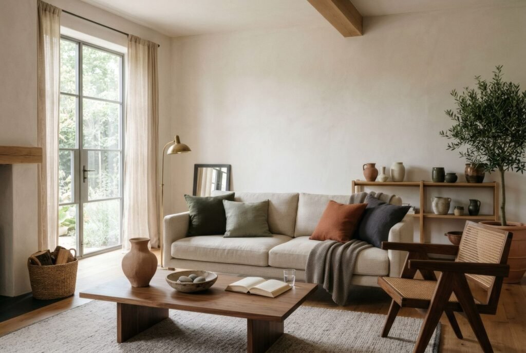
In a living room with sand walls, an oatmeal linen sofa and a jute rug, a 50 × 70 cm print of a toasted organic form with a charcoal line on a bone ground, framed in walnut, adds depth without breaking the calm. In a bedroom of flax and off-white, a pair of prints in gradients of sand, each with a small terracotta circle, brings relief and a touch of warmth. In a grey-beige entrance hall, a black-and-white photograph of a stone, in a thin black frame, anchors the space.
Neutral, with relief
A beige home need not give up its calm to gain depth. It is enough to play within the palette: light and dark values, consistent undertones, varied textures and a small dark anchor. Art is the perfect place to do it.
If you are looking for work in this range, Bendíra’s Quiet forms and Southern light collections use bone, sand, charcoal and earth tones, with enough contrast to give a neutral home its relief.
Keep reading: Common Wall Art Mistakes and How to Avoid Them, Black and White Wall Art: Styling Ideas and Warm Minimalism: How to Decorate with Art.