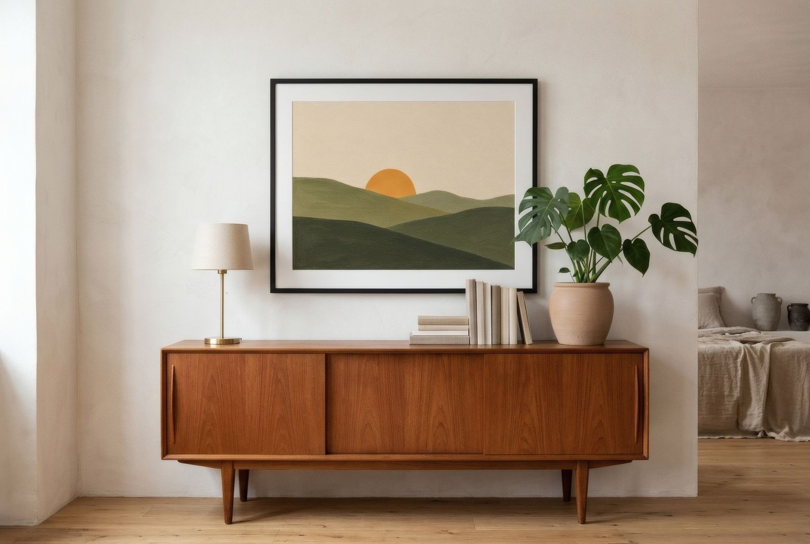
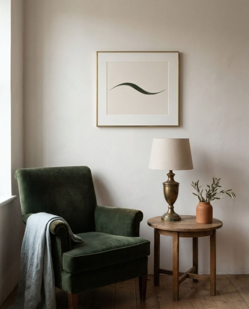
A 1950s chest of drawers from a flea market, an inherited armchair with slightly worn upholstery, a brass lamp someone spotted at a car boot sale. And above them, a newly arrived abstract print of simple forms. On paper it might sound like an unlikely mix, but in practice it is one of the loveliest combinations there is. The contrast between old and new makes both look better: the vintage piece gains freshness and the abstract work gains roots. To make it work, look for a bridge, usually colour or form, and make sure the contrast does not tip over into clutter.
Why they work together
Vintage furniture and objects have something contemporary art cannot manufacture: time. A patina, edges softened by use, timber that has deepened in colour. That weight of history is precious, but too much of it can make a room heavy or nostalgic, like a house museum.
Abstraction brings the opposite: lightness and the present moment, an image that tells no particular story and leaves room for imagination. When the two live together, they balance each other. There is also a less obvious affinity. Much of the most sought-after vintage furniture, from the mid-twentieth century, was made at the very time abstraction was establishing itself in art and design. It is no surprise they understand one another.
Colour as a bridge
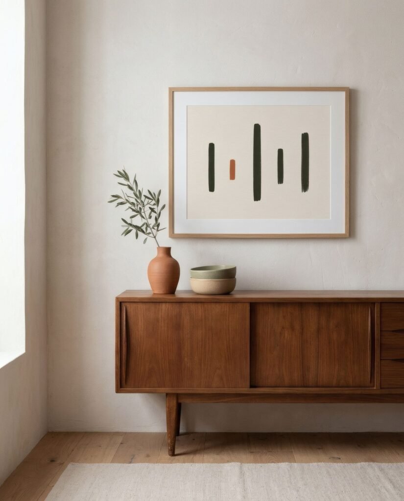
The simplest way to connect a vintage piece and an abstract work is a shared colour. The teak of a mid-century chest has a warm orange tone; an abstract with some terracotta or ochre will pick it up naturally. The bottle-green velvet of an old armchair can converse with a print that includes a deep olive. The aged brass of a lamp finds an echo in a muted mustard.
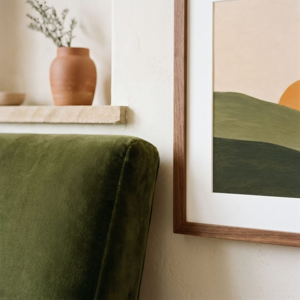
The bridge need not be obvious or fill the whole work. As long as the colour appears somewhere in the composition, the eye draws the connection without anyone explaining it.
Form as a bridge
Another route is form. Many vintage pieces have distinctive lines: the angled, tapered legs of mid-century furniture, the curves of an Art Deco armchair, the geometric rigour of a 1970s sideboard. An abstract work that echoes or answers those lines creates a very elegant dialogue.
A chest with rounded edges sits well with organic, curving abstracts. A straight-lined sideboard with geometric handles finds its match in compositions of blocks and rectangles. A chair with slender, tapering legs can have as its backdrop a print of fine lines and plenty of open space.
Contrast, in measure
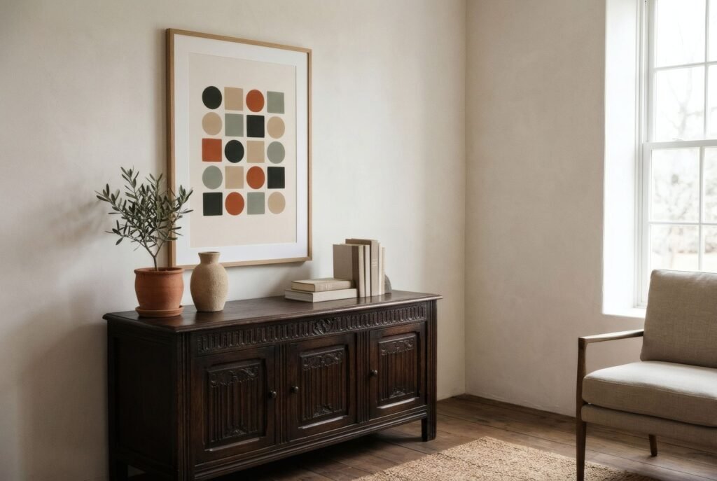
There is a third, bolder route: deliberate contrast. Picture a crisp black-and-white abstract above a carved antique sideboard. There is no bridge of colour or form here; the relationship is the difference itself. It can be striking, but it needs everything else in the room to be restrained, because the contrast already takes all the attention.
Whichever route you take, the risk is the same: overload. A room where every piece of furniture is vintage, every object has a story and every wall has a bold work becomes exhausting. The practical rule is to let one side lead. If the furniture is the star, a carved sideboard or a patterned armchair, the art should be calmer. If the art is intense, the surrounding furniture should step back.
Few objects, plenty of air
Vintage decorating leans towards accumulation; it is easy to fall for everything a flea market offers. When combining it with abstract art, edit firmly. On the chest beneath the print, one or two objects are enough, such as a lamp, a book or a pot. Around the pairing, leave clear wall. Then the conversation between furniture and art can be heard.
The frame as go-between
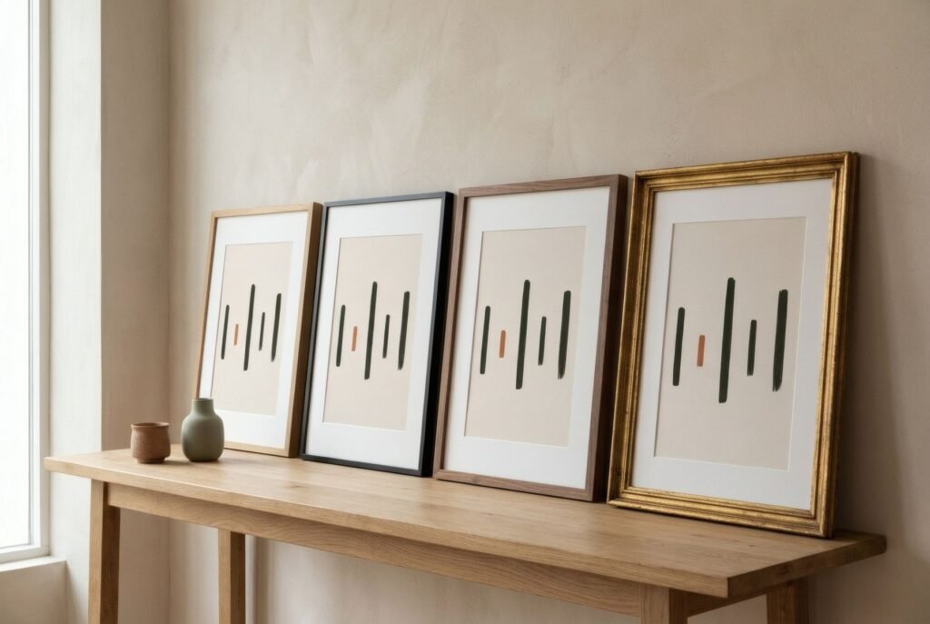
The frame can tip the balance either way. A wooden frame with some patina draws the abstract work towards the vintage world and settles it in. A thin black or pale wood frame keeps it clearly contemporary, sharpening the contrast. An antique gilt frame around a softly coloured abstract can be a charming nod to tradition, provided the rest of the room goes along with it.
Three pairings
A 1960s teak chest with tapered legs beneath a 50 × 70 cm print of seven rounded bars in olive, sand and clay: the rhythm of the work answers the drawers, and its colours pick up the wood. An old green velvet armchair beside a portrait print of organic forms in sage and cream, in a pale oak frame that lightens the corner. A dark carved walnut sideboard with a black and bone geometric abstract in landscape format and a wide mount, with nothing on the sideboard but a lamp.
The beauty of mixed time
The most interesting homes rarely belong to one era. They mix things that arrived at different moments in life and find affinities between them that nobody planned. A piece of furniture with history and an abstract work are one of those unexpected couples that, chosen well, seem to have been looking for each other.
If you have a vintage piece that needs company, Bendíra’s collections include abstract prints of simple forms in warm palettes that sit well with woods and fabrics that carry a story.
Keep reading: Modern Mediterranean Interiors and Wall Art, How to Add Personality to Neutral Interiors and How to Mix and Match Wall Art.