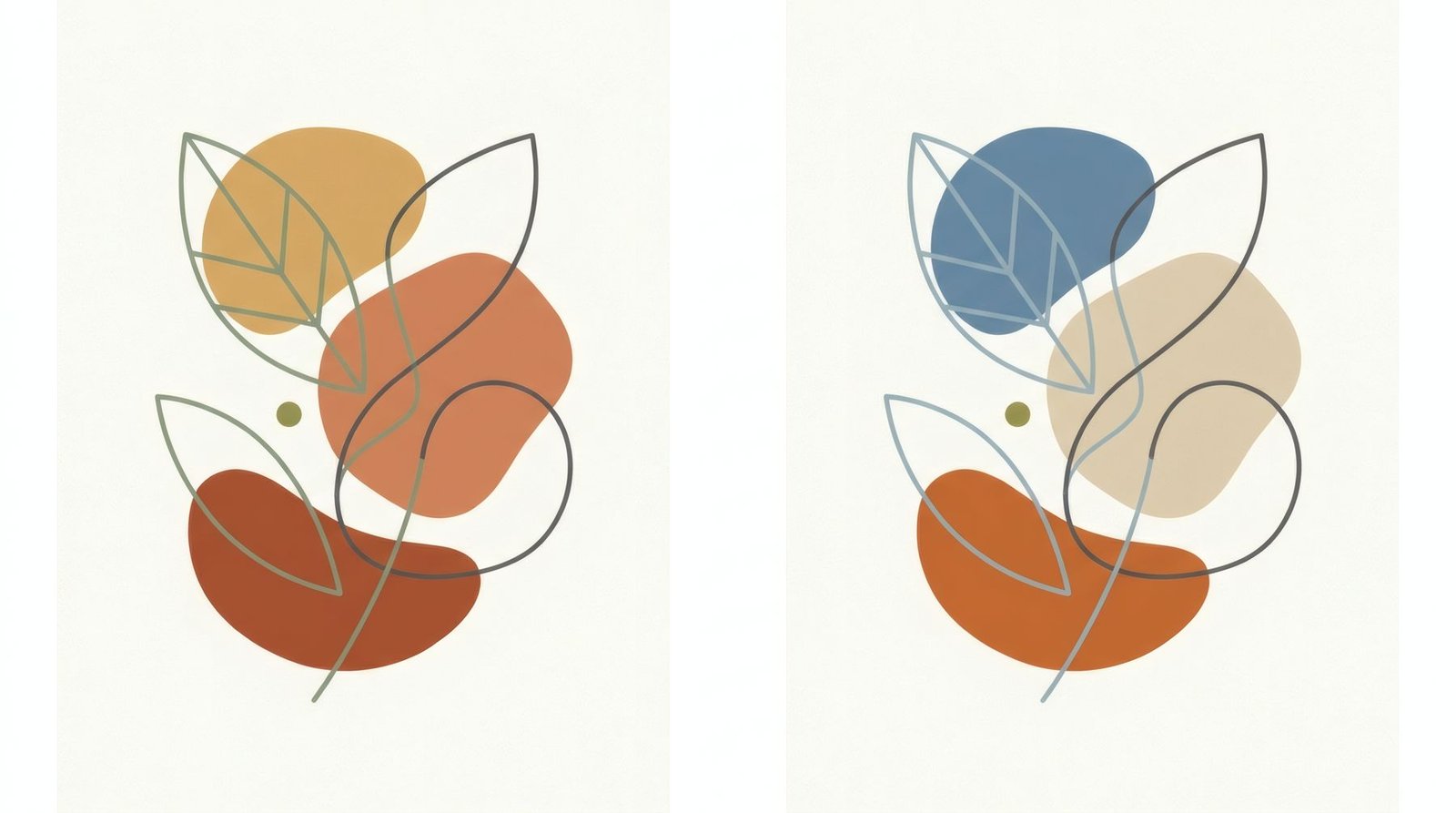
Think of a summer sunset in the south. The sky moves from pale yellow to orange, orange to pink, pink to a muted red. No violent contrasts, no blue interrupting: just a gentle progression of colours that seem to belong to one family. Or think of a woodland in spring, with its yellow-greens, deep greens and blue-greens in the shade. What those two scenes share is what colour theory calls an analogous palette. It’s one of the oldest, most natural and easiest harmonies to live with, and once you learn to see it, it’s everywhere in art.
Neighbours on the wheel
To understand an analogous palette, picture the colour wheel, the circle where colours follow the rainbow: yellow, orange, red, violet, blue, green and back to yellow. We explain it in detail in the colour wheel as a tool for looking at art.
Analogous colours sit next to one another on that wheel. A typical analogous palette takes three or four neighbours: yellow, yellow-orange and orange, say; or blue, blue-green and green; or red, red-orange and orange.
Opposite them are complementary palettes, which play colours from opposite sides of the wheel, such as blue and orange, producing contrast and vibration. Analogous does the reverse: it seeks continuity.
Why it works
An analogous palette feels harmonious because neighbouring colours share part of their make-up. Orange contains yellow and red; teal contains green and blue. Put them together and the eye travels from one to the next without jumps, like a musical scale rising note by note.
That’s why these palettes tend to feel calm, coherent and natural. They’re everywhere in nature: foliage, sea, desert, autumn, rock. And that’s why they work so well in spaces where calm is the aim.
The risk of monotony
An analogous palette has one risk: if every colour has the same intensity and lightness, the result can be flat, with nowhere for the eye to settle. Good use of analogous colour usually involves two things.
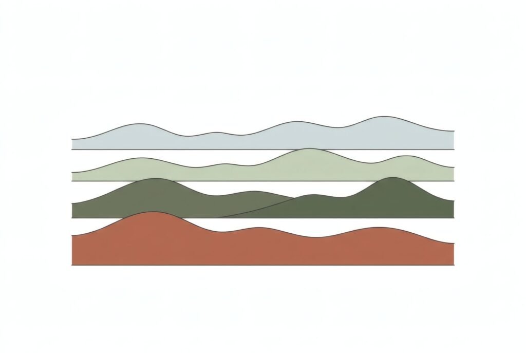
First, varying lightness: a pale, a mid and a dark tone within the same family. A pale ochre, a mid terracotta and a deep rust red.
Second, sometimes, a small accent: a touch of a more distant colour, in a small area, which makes everything else sing. A spot of blue in an earthy composition, for instance.
Analogous palettes in art
Many artists have worked with analogous palettes, often very deliberately. Countless landscapes are built on the blues and greens of water and foliage, or the ochres and reds of earth. In mid-twentieth-century colour field painting, many works play with rectangles of neighbouring colours, reds over oranges, blues over violets, that vibrate softly against one another, as we discuss in Abstract Expressionism and the importance of scale.
And in photography, the light of golden hour or blue hour produces analogous palettes naturally: everything takes on a single family of colour.
When you look at a work, a good question is: how many colour families are there here? If nearly everything belongs to one or two neighbouring zones of the wheel, you’re looking at an analogous palette.
At home
The analogous palette is probably the easiest to apply in decorating, and the safest. A few ideas.
Choose an analogous piece that gathers the room’s colours: a print in terracottas and ochres in a living room of warm wood and sandy textiles; a print in blues and greens in a bedroom with blue bedding.
Or use the art to extend the palette: if the room is sand-toned, a piece in ochres and terracottas carries that family a step further without breaking it.
And remember the accent: if everything is analogous, a small touch of an opposite colour, in a cushion or a detail of the art, wakes the whole thing up. We develop this in how to match art colours to your room.
A family of colour
Analogous palettes are, in a sense, the most human: they echo how we see nature and how light tints things. Learning to spot them in art is a way of looking more closely; using them at home, a simple route to calm.
All three Bendíra collections are built on analogous palettes: earth tones in Southern light, neutrals and sage in Quiet forms, blues and sands in Coastline.
Keep reading: The Psychology of Colour in Art and Interiors.