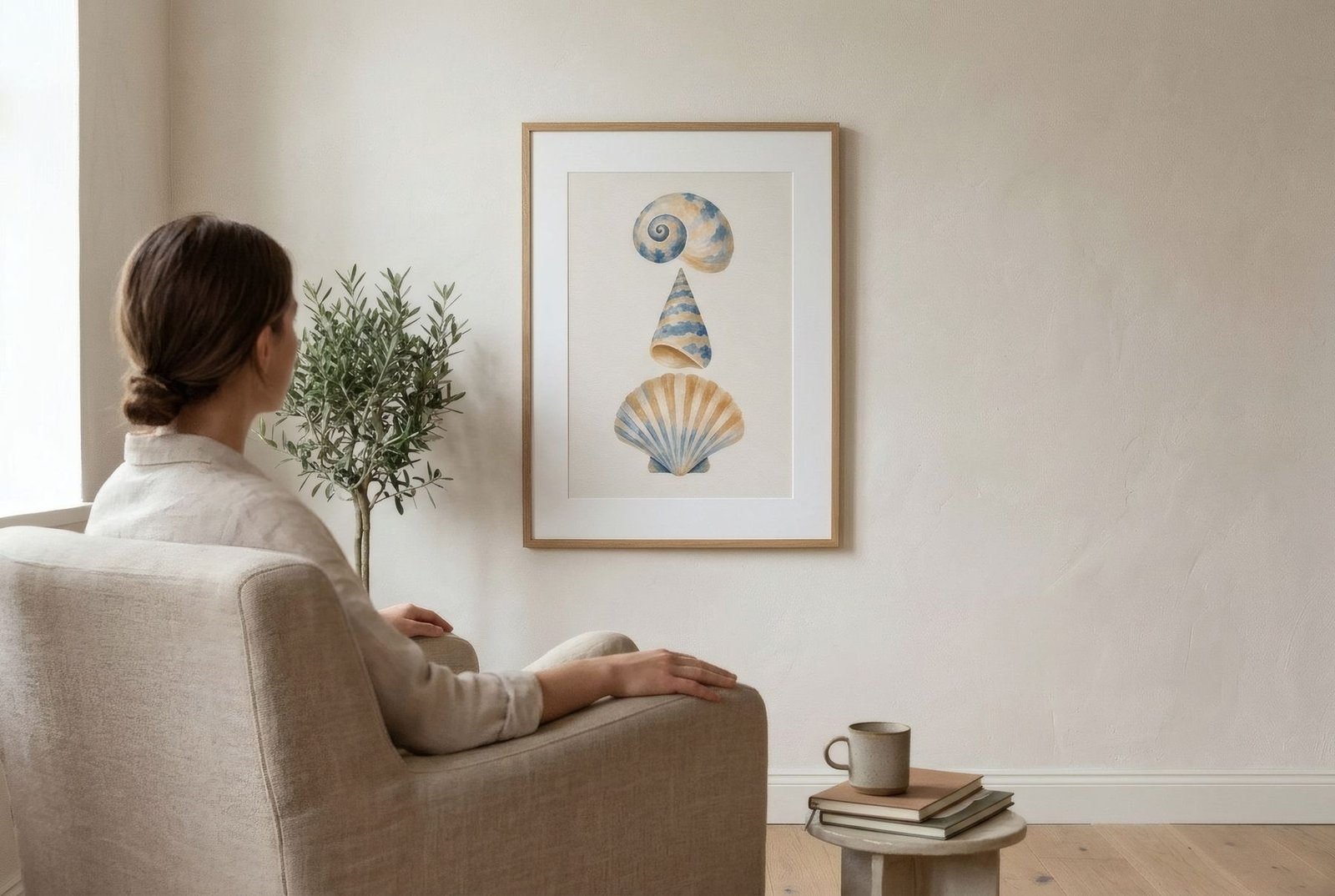
«So what does it mean?» It is probably the most common question in front of an abstract painting, and the one that most often gets between the work and the viewer. We look for a hidden meaning, a correct answer, and when we cannot find it we decide we do not understand. But looking at abstract art is not about cracking a code. It is about letting the work act on you: noticing its colours, forms and rhythm, the traces of gesture, and what it stirs in you. There is no single interpretation and no correct way to feel. There is, though, a way of looking that helps you get much more from it, and it can be learned.
First, give it time
It is often said that most museum visitors spend only a few seconds in front of each work. That is understandable, since there is a lot to see and time is short. But with abstract art those seconds are rarely enough. A work with no recognisable subject needs a little longer before it begins to speak.
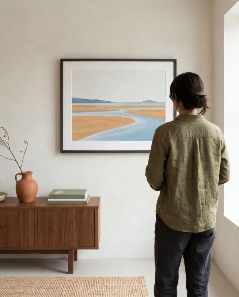
So the first step is almost an act of will: stay. A minute, two, five. No rush to reach a conclusion. What at first seems a mere surface of colour gradually reveals relationships, tensions and details that were not there at first glance.
Look from a distance
Begin a little way back, where you can see the whole work. From there, take in the overall impression. Is it calm or restless? Light or heavy? Ordered or chaotic? Warm or cool?
Notice where your eye goes first. Most compositions have a point that pulls hardest, whether a zone of intense colour, a contrasting form or a place where lines cross. Then notice how your eye moves on from there, and what path it traces across the surface.
Look up close
Then move closer. At short range a different world appears. In a painting there is the texture of the material, layers of colour, brushstrokes, drips, scraped areas. In a print there is the delicacy of a line, the smoothness of a gradient, the texture of the paper.
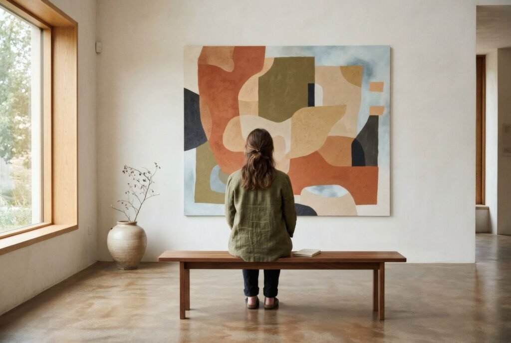
Many abstract works change completely up close. What looked like a uniform field of colour turns out to be full of nuance; what seemed a crisp form dissolves into gestures. Moving between the two distances is one of the richest ways of looking.
Colour
In abstract work, colour is often the protagonist. Ask which colours dominate and which appear in small doses. How do they relate: do they blend softly or clash? Does one seem to come towards you and another recede? What is the temperature of the whole?
And notice how those colours make you feel, without hunting for a universal meaning. What a deep blue or a strong red conveys to you is as valid as any textbook explanation. We discuss this in the psychology of colour in art and interiors.
Form and direction
Look at the forms: geometric or soft, large or small, crisp or blurred. Notice directions too. Horizontals tend to suggest rest, verticals steadiness, diagonals movement. Forms that cluster seem to converse; forms that pull apart seem to strain.
The aim is not to classify but to notice. The more you observe these relationships, the more you «read» the composition, much as you can follow a melody without knowing music theory.
Gesture
In many abstract works, the maker’s hand is visible: the speed or slowness of a stroke, the pressure of a brushmark, a drip, a scraped surface. Paying attention to those traces is almost like witnessing the moment the work was made. Some works convey calm and control; others urgency and energy.
Title and context, afterwards
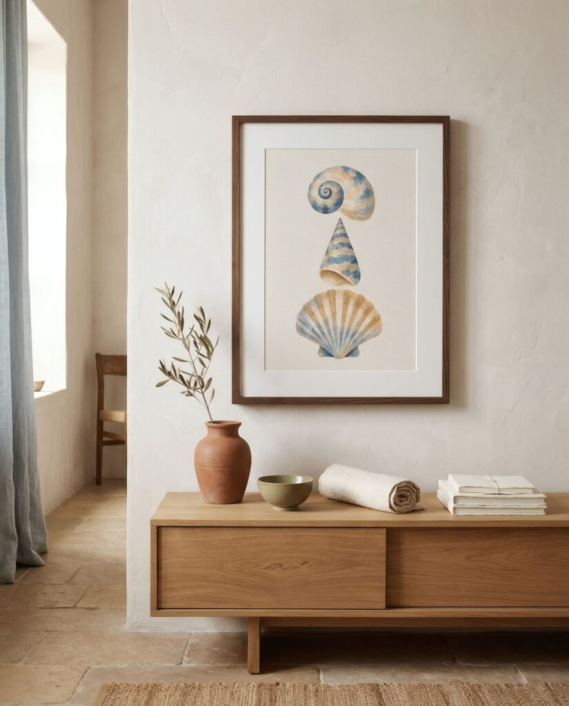
Many abstract works have evocative titles; others are simply called Untitled or carry a number. It is worth reading them after you have looked, not before, so they do not shape your first experience. Afterwards, the title, the date or a label about the artist can add fascinating layers. But they are a contribution, not the definitive answer.
What it stirs in you
In the end, the most important question is not what the artist meant but what happens to you in front of the work. It might be calm, unease, joy, curiosity or indifference. All of it counts. Even disliking a work is a legitimate response, and asking why can teach you a lot about your own taste. We explore that in how to discover your personal taste in art.
Look again
An abstract work is not exhausted in a single viewing. If you can, return another day, in different light, in a different mood. It will probably tell you something new. That may be the greatest pleasure of living with abstract art at home: it changes with you.
If you would like to practise that kind of looking on your own wall, Bendíra’s collections include abstract prints of calm composition, made to be looked at slowly and returned to again and again.
Keep reading: Art and Architecture: A Creative Connection, Photography as Wall Art and What Is Abstract Art? A Beginner’s Guide.