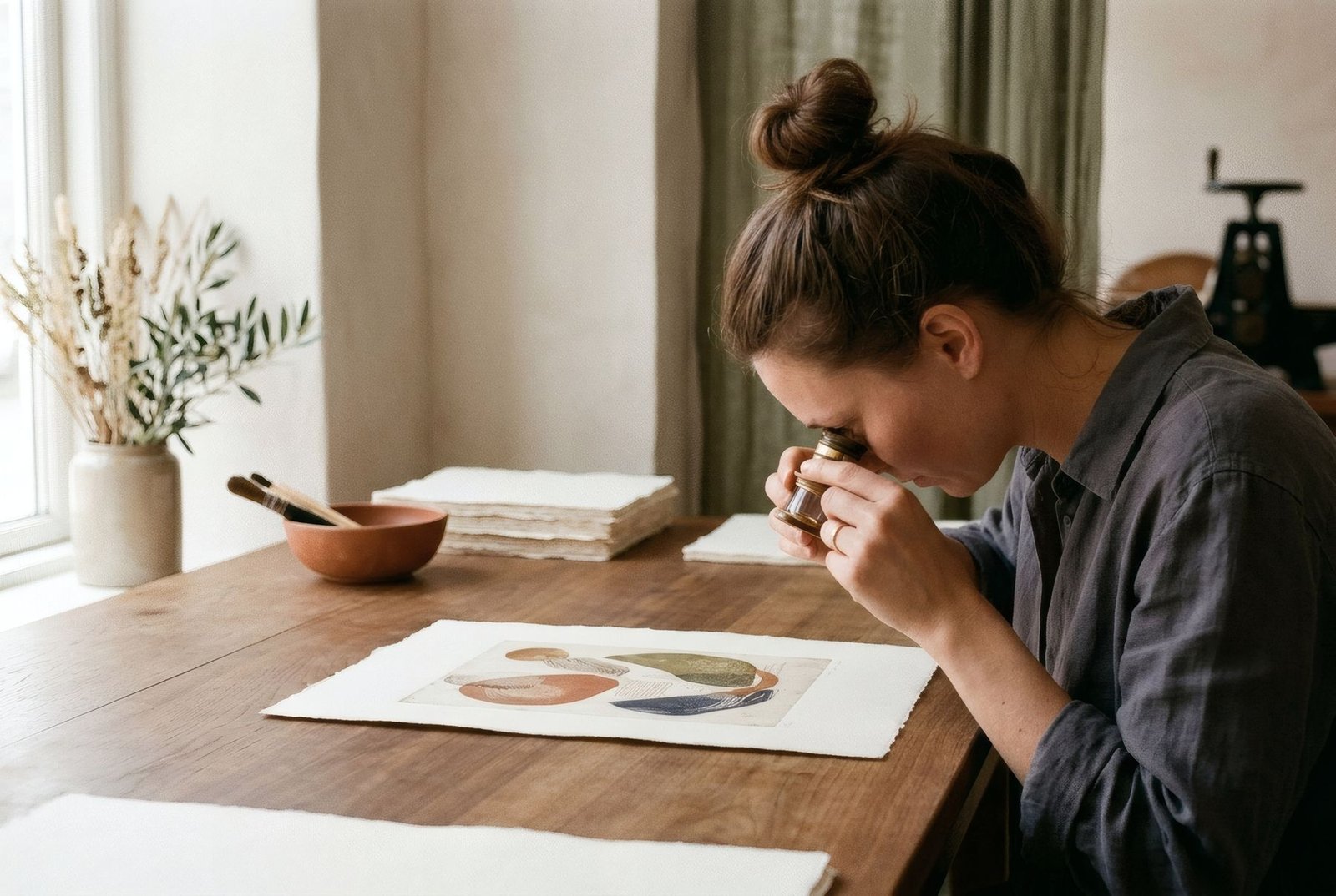
You do not need to be a printer to tell a good print from an ordinary one. Often it is enough to look calmly, first from a distance and then up close, and notice a few details. A high-quality art print shows itself through sharpness without artefacts, smooth gradients, believable and balanced colour, blacks with depth and detail, paper with body, and a clean finish free of marks and careless edges. None of these depends on a word on a label. All of them can be seen with your own eyes, and learning to see them helps you compare with judgement and enjoy what you hang at home all the more.
From a distance, then up close
A print is looked at in two ways. From a distance, at the range you will usually see it on the wall, what matters is the overall impression: whether the colours feel balanced, whether the image has depth, whether it breathes. Up close, at a hand’s length, the details that reveal the quality of the process emerge: the definition of lines, the smoothness of transitions, the texture of the paper, the neatness of the edges.
A good print holds up to both. A mediocre one may look fine from afar and give itself away as you approach.
Sharpness and detail
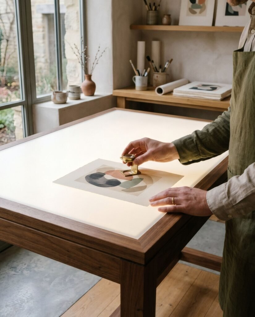
Move close to an area with fine lines, contours or small lettering. In a good print, edges are clean and defined, with no jagged steps or halos. Textures of the original, such as brushwork, the grain of a drawing or the weave of a canvas, are clearly visible.
If you see little squares, stepped edges or blurry areas where there should be detail, the problem usually lies in the source file: an image with too little resolution for the size it was printed at. Even the best printer cannot invent detail that is not in the file. We explain this in image resolution for art prints: what you need to know.
Gradients
Find an area where one colour passes smoothly into another, such as a sky, a shadow or a soft background. In a good print the transition is continuous, without steps. In a poor one you may see banding, parallel stripes of slightly different tone, or a grainy look where there should be smoothness.
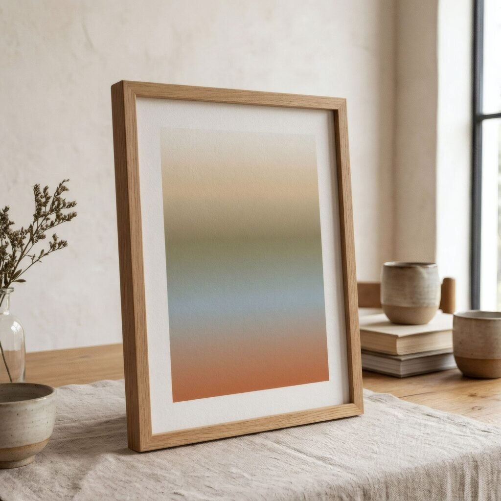
Gradients are among the toughest tests for a printer and for file preparation, so they say a great deal about the care taken.
Colour
Judging colour is harder, because it depends on the light and on what you expected. But there are clues. In a good print, colours feel consistent with one another: none seems out of place, too garish or too dull compared with the rest. Greys and whites look neutral, without green, pink or blue casts that should not be there. And if the print reproduces a work you know, its colours are reasonably close to the original.
Bear in mind that a print will never be identical to what you saw on a screen, because a screen emits light and paper reflects it. A small difference is normal; a large one is not.
Blacks and shadows
Look at the darkest areas. In a good print, blacks have depth but also detail: within a shadow you can still make out forms and nuance. In a poor print, shadows become flat patches where everything is lost, or blacks look greyish and washed out. Paper type matters a lot here. Matte papers give softer blacks than satin ones, which is not a defect but a different character, explained in matte vs satin paper for art prints.
Paper
Touch the paper if you can. A quality fine art paper has body: it does not flop like newsprint or crease at the slightest touch. Its surface is even, and any texture is regular and pleasant. Its white is clean and consistent. And the ink is well settled: it does not smear, shine unevenly or rub off if you run a finger gently along a border, though it is best not to touch the image itself.
Finish
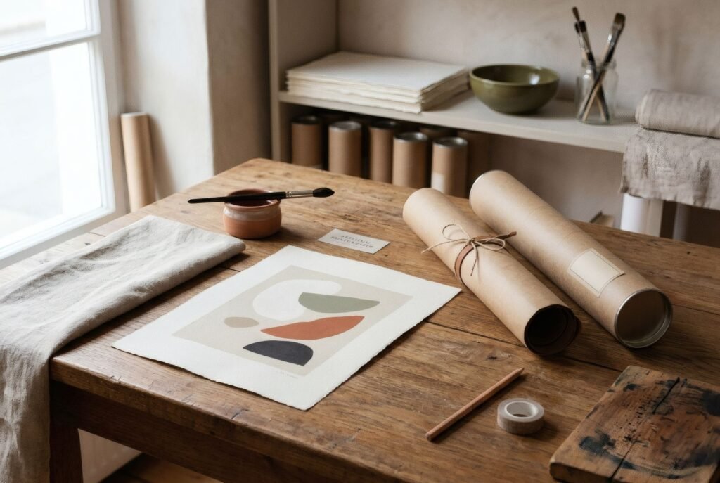
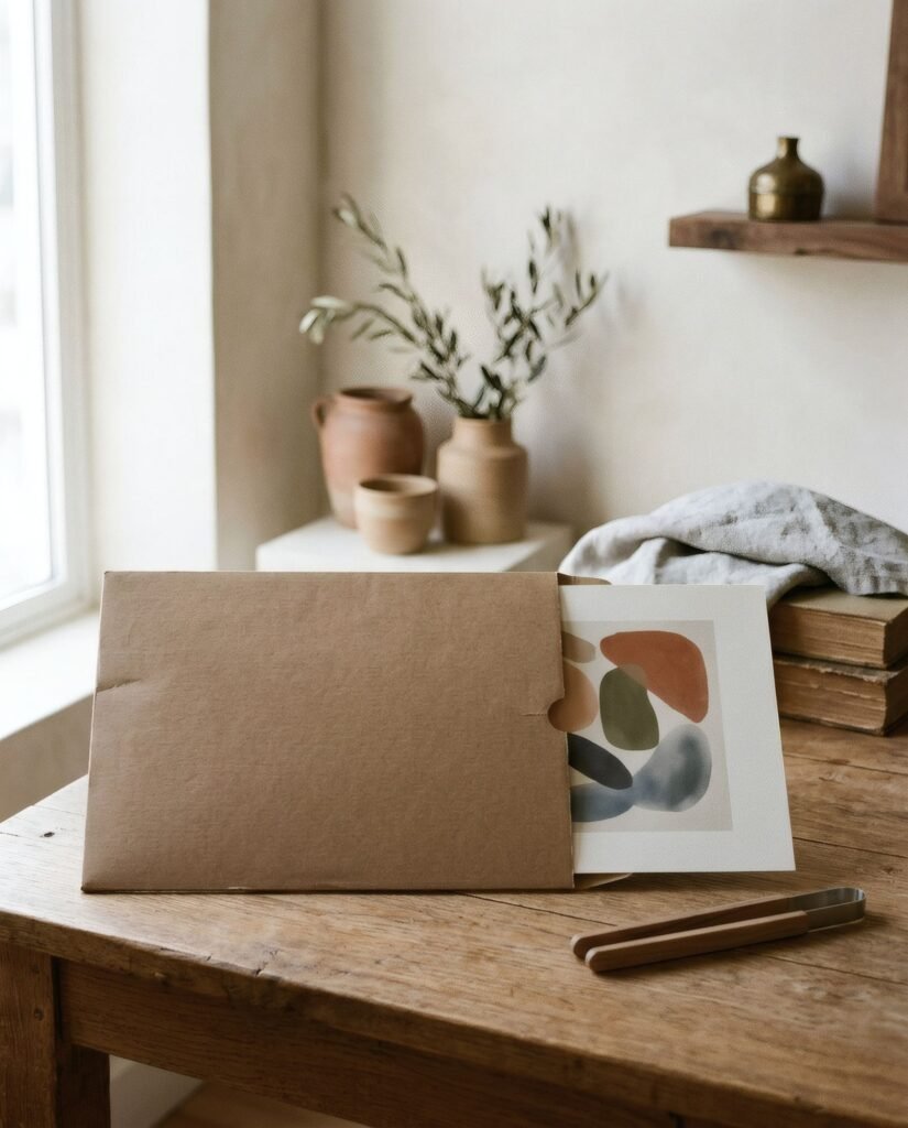
Finally, look at the details that show care at the end of the process. White borders, if any, should be even and cleanly trimmed, with straight, crisp edges. There should be no fingerprints, smudges, scratches or roller marks. And the packaging should have protected the print from knocks and bends. These are small things, but they reveal whether someone checked the piece before sending it.
What the label will not tell you
Terms such as fine art, giclée and museum quality appear often in descriptions, but they are not regulated and guarantee nothing on their own. What really counts is what you can see and touch, together with concrete information about paper, inks and process. We help you read that information in how to read an art print product description.
Learning to look
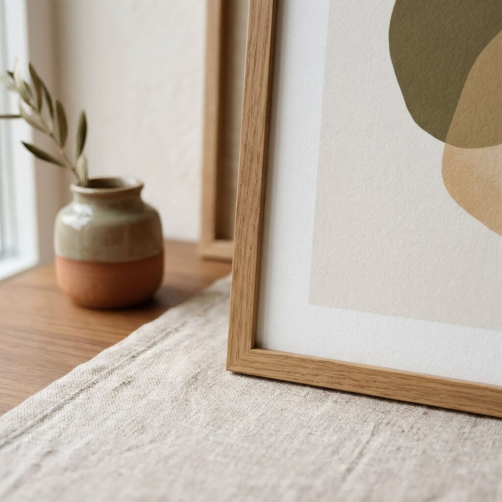
Recognising a high-quality art print comes down to looking carefully: far and near, at lines and gradients, at colours and shadows, at paper and edges. With a little practice it becomes second nature, and you begin to enjoy not only the image but also the craft behind it.
At Bendíra, every print is checked by hand before it is sent, so that what reaches your home holds up to that close look.
Keep reading: How to Protect Art Prints from Sunlight and Moisture, Why Art Matters in Everyday Spaces and How Paper Changes the Look of an Art Print.