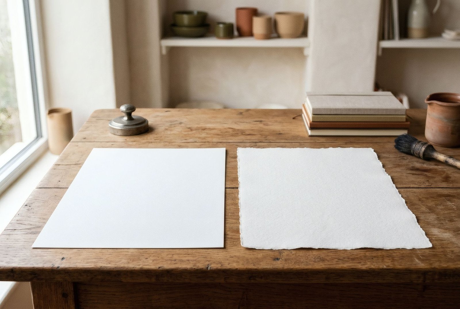
If you’ve ever run your fingers over a good-quality print, you’ll know that paper isn’t just something to print on. It has a feel, a weight, a surface. Some papers are smooth as fine card; others have a visible tooth, like watercolour paper, that catches the light in tiny shadows. Among matt fine art papers, that difference in surface, textured or smooth, is one of the things that most shapes how a piece looks and feels. And there’s no right answer: some papers flatter some images, others flatter others.
Two families of surface
Within matt fine art papers, which we cover more broadly in types of paper for art prints, there are two broad families.
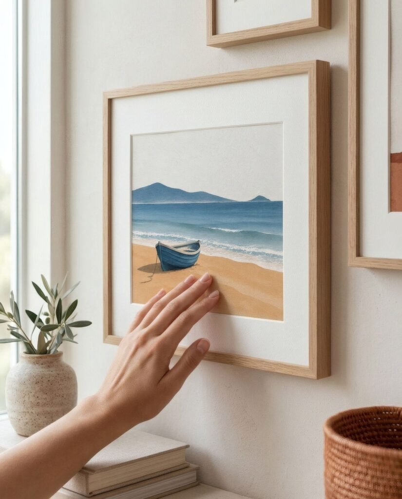
Smooth papers have an even surface with no noticeable grain. They feel soft, sometimes velvety. Visually, they let the image come through cleanly, without interference.
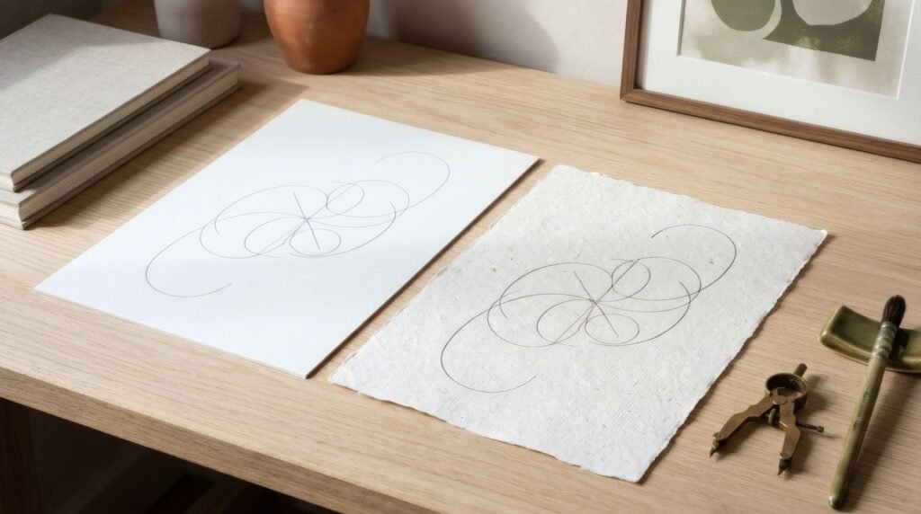
Textured papers have visible grain, from subtle to pronounced. Many imitate or derive from watercolour or printmaking paper, with an irregular tooth you can feel under your hand and, above all, see when light falls across it.
What changes in the image
The paper surface affects the image in several ways.
Detail. On smooth paper, fine lines, small text and intricate detail come out crisp. On textured paper, the grain can slightly break up the finest lines, because the ink settles on an uneven surface. It isn’t a flaw, it’s a characteristic, but it’s worth knowing.
Gradients and flat areas. On smooth paper, a graded sky or a flat colour field looks continuous and soft. On textured paper, the same areas show the grain, which gives them a vibration, an almost painterly quality.
Light. Textured papers create tiny shadows across their surface when light comes from the side. That makes them change through the day and gives them depth. Smooth papers are steadier, more neutral under light.
Colour. In general, both matt surfaces reproduce colour similarly, without shine. Texture can make some dark areas feel slightly less dense, because of those micro-shadows, but the difference is subtle.
Which art suits which paper
As a guide rather than a rule:
Smooth paper tends to suit photography, especially highly detailed work; fine-line illustration and technical drawing; graphic pieces with type; flat-colour abstracts with crisp edges; and anything that wants precision and clarity.
Textured paper tends to suit work with painterly origins, such as digitised watercolours, gouaches or pastels; abstracts built from washes and layers; watercolour-style botanicals; and images that gain from a handmade, tactile feel.
The useful question is: does the work want to look precise, or does it want to look made by hand?
Framing and care
A practical point: texture shows far better without glass, or behind non-reflective glass, and with side light. Frame a textured print behind shiny glass opposite a window and much of its charm is lost. A mount separating it from the glass also stops the grain being flattened.
On care, textured papers can collect a little more dust on their surface if displayed unglazed; a closed frame solves that.
Looking with your fingers
Choosing between textured and smooth paper really comes down to how you want a piece to feel: clean and precise, or warm and tactile. Neither is better. Each, matched to the right image, turns a print from a reproduction into an object.
Bendíra prints are made on matt fine art paper.
Keep reading: How to Build an Affordable Personal Art Collection, How to Light Wall Art at Home Without Glare and Wall Art for Monochrome Interiors.