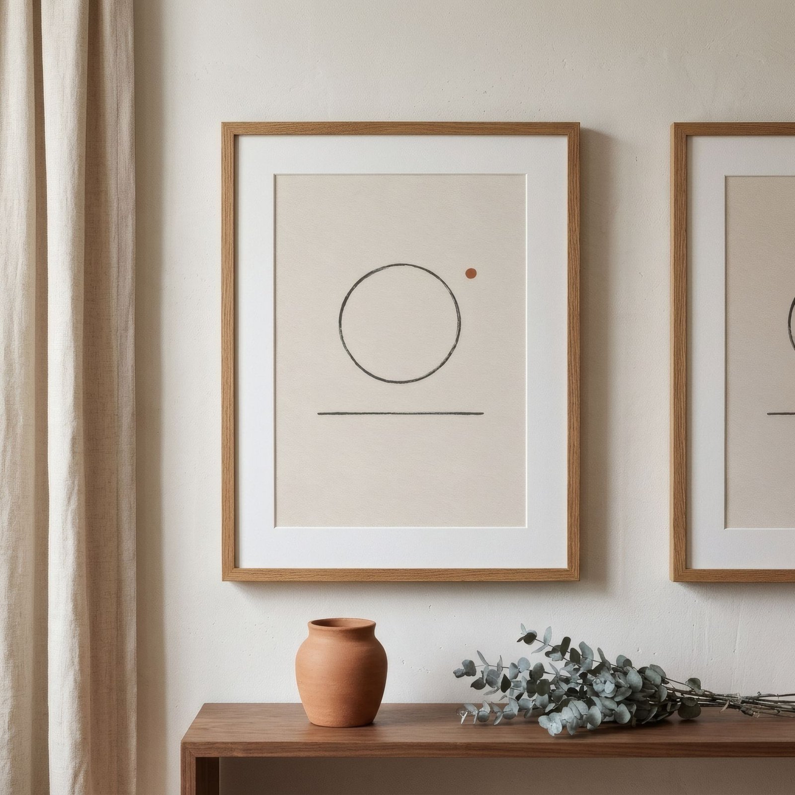
A monochrome interior is built from a single colour in all its variations of lightness and intensity. It might be white, from chalk to ivory; grey, from mist to charcoal; oatmeal, from linen to hazelnut; or something less expected, sage or terracotta, unfolded across its whole range. When it works, it’s extraordinarily calm: the eye doesn’t jump from colour to colour but glides. When it doesn’t, the home feels flat, like a photograph with too little contrast. The difference nearly always comes down to two things: tonal variation and texture. Art can contribute a great deal to both.
Monochrome isn’t flat
The most common mistake in a monochrome room is using exactly the same tone for everything. Walls, sofa, curtains, rug, all in the same beige. The result has no depth: nothing comes forward and nothing recedes.
Good monochrome interiors play across the full tonal scale of the chosen colour: very pale, mid and very dark, in different proportions. A grey living room might have mist-grey walls, a mid-grey sofa, a charcoal cushion and a detail that’s almost black. It’s contrast of lightness, not of colour, that creates depth.
Art as a step on the scale
In a monochrome interior, art fits naturally when it stays within the same colour family but adds a tone that’s missing from the scale. If the room is mostly pale, a piece with dark tones, charcoal, sepia, black, gives an anchor and depth. If it’s mid-toned, a very pale piece with plenty of white brings light.
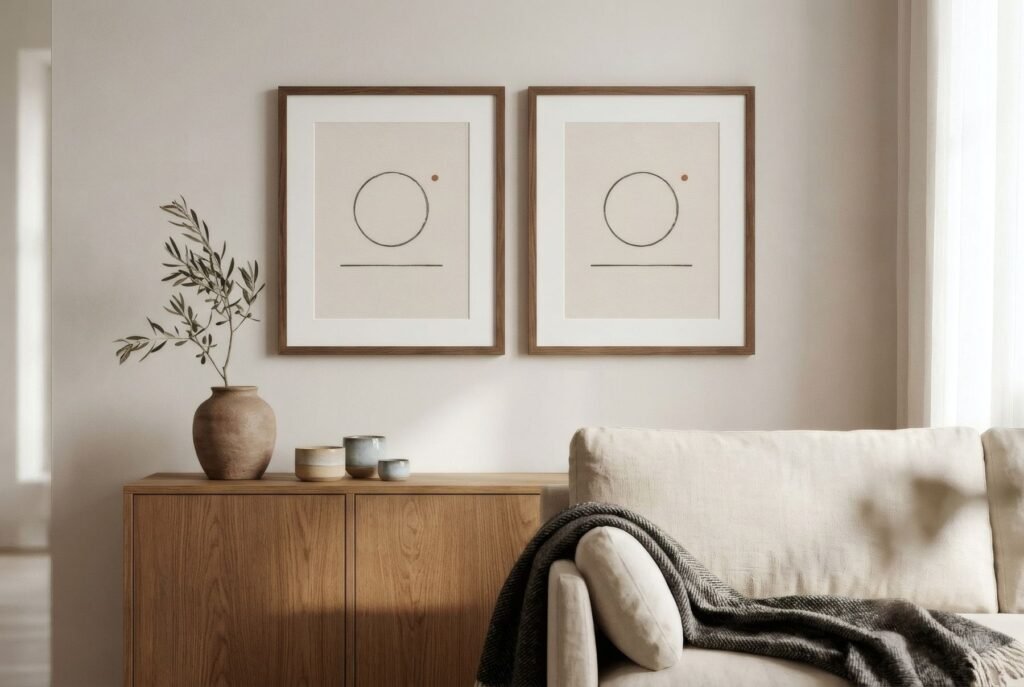
Black-and-white and greyscale art are natural allies of grey and white rooms. Bone and charcoal abstracts, of oatmeal and cream ones. Terracottas and ochres, of an earthy monochrome. There’s more in black and white art at home.
Texture does the rest
When colour narrows to one, texture takes the lead. A well-resolved monochrome interior brings together very different surfaces in the same tone: nubby linen, chunky wool, grained wood, matt ceramic, stone, paper. Each catches the light differently, which creates variety without any colour at all.
Art adds to that tactile richness. A print on matt fine art paper has a soft, velvety surface that absorbs light rather than reflecting it. A cotton mount brings another texture; a frame with visible grain, another. Even within the image, pieces with texture, mesh, visible brushwork or soft tonal gradations offer more than flat colour.
Volume and shadow
There’s another source of interest in monochrome rooms that’s often forgotten: shadow. In a single-colour space, the shadows cast by objects, frames and reliefs become visible and part of the composition. A frame with some depth, casting a soft shadow on the wall, adds a dimension. A print leaning on a ledge with its shadow behind it does the same.
One accent, or none
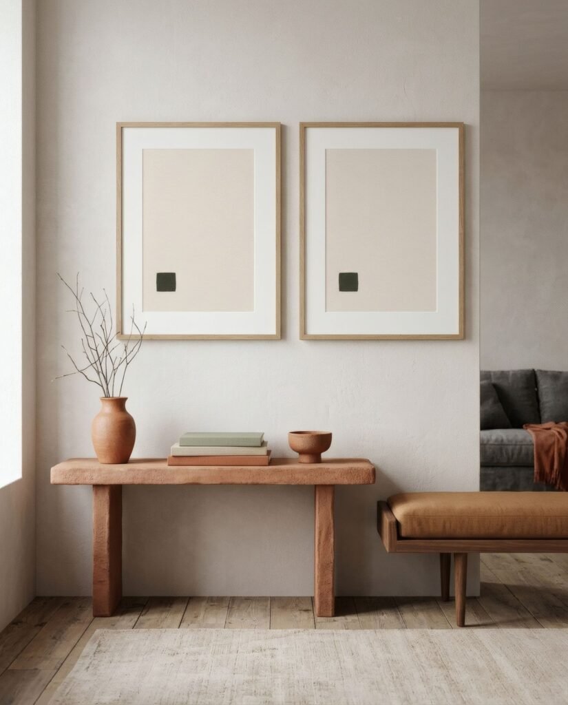
Can you bring a different colour into a monochrome room? Yes, and it can be very effective: a single accent, in a piece of art, makes everything else read as a calm background. A print with a terracotta detail in a grey living room. But it should be one, and not too large. Once accents multiply, the room stops being monochrome.
The alternative, just as valid, is none at all: keep the discipline and let tonal variation and texture do everything.
The calm of one colour
A monochrome interior with well-chosen art has a quiet sophistication that’s hard to match. The key is not to confuse unity with uniformity: run across the colour’s whole scale, multiply the textures and let light and shadow do their work.
For white, grey or oatmeal rooms, the bone, charcoal and sage prints of Quiet forms add exactly that missing tonal step.
Keep reading: White Walls, Warm Spaces: Choosing Art with Character, How to Add Personality to Neutral Interiors and How to Choose a Frame for an Art Print.