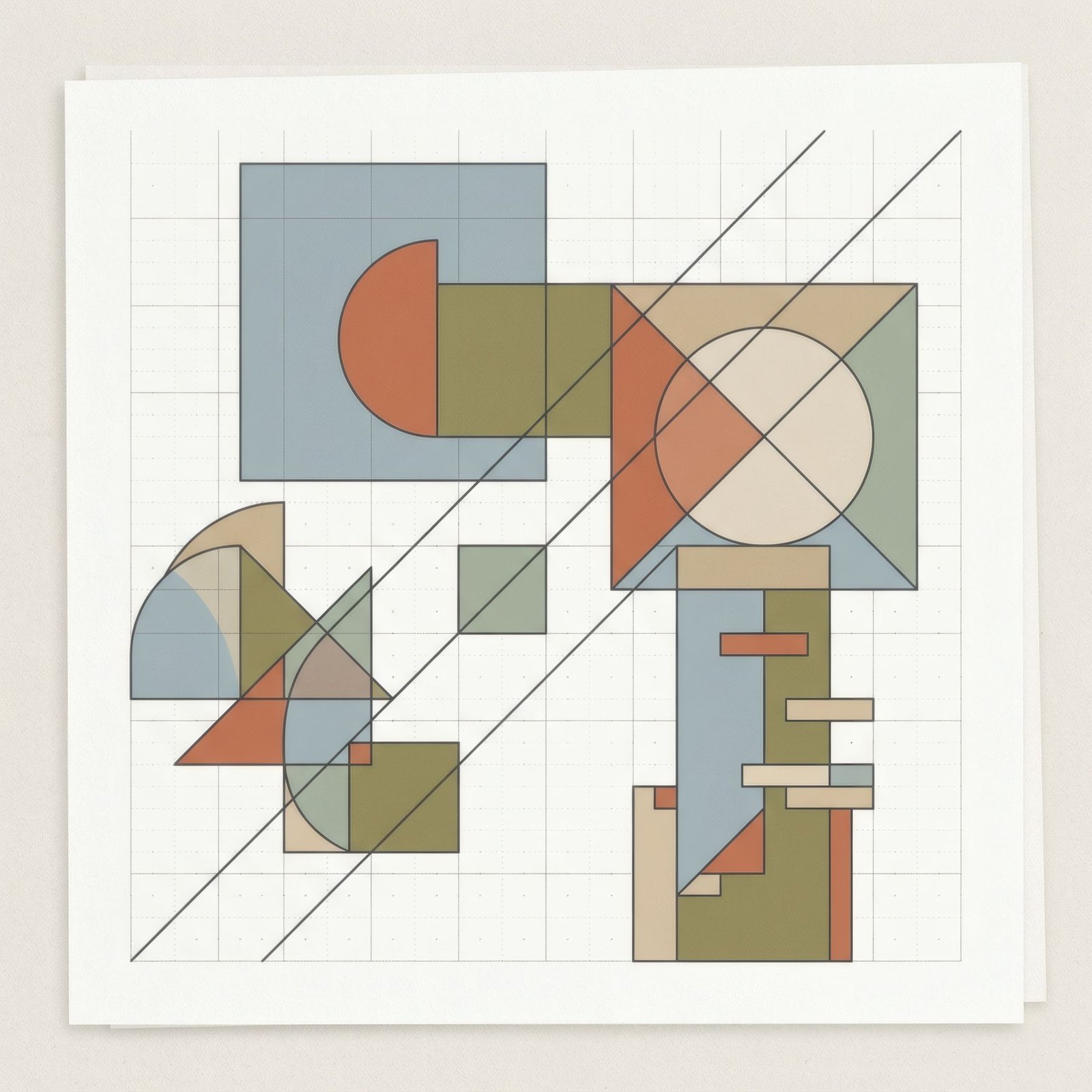
If you have ever seen a poster where everything seems exactly where it should be, with clean left-aligned type, a black-and-white photograph, blocks of colour arranged with almost mathematical precision and plenty of white space, you were probably looking at Swiss design or something inspired by it. In the mid-twentieth century, designers trained in schools in Zurich and Basel developed a graphic language based on clarity, order and objectivity, which spread worldwide as the International Typographic Style. Its principles live on today in signage, branding, websites and posters.
The pursuit of clarity
Swiss design, as it is often called, grew from a conviction: graphic design should communicate as clearly as possible, without ornament or unnecessary effects. Instead of expressing the designer’s personality, it should organise information objectively and comprehensibly for anyone.
That idea had roots in the early twentieth-century avant-gardes, in Constructivism, De Stijl, the Bauhaus and the New Typography of the 1920s and 30s, and found especially fertile ground in Switzerland. A country neutral in the Second World War, with a tradition of fine printing and demanding design schools, was where those ideas were refined into a system.
The grid
The most characteristic element of Swiss design is the grid: an invisible structure of columns and rows organising every element on a page or poster. Text, images and white space follow that structure, giving the whole a recognisable order and coherence.
The grid is not a cage but a tool, allowing compositions to vary without losing harmony. The Swiss designer Josef Müller-Brockmann, one of the style’s great theorists and practitioners, devoted much of his work to explaining and championing it.
Sans-serif type
Swiss design’s lettering is almost always sans-serif, without the small strokes at the ends of letters. It was thought more neutral, more modern and more legible at a distance. It is usually set ranged left, with a ragged right edge, rather than justified, which gives text a natural rhythm and avoids uneven word spacing.
Some of the twentieth century’s most influential typefaces emerged from this setting in the late 1950s. The most famous, created by Max Miedinger with Eduard Hoffmann as Neue Haas Grotesk, was soon renamed Helvetica, a name referring to Switzerland itself.
Asymmetry and white space
Unlike traditional posters, often centred and symmetrical, Swiss design favours asymmetric compositions built on the grid, in which white space plays an active role: a block of text in one corner, an offset photograph, a large void that gives air and guides the eye. That asymmetric balance, partly inherited from De Stijl, is one of the style’s most elegant features, explored in asymmetrical composition in contemporary art.

Photography and objectivity
Instead of illustration, Swiss designers often preferred photography, especially black and white, as more objective. They also used abstract geometric forms and flat colour, with a restrained palette in which red, black and white stand out.
Schools and figures
Two schools were fundamental: Zurich and Basel. In Basel, designers such as Armin Hofmann and Emil Ruder taught and shaped generations of students. In Zurich, Josef Müller-Brockmann designed some of the style’s most celebrated posters, particularly for concerts, where music was translated into rhythmic geometric compositions.
In 1958 the journal Neue Grafik was founded in Zurich, and between then and 1965 it spread the movement’s principles internationally.
Its legacy
Few currents in graphic design have been so widely influential. Swiss design’s clarity, grids and sans-serif type are found in airport and station signage, corporate identities, books, websites and the apps we use daily. Its language is so familiar that we often no longer see it as a style but simply as «design».
Swiss design at home
An original mid-century Swiss poster, or a print inspired by its principles, brings order, clarity and an elegant graphic feel to a home. It suits studies, libraries and clean-lined spaces especially well. As a highly refined aesthetic, it deserves space around it and a simple frame, thin black or white, that respects its precision.
Bendíra’s prints do not belong to this tradition, but their love of clear composition, white space and simple form has much in common with the lessons of Swiss design.
Keep reading: Art Deco Posters: Visual Features and History, Editorial Illustration: Art That Communicates Ideas and Bauhaus: Its History and Influence on Modern Design.