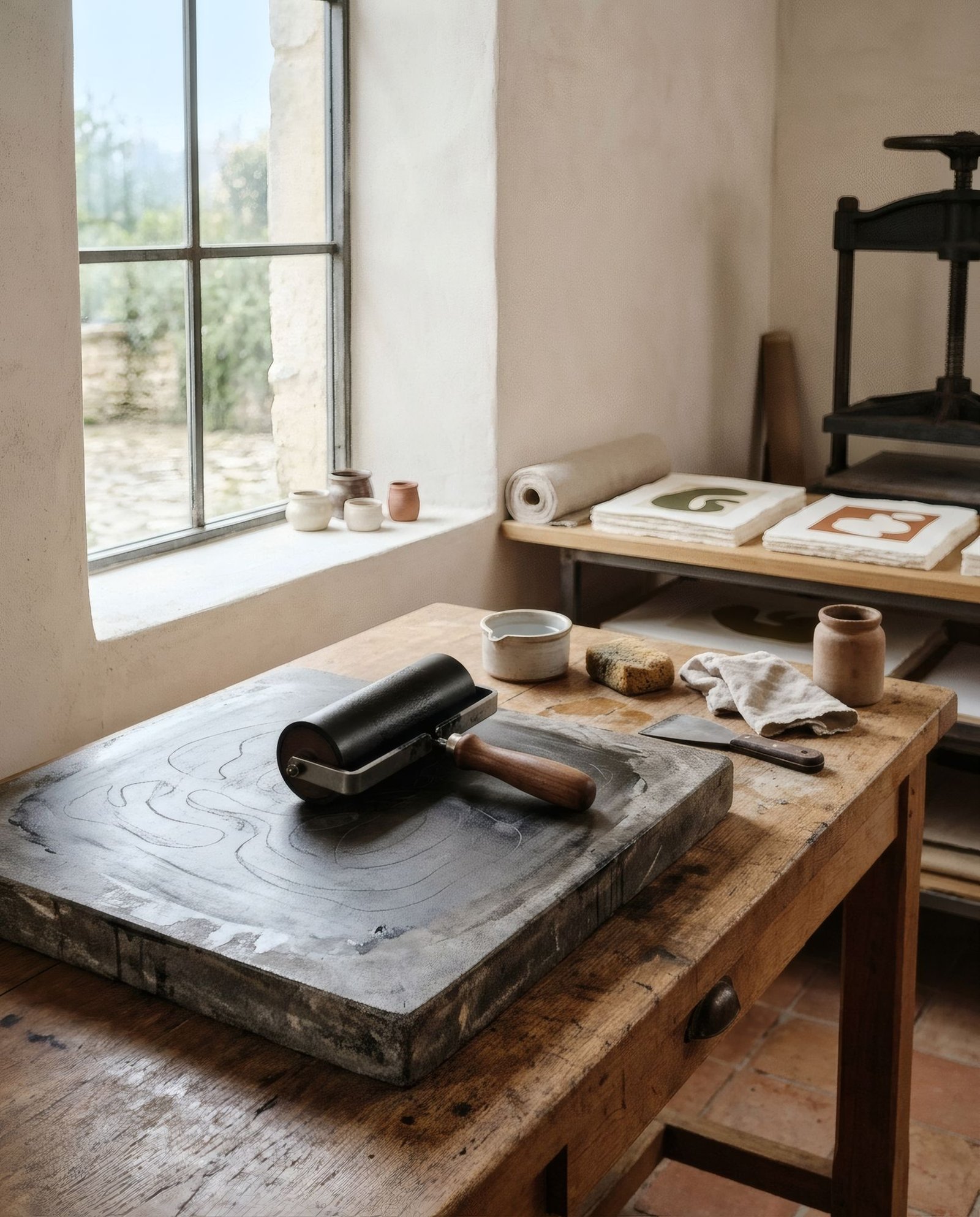
Imagine Paris at the end of the nineteenth century, its walls suddenly bursting with colour. Dancers who seem to fly, actresses wreathed in flowers, bottles of liqueur held aloft by elegant figures. For many passers-by it was the first time they had seen images so large, so vivid and so close, free and out in the street. The modern art poster was born there, where a new printing technique, a growing city and a commerce that needed to be seen all met. In little more than a century it became one of Europe’s great visual languages, able to announce a show, sell a product, rally a nation or simply brighten a street.
A technique that made it possible
Before the poster could be art, it had to be printable. Lithography, invented at the end of the eighteenth century, let artists draw directly onto stone and reproduce the image many times. Through the nineteenth century, colour lithography was refined until large prints in strong colours could be made affordably.
The Frenchman Jules Chéret, often called the father of the modern poster, was central to that transformation. Trained as a lithographer, he spent years in London learning colour techniques and, back in Paris, developed a bright, joyful style of moving female figures on vibrant grounds that filled the city’s streets. Between 1895 and 1900 he also championed the series Les Maîtres de l’Affiche, which reproduced posters by dozens of artists in small format and helped make the poster a collectable object.
Belle Époque Paris
In the last decade of the nineteenth century, Paris enjoyed a golden age of the poster. Henri de Toulouse-Lautrec brought a surprising economy and graphic force to his posters for cabarets and café-concerts such as the Moulin Rouge: broad areas of flat colour, cut-out silhouettes and daring compositions recalling the Japanese woodblock prints that so fascinated European artists of the time.
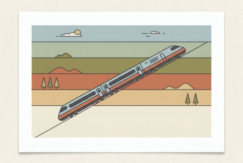
Alphonse Mucha, a Czech artist working in Paris, took a very different path. His poster for the play Gismonda, starring Sarah Bernhardt, dated 1894 and commissioned at very short notice, made him famous almost overnight. His elongated figures, framed by plant ornament and circular haloes, became some of the most recognisable images of Art Nouveau.
The poster spreads across Europe
Poster fever spread throughout Europe, and each country gave it its own accent. In Catalonia, at the height of Modernisme, the painter Ramon Casas won a celebrated 1898 competition for the Anís del Mono liqueur, a poster that made him widely known. In Britain, the Beggarstaffs, a partnership of two artists, developed a bold, simplified style of flat silhouettes in the 1890s.
From ornament to synthesis
In the early twentieth century, taste began to shift. Against the decorative exuberance of Art Nouveau, Germany developed a far more concise style, sometimes called Plakatstil: a single object in flat colour with the brand name in large letters. It was a direct poster, understood in a second, and it anticipated much of modern advertising.
After the First World War, the avant-gardes transformed the poster’s language. In Russia, the Constructivists used photography, diagonal type and red and black with new intensity. In France, Art Deco produced posters of unmistakable geometric elegance, especially for travel, railways and ocean liners, with figures such as A. M. Cassandre.
In London, the Underground became one of the great patrons of poster art. Under the direction of Frank Pick, it commissioned many artists, including Edward McKnight Kauffer, and the posters of the Underground remain a landmark of British design.
War and propaganda
The twentieth century also used the poster for less gentle purposes. In wartime, posters recruited, mobilised and persuaded. Spain’s Civil War produced vast numbers of posters on both sides, by artists such as Josep Renau, who combined avant-garde graphic power with urgent political messages. These posters are now historical documents of great value, to be read in context.
Swiss design and the later century
From the 1950s, Swiss graphic design established a language of clarity and rigour: the grid, sans-serif type, asymmetric composition and photography. Its posters for concerts, exhibitions and public campaigns remain models of design, as we explore in Swiss graphic design: grids, typography and posters. In Poland during the same years, a school of poster artists developed a highly personal, painterly and metaphorical style, above all for film and theatre.
A legacy on our walls
The poster was born for the street and meant to be short-lived, yet many of those ephemeral sheets are now preserved in museums and collections and studied as part of the history of art and design. Its language of colour, type and synthesis still shapes how we communicate and how we decorate. We look at its return to our homes in the appeal of vintage posters in modern interiors.
Keep reading: The Psychology of Colour in Art and Interiors, Art and Architecture: A Creative Connection and Art Deco Posters: Visual Features and History.