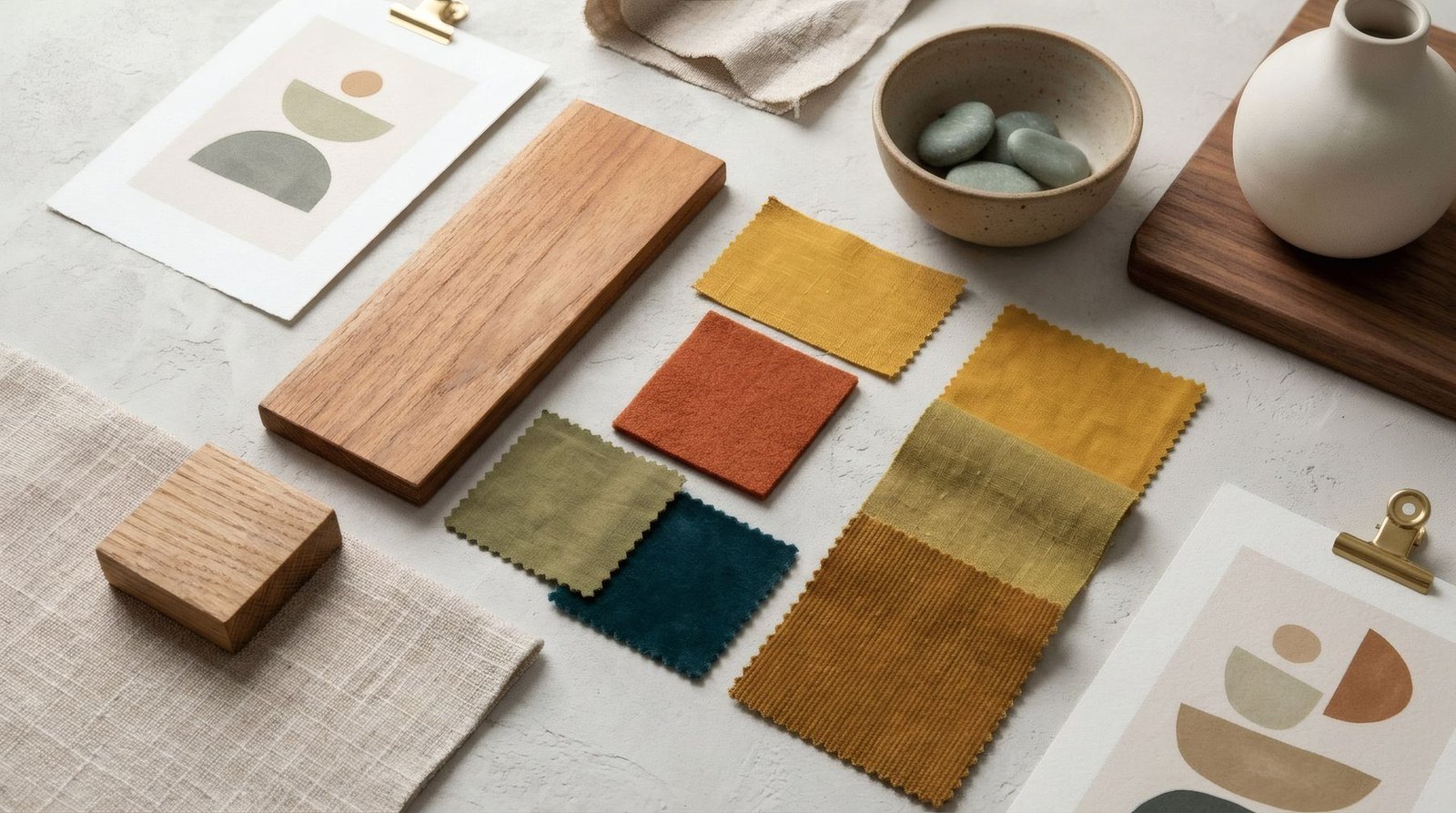
Few periods of design have aged as gracefully as the middle of the twentieth century. A moulded plywood chair, a floor lamp with an articulated arm, a teak sideboard on slender legs, a printed fabric whose shapes seem to dance: many of these designs are still made today, and others are hunted down in vintage shops and markets. The graphic and decorative art of those years shares the same spirit. Organic and geometric forms, often together, a palette of earth tones with lively accents, and an optimism that shows in every line. Knowing its motifs and variants helps you recognise mid-century modern prints, and bring them home without turning the house into a period set.
An optimistic era
«Mid-century modern» usually refers, roughly, to the decades after the Second World War, from the mid-1940s to the late 1960s. It was a time of rebuilding in Europe, economic growth in many countries and great confidence in the future, in science and in technology.
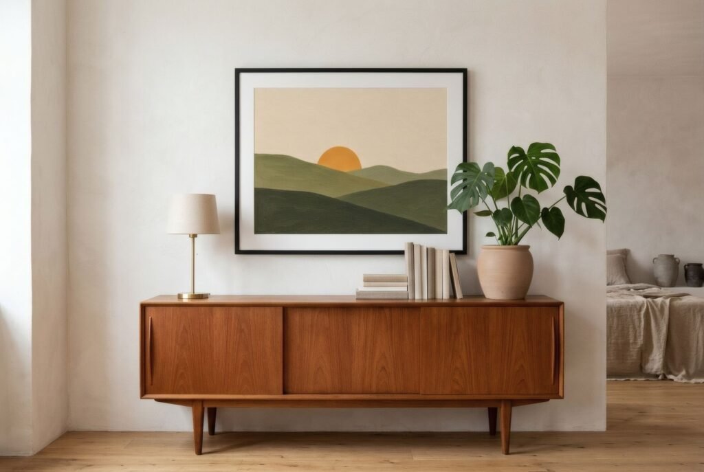
That optimism found its way into design. New materials and techniques, such as moulded plywood, plastics and fibreglass, made forms possible that had been unthinkable before. Designers such as Charles and Ray Eames in the United States and Arne Jacobsen and Hans Wegner in Denmark created furniture that combined comfort, lightness and unadorned beauty. The graphic art of the period, in posters, illustration, textiles and record sleeves, spoke the same language.
Shapes: organic and geometric
Perhaps the most distinctive thing about mid-century art is how it brought together two worlds that had seemed opposed.
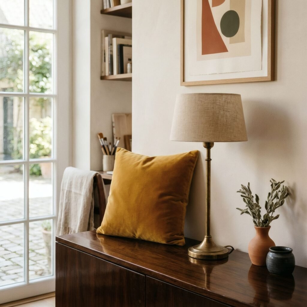
On one side were organic forms: rounded, soft, asymmetric silhouettes like pebbles, leaves, drops or amoebas. They owed something to sculpture and to the biomorphic abstraction of earlier decades, and they appear in kidney-shaped tables, prints of floating colour patches and softly drawn illustration.
On the other were geometric forms: circles, triangles, straight lines, grids. This was a geometry inherited from the Bauhaus and modern abstraction, but more cheerful and relaxed, less rigorous.
Between the two sat the motifs we now associate instantly with the era: starbursts, boomerangs and atoms with orbiting electrons, evoking the space age and a fascination with science. This repertoire is often called the «atomic» style.
In Britain, the 1951 Festival of Britain is often cited as a showcase for this optimistic new design language, from furniture to fabrics and graphics.
The palette
The mid-century palette is one of the most recognisable in design. It combines a warm, earthy base, the honey of teak and walnut with browns and ochres, with accents that are lively yet softened: mustard, burnt orange, olive, teal, turquoise, cherry red. Black and off-white add graphic contrast.
It is an optimistic palette but never shrill. The colours are rarely pure; almost all carry a touch of earth or grey that softens them. That is why they sit so well with wood, and why they still feel warm today.
Variants by place
Mid-century style was not uniform. In the United States it was bolder and more commercial, with bright colours, daring forms and a strong influence from advertising and popular culture. In Scandinavia it was more restrained and craft-based, with paler woods, simpler lines and a more measured palette. In Italy it grew more sculptural and experimental. In Britain, post-war design blended modernist ideas with a distinctly gentle, often textile-led sensibility.
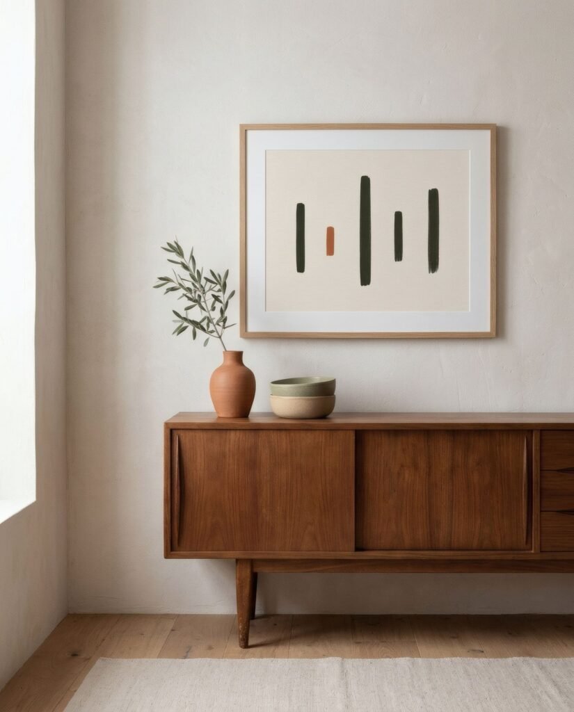
These differences help when choosing. A home of pale woods and northern light will suit the Scandinavian variant; one of warm colours and a relaxed spirit, the American.
Living with it today
Mid-century art sits naturally in homes with furniture from the period or inspired by it, such as a teak sideboard, a bentwood armchair or a brass lamp. But it can also give character to an entirely contemporary interior, where a single print of organic forms in mustard and olive brings warmth and a nod to the era.
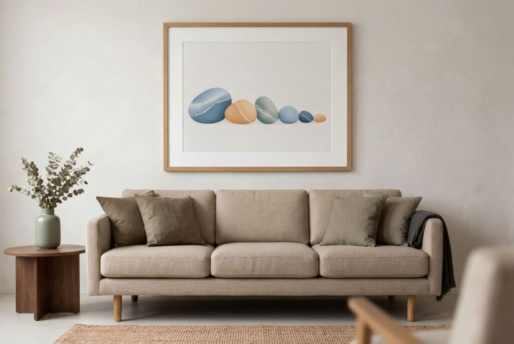
As with anything retro, the risk is excess. A home where every piece of furniture, textile and print belongs to the 1950s ends up looking like a set. It works better to mix: a mid-century-inspired print above a contemporary sofa, a teak sideboard beneath a new abstract. More in how to style retro art in a contemporary home.
Original, reissue, inspiration
As with vintage posters, it is worth distinguishing. Original prints and posters from the period are collectors’ items. Reproductions of specific works may still be under copyright, since many of their creators died less than seventy years ago. And there are contemporary works that draw on the mid-century language without copying it, which are the most common in interiors and let you enjoy the style with a present-day eye.
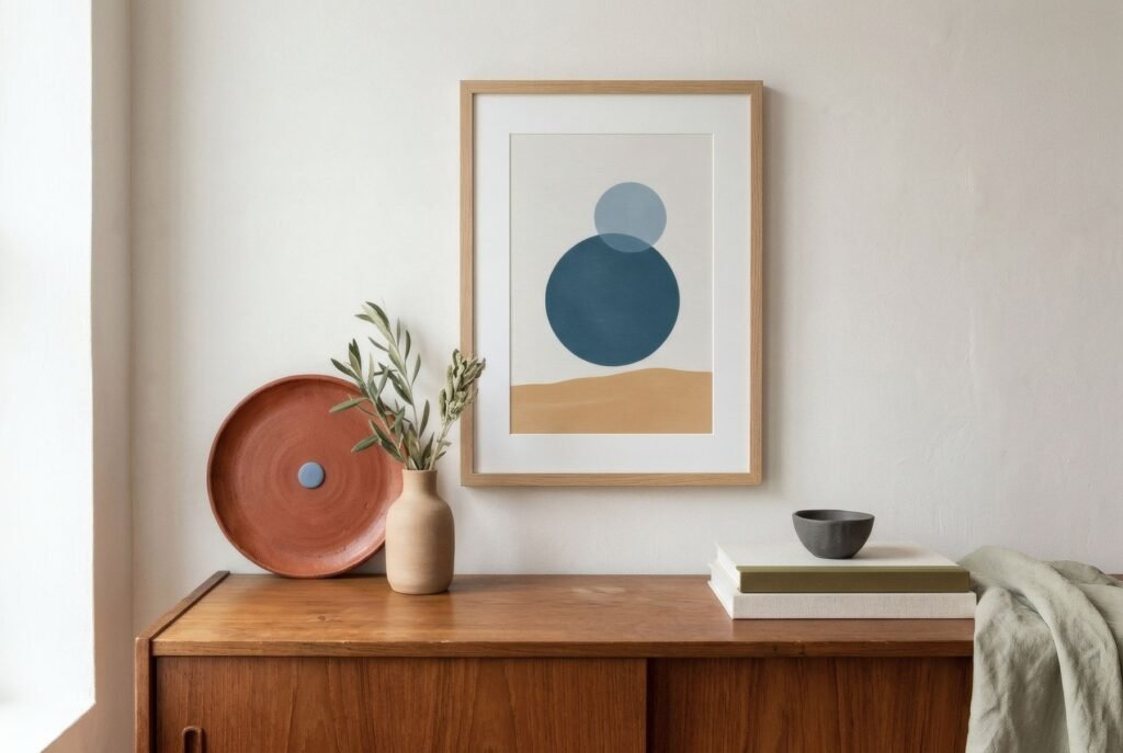
A mid-century corner
Picture a teak sideboard on tapered legs, a brass lamp and a large-leaved plant. Above the sideboard, a 50 × 70 cm print of seven rounded bars rising and falling in olive, sand and clay, like a visual rhythm. The arrangement evokes the era without imitating it, and the room still feels of today.
If that language of shapes and warm colour appeals, Bendíra’s collections include contemporary prints that carry echoes of mid-century design, with rhythms of rounded forms, circles and blocks in mustard, olive and clay.
Keep reading: Botanical Art: From Scientific Illustration to Interior Design, Typography as Art: When Letters Become Decor and How to Pair Wall Art with Wooden Furniture.