A red wedge driving into a white circle. A woman shouting through cupped hands, letters shooting out diagonally. Cut-out photographs combined with blocks of flat colour. Anyone who has seen a Russian Constructivist poster is unlikely to forget it. In barely fifteen years, a group of Russian avant-garde artists transformed graphic language with diagonals, red-and-black contrast, photomontage and type that seemed constructed rather than written. Their influence reaches us still, in posters, book covers and brands. To understand it properly, though, it helps to look at its context, because this was art born for a very particular historical moment.
Building rather than composing
Constructivism emerged in Russia around the 1910s, in a period of enormous political and social upheaval that culminated in the revolution of 1917. Artists such as Vladimir Tatlin and Alexander Rodchenko, regarded among its founders, put forward a radical idea: art should not «compose» beautiful images to contemplate, but «construct» useful things for a new society.
That idea led many of them to give up easel painting for design: posters, books, typography, furniture, textiles, stage sets, architecture. The artist was seen almost as an engineer, and the visual language drew on machines, industry and geometry. One of the movement’s most emblematic projects, Tatlin’s Monument to the Third International, a vast spiralling tower of iron and glass, was never built, but it became a symbol of that ambition.
The key visual ideas
Constructivist graphic design has an unmistakable language built from a few powerful devices.
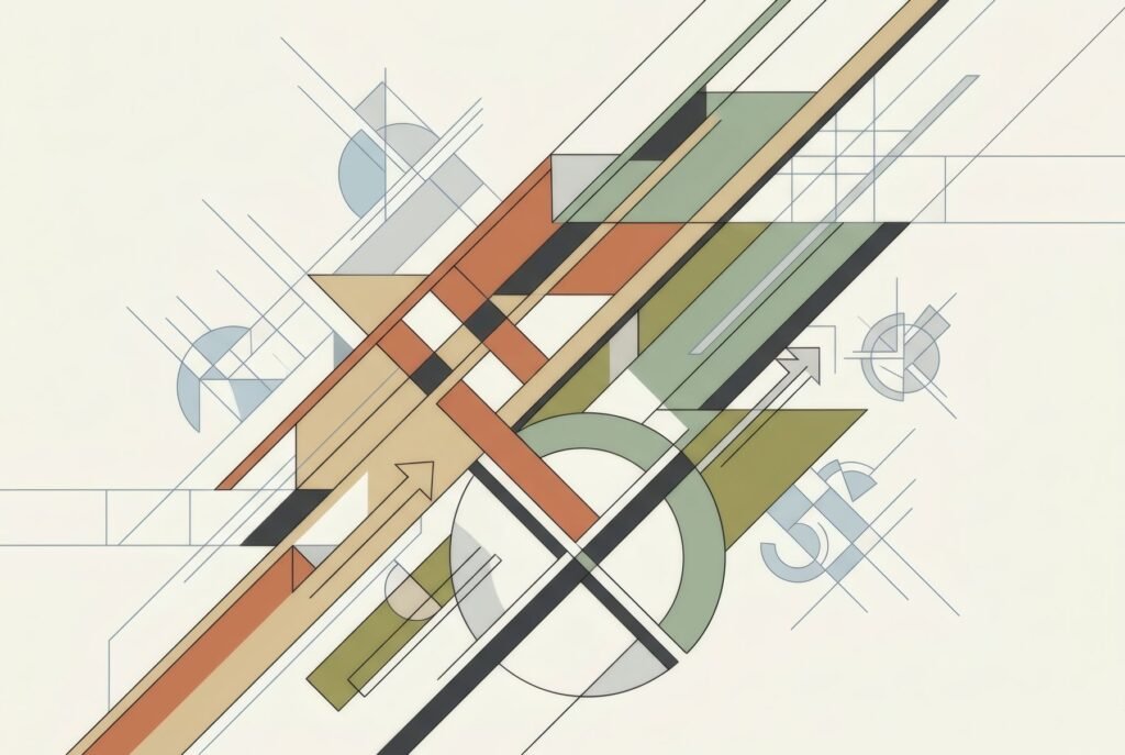
The diagonal. Against stable compositions of horizontals and verticals, Constructivists used the diagonal to convey movement, energy and tension. Slanted text, forms crossing the page at an angle, compositions that seem to surge forward.
Red and black. The palette is reduced and forceful: red, black and the white of the paper, sometimes with a grey. Red, politically charged in that context, brings intensity; black brings structure.
Geometry. Circles, squares, triangles and bars are used as building blocks. A celebrated example is El Lissitzky’s poster Beat the Whites with the Red Wedge, of around 1919–20, in which a red wedge pierces a white circle: an abstract image working as a direct political message.
Photomontage. Constructivists were pioneers in combining cut-out photographs with type and coloured forms. Rodchenko and Gustav Klutsis, among others, made photomontage a powerful expressive tool that remains central to graphic design today.
Type as structure. Letters stopped being merely text and became visual elements, enlarged, tilted, stacked, built into the composition. Books designed by Rodchenko and Lissitzky completely renewed the idea of the page.
Art with a purpose
It is important to remember that Constructivism was not a decorative style but art in the service of a political and social project. Many of its best-known posters were revolutionary propaganda or advertising for state enterprises. Rodchenko, for instance, collaborated with the poet Vladimir Mayakovsky on advertisements for Soviet businesses.
We can admire their graphic power today, but it is worth looking at them with an awareness of where they came from. The movement’s history was also short: from the 1930s, the Soviet regime imposed Socialist Realism as the official style, and the Constructivist avant-garde was pushed aside.
A legacy that travelled
Constructivist ideas did not stay in Russia. El Lissitzky in particular helped spread them in Germany in the early 1920s through publications and exhibitions. The Bauhaus, modern typography and later Swiss graphic design took up many of their intuitions: asymmetric composition, unadorned type, the relationship between text and image. Designers such as Jan Tschichold, a key figure of the New Typography, acknowledged that influence.
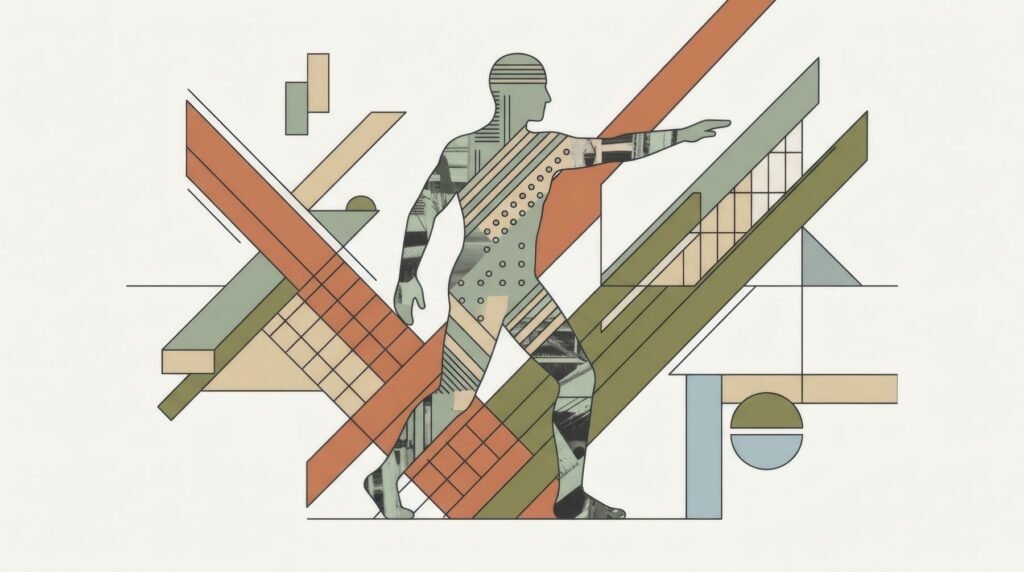
Today the Constructivist language reappears constantly, in gig posters, album covers, advertising campaigns and brand identities. We look at its relationship with the Bauhaus in Bauhaus: its history and influence on modern design and with Swiss design in Swiss graphic design: grids, typography and posters.
Constructivism at home
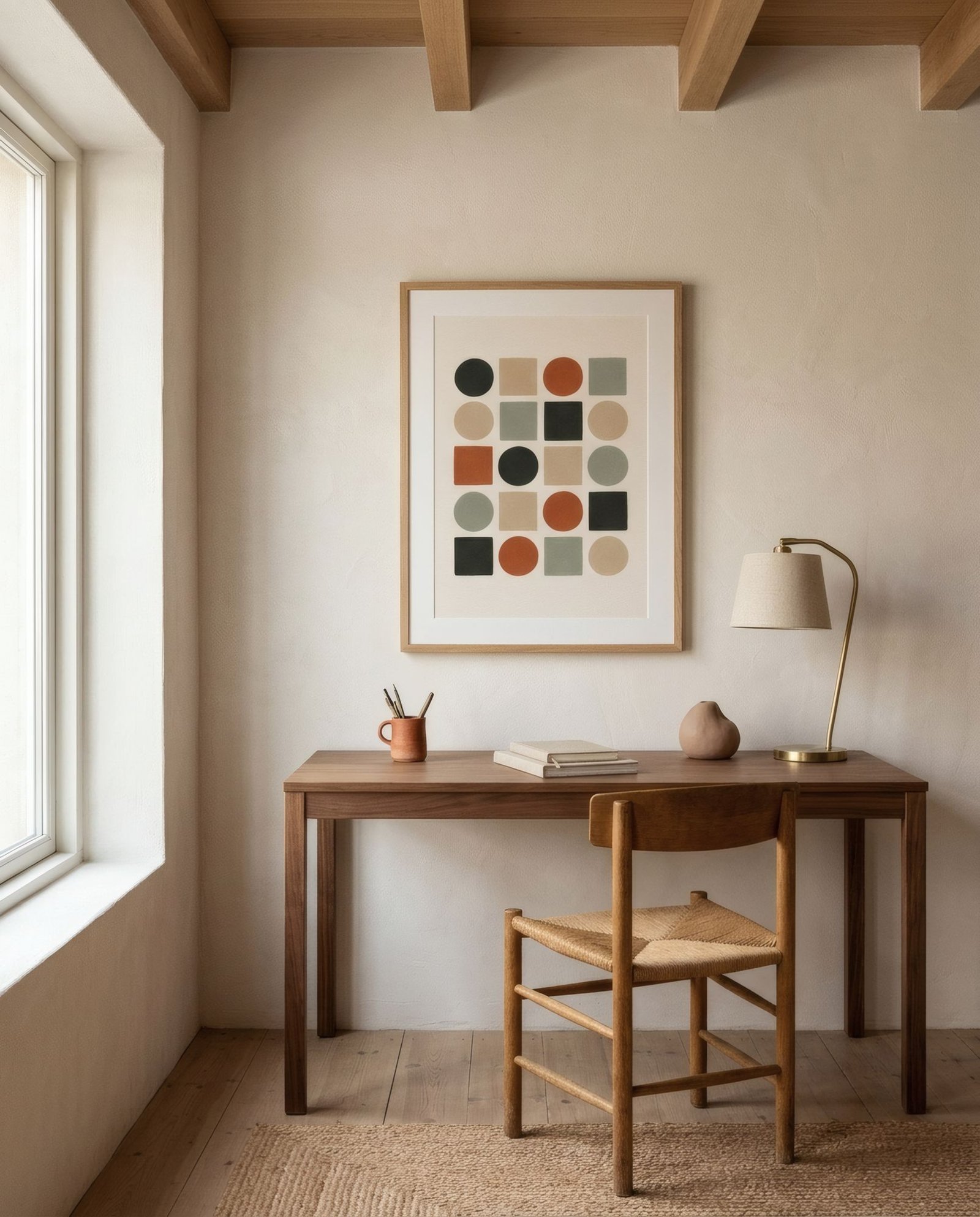
Bringing the Constructivist spirit home does not mean hanging historical propaganda. Many contemporary prints borrow its geometry, diagonals or flat-colour contrast and apply them to abstract compositions with no political charge. They work well in clean-lined interiors, studies and spaces with a graphic character.
For something less forceful, the Constructivist inheritance also lives in the serene geometry of many prints today, which share its love of pure form while swapping red and black for warmer tones. Bendíra’s collections include geometric studies of forms and blocks that draw, at a distance, on that tradition.
Keep reading: Using Wall Art to Connect Open-Plan Rooms, De Stijl: Geometry and Colour in Modern Design and Geometric Art: Shapes, Colour and Composition.