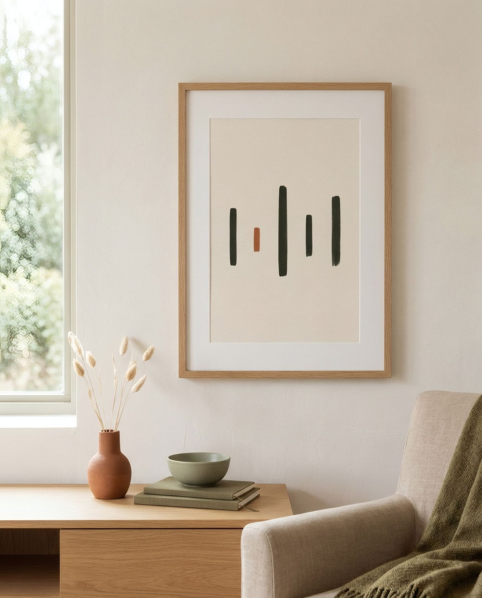
Few images in twentieth-century art are as recognisable as a Piet Mondrian painting: a grid of black lines on a white ground, with a few rectangles filled with red, blue or yellow. It has been reproduced on dresses, posters, mugs and building façades, becoming almost a pop icon. But behind that image lies far more than a decorative pattern. There is an art movement, De Stijl, born in the Netherlands in the late 1910s, which sought nothing less than universal harmony through the most basic elements: the straight line, the right angle and the primary colours. Understanding its ideas helps you see those works afresh, and explains why its influence reaches into design today.
A name and a magazine
De Stijl simply means «the style» in Dutch. It was the name of a magazine founded in 1917 by the artist Theo van Doesburg, which became the meeting point for a group of painters, architects and designers with shared ideas. Besides Van Doesburg, they included Piet Mondrian, the painter Bart van der Leck, the architect J. J. P. Oud and the designer-architect Gerrit Rietveld, among others.
The Netherlands had stayed neutral in the First World War, and in that setting, surrounded by a devastated Europe, these artists imagined a new art able to express an order and harmony beyond the individual and the national.
The search for the universal
De Stijl’s central idea was that art should strip away everything incidental, such as depiction of objects, perspective, texture and personal gesture, to reach the essential. Mondrian called his version of this search Neoplasticism.
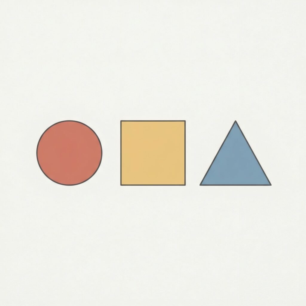
The essentials were few. Straight lines, horizontal and vertical, crossing at right angles. Primary colours, red, blue and yellow, in pure planes. And non-colours: white, black and grey. With these, combined in asymmetric yet balanced compositions, they believed universal, almost spiritual, harmony could be expressed.
It is easy now to see cold or rational geometry in these works, but many of their makers understood them far more deeply, as a search for balance between opposing forces.
Asymmetric balance
One of the great lessons of Mondrian’s compositions is asymmetric balance. His paintings are almost never symmetrical: a large red rectangle in one corner may be offset by a small blue square on the opposite side and a yellow band elsewhere. Line thickness, plane size and colour intensity are tuned precisely so the whole feels stable without being centred.
That idea of dynamic balance has deeply influenced graphic design, architecture and composition in general. We explore it in asymmetrical composition in contemporary art.
Beyond painting
De Stijl was not only a painting movement. Its ideas were applied to architecture, furniture, typography and interiors. Gerrit Rietveld created a chair, known as the Red and Blue Chair, that translates the movement’s language of lines and colour planes into three dimensions.
His best-known architectural work is the Rietveld Schröder House in Utrecht, completed in 1924: a home of sliding planes, movable walls and primary colours, inscribed on UNESCO’s World Heritage List in 2000 and described by UNESCO as a manifesto of the group’s ideals. It is now a museum open to visitors.
A history of disagreements
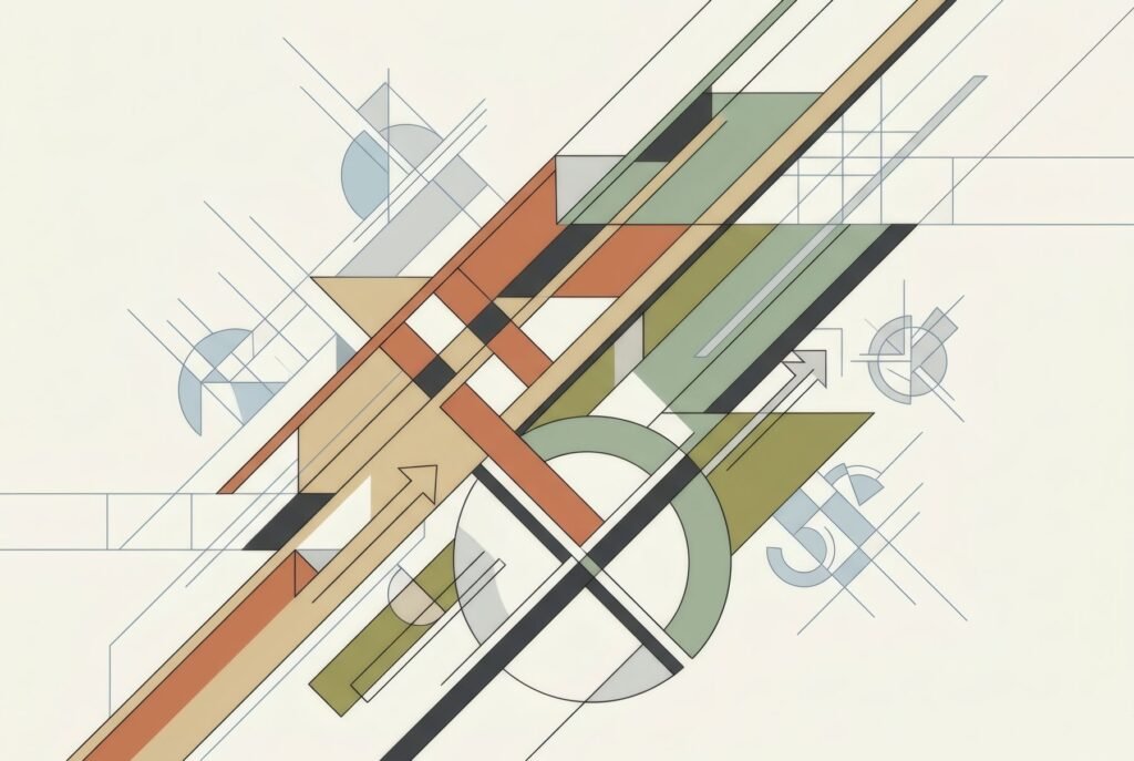
Like many avant-garde movements, De Stijl was neither unified nor long-lived. Members argued, left and rejoined. It is often said that Mondrian distanced himself from Van Doesburg in the mid-1920s, partly over the diagonal, which Van Doesburg began to introduce and Mondrian considered contrary to the movement’s principles. The magazine ceased after Van Doesburg’s death in 1931.
The legacy
Despite its brief life as a group, De Stijl was hugely influential. Its ideas connected with the Bauhaus and international modern design, and its language of lines, planes and primary colours became one of the most recognisable of the twentieth century. It appears today in architecture, fashion, graphic design and interiors, often in very simplified form.
De Stijl at home
Bringing something of De Stijl home does not require a wall of primaries. A print of balanced geometric composition, with fine lines and a few planes of colour, in a clean-lined interior may be enough. Pure primaries bring plenty of energy; for a calmer room, contemporary works that translate that geometry into warmer or more muted palettes keep the balance without the intensity.
Mondrian’s originals hang in museums, but his way of thinking about balance, proportion and space can inspire any wall. Bendíra’s collections include geometric studies in warmer palettes that converse with that tradition of pure form.
Keep reading: Constructivism in Graphic Design: Key Visual Ideas, Memphis Design: Colour, Pattern and Play and What Is Abstract Art? A Beginner’s Guide.