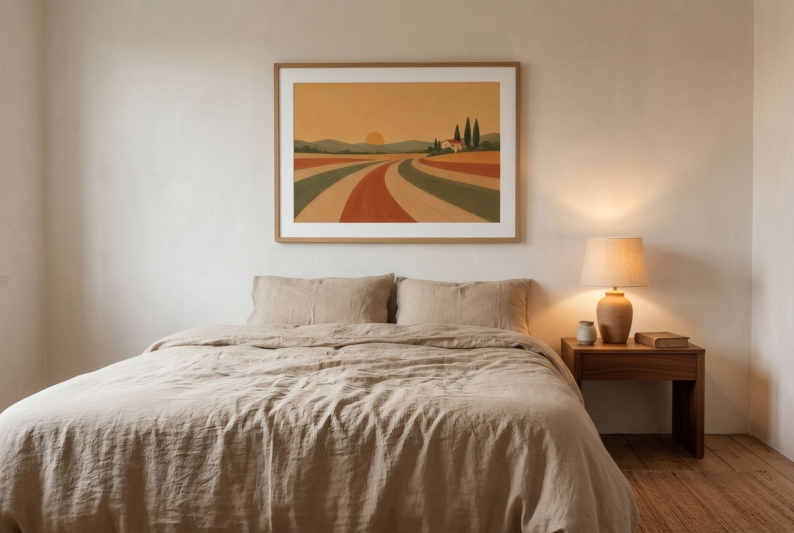
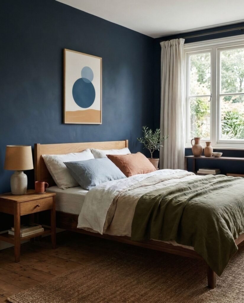
Bedroom wall art works best when it lowers the volume: soft palettes, moderate contrast and compositions that do not demand attention. Three places matter most. The first is above the headboard. The second is the wall opposite the bed, the one you see when you wake. The third is the in-between spots beside a wardrobe or window. Each calls for a different kind of piece.
Why bedrooms are different
A living room is seen in passing and in company. A bedroom is seen at particular moments: going to sleep, waking up, getting dressed. It is often looked at lying down, in low light and without hurry. That changes the brief:

- Less stimulation: high-contrast, busy or very saturated images can feel insistent in a room meant for rest.
- More nuance: under a bedside lamp, soft gradients, paper texture and in-between tones come forward.
- More privacy: it is the room where other people’s opinions matter least, which makes it a good home for something personal.
Idea 1: one landscape-format print above the headboard
The calmest option. A single horizontal piece echoes the line of the bed and settles the whole wall.
As a rough guide, aim for half to two-thirds of the bed’s width. Above a 150 cm (5 ft) king-size bed in the UK, that means a piece or group around 75–100 cm (30–39 in) wide. Above a 135 cm (4 ft 6 in) double, around 70–90 cm (28–35 in).
Leave about 20–30 cm (8–12 in) between the headboard and the bottom of the frame. That is slightly more than above a sofa, because people sit up and lean back. There is more on heights in how high to hang pictures.
Idea 2: a matching pair over the bedside tables
Two portrait prints, the same size and frame, each centred over one half of the bed. This suits shared bedrooms and symmetrical layouts, and works well with prints that relate to each other in palette or subject without being identical. There is more on spacing and alignment in how to style a pair of art prints.
Idea 3: a row of three above a wide headboard
On a very wide headboard or a long wall, three prints in a line with equal gaps of 5–8 cm (2–3 in) give rhythm without clutter. Keep them the same size and let colour or subject vary slightly.
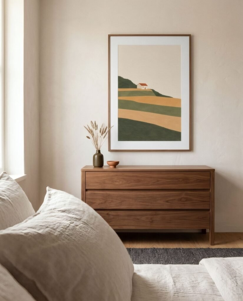
On safety: above a bed, use two fixing points per frame and consider acrylic glazing or lightweight frames. It is a small precaution that makes the room feel easier.
Idea 4: the wall you wake up to
The wall opposite the bed is often overlooked, yet it is the one you see first every morning. It is the best place in the house for an image you want to live with daily.
It can take a little more presence: a wide-horizon landscape, a soft-coloured abstract, a photograph with depth. It is viewed from two or three metres away, so a medium to large scale reads well, with a diagonal of around 70–100 cm (28–39 in).
If there is a chest of drawers on that wall, the furniture sets the scale again: centre the print 15–25 cm (6–10 in) above the surface.
Idea 5: small pieces for in-between spaces
Beside the wardrobe, next to a window, or on the narrow strip between a door and a corner: a small or medium portrait print, A3 or 30 × 40 cm, adds a quiet note without taking up room. These are good spots for something personal, such as a drawing, a family photograph framed to match the rest, or a fine botanical study.
Palettes that feel restful
There is no robust science behind particular colours «for sleep», but some combinations are widely felt to be calm in a bedroom:
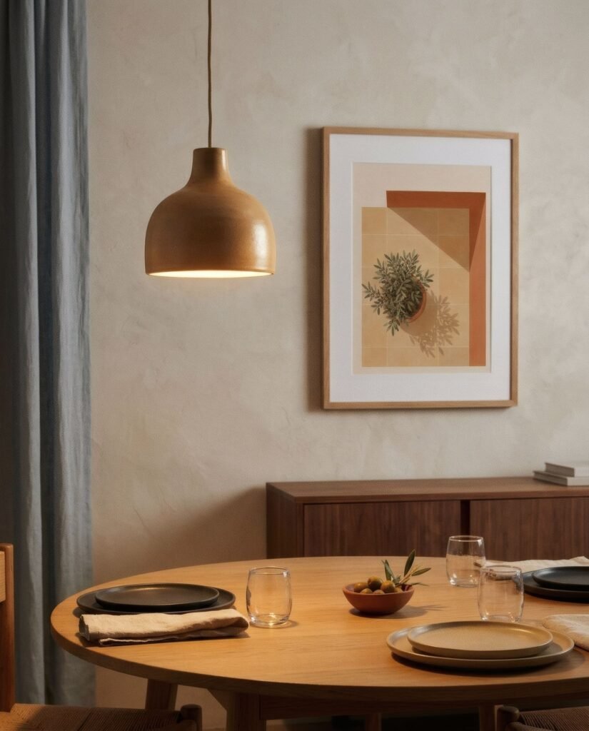
- Sand, bone and stone: warm neutrals that sit naturally with linen, pale wood and cotton. Quiet without being cold.
- Sage and olive: plant-like greens that pair well with timber and ceramics. In north-facing rooms, choose greens set against a warm ground.
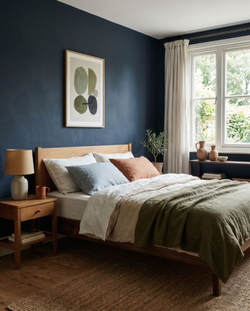
- Soft blues and mist: fresh and spacious. Balance them with a warm touch, such as a sand or a small terracotta, so the room does not feel chilly.
- Muted terracotta: enveloping and cosy when it covers a moderate area and is surrounded by lighter tones.
Rather than choosing a colour in isolation, think about your bedding. If it changes with the seasons, a print in middle tones will live happily with more combinations.
Which kinds of image work
- Gentle abstraction: few, broad forms, gradients, no harsh edges.
- Landscape and horizon: the horizontal line carries a sense of calm and space.
- Botanical: delicate and easy to combine, especially in pairs and corners.
- Line drawing: a single figure, object or form with plenty of space around it.
- Photography: best with few elements and uncrowded scenes.
What tends to work less well: prints heavy with text, extreme black-and-white contrast at large scale, and scenes that need decoding.
Check it under lamplight
Bedrooms spend much of their time lit by warm, low artificial light. Before you decide, look at the print, or a printed colour sample, with the bedside lamp on. Blues can turn grey and whites can yellow, while ochres and terracottas usually improve.
If direct sun falls on the wall, consider UV-filtering glazing and avoid hanging directly opposite the window. More in how to protect art prints from sunlight and moisture.
Three bedrooms, three solutions
- A small room with a 135 cm double: one landscape print of around 70 cm above the headboard, in sand tones, and nothing else on the walls. Calm by restraint.
- A shared room with a king-size bed and matching bedside tables: two 30 × 40 cm portrait prints in the same frames, one over each table. Order and symmetry.
- A larger room with a free wall opposite the bed: a 50 × 70 cm landscape with a mount on the facing wall, plus a small botanical beside the wardrobe. One image to wake to, one to pass by.
In the end
Good bedroom wall art does not impose itself. It keeps you company. A moderate size, a gentle palette and a position chosen for the moments when you will actually look at it are usually enough.
If you are looking for pieces made in that spirit, Bendíra’s collections in earth, sage and misty blue tones bring together prints suited to quiet rooms.
Keep reading: How to Choose the Right Art Print Size and How to Decorate a Large Wall with Art.