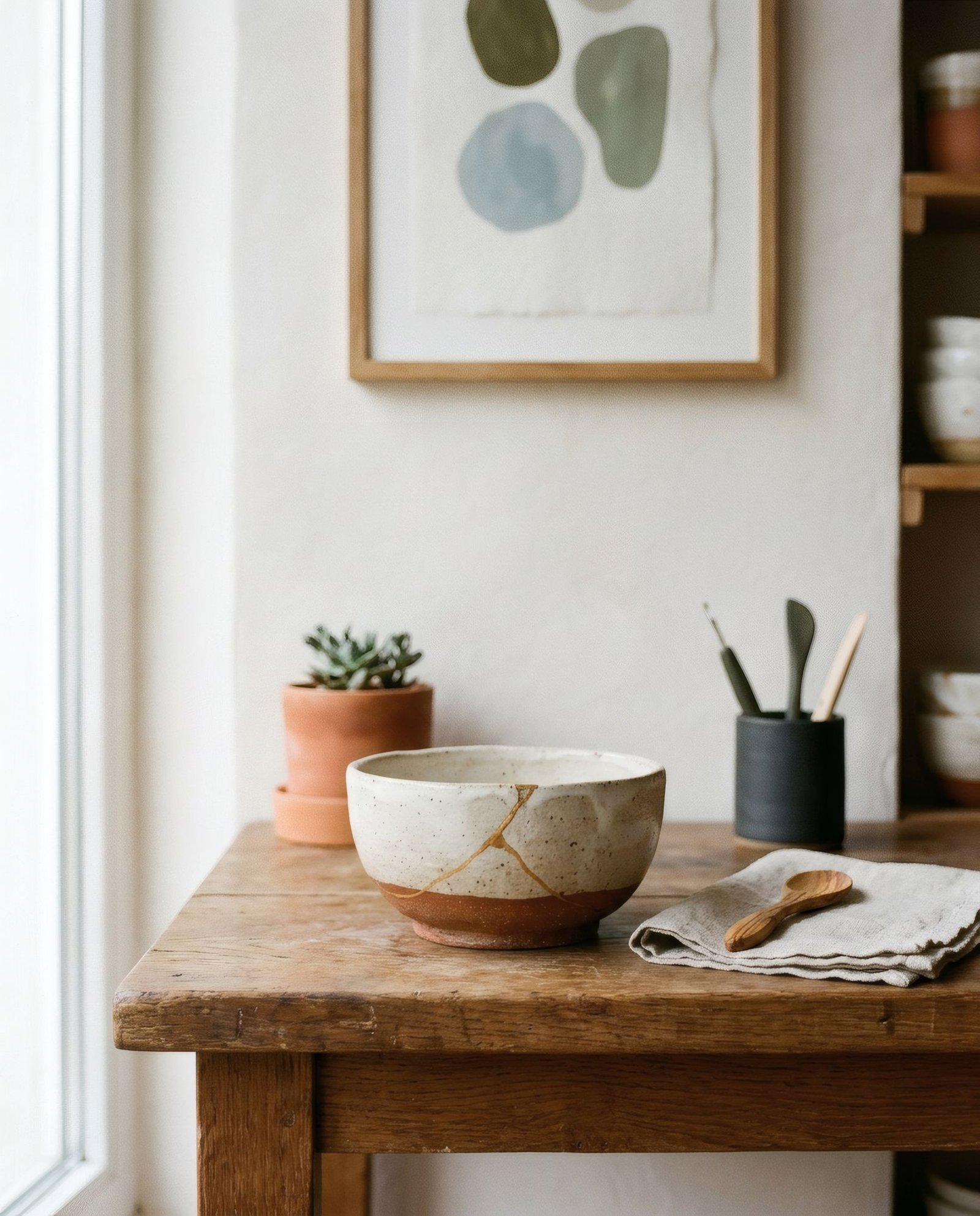
In recent years, «wabi-sabi» has become a familiar phrase in interiors magazines and furniture catalogues. It usually comes with images of pots with uneven rims, unvarnished wood, crumpled linen and roughly textured walls. All of that has something to do with wabi-sabi, but it is not the whole of it. Wabi-sabi is, at its origin, a Japanese aesthetic sensibility, deeply tied to a way of understanding the world: the beauty of the imperfect, the incomplete and the changing. Before talking about bringing it home or choosing art to accompany it, it is worth approaching it with some patience and respect, because it is far richer than the simplified version circulating as a trend.
Two words, one sensibility
Wabi-sabi joins two Japanese terms with different histories that have become intertwined over time. Very simply put, wabi is associated with austere simplicity, a rustic, humble beauty born of living with little. Sabi relates to the passage of time and the patina it leaves on things: wear, ageing, the marks of years.
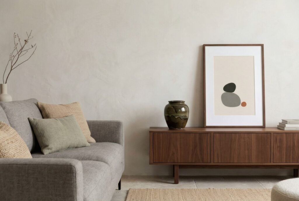
Together they describe a sensibility that finds beauty in the imperfect, the transient and the incomplete. It has roots in Buddhist thought about impermanence and developed especially around the Japanese tea ceremony, where simple, often irregular utensils were valued over luxurious, flawless objects.
It is worth acknowledging that any short explanation, this one included, simplifies a complex tradition that specialists themselves describe with nuance. What follows is an approach, not a closed definition.
What wabi-sabi is not
On its way into Western interiors, wabi-sabi has sometimes been reduced to a shopping list, as if buying an irregular pot and a linen throw were enough to «have» a wabi-sabi home. It has also been confused with minimalism or japandi, with which it shares traits but is not the same.
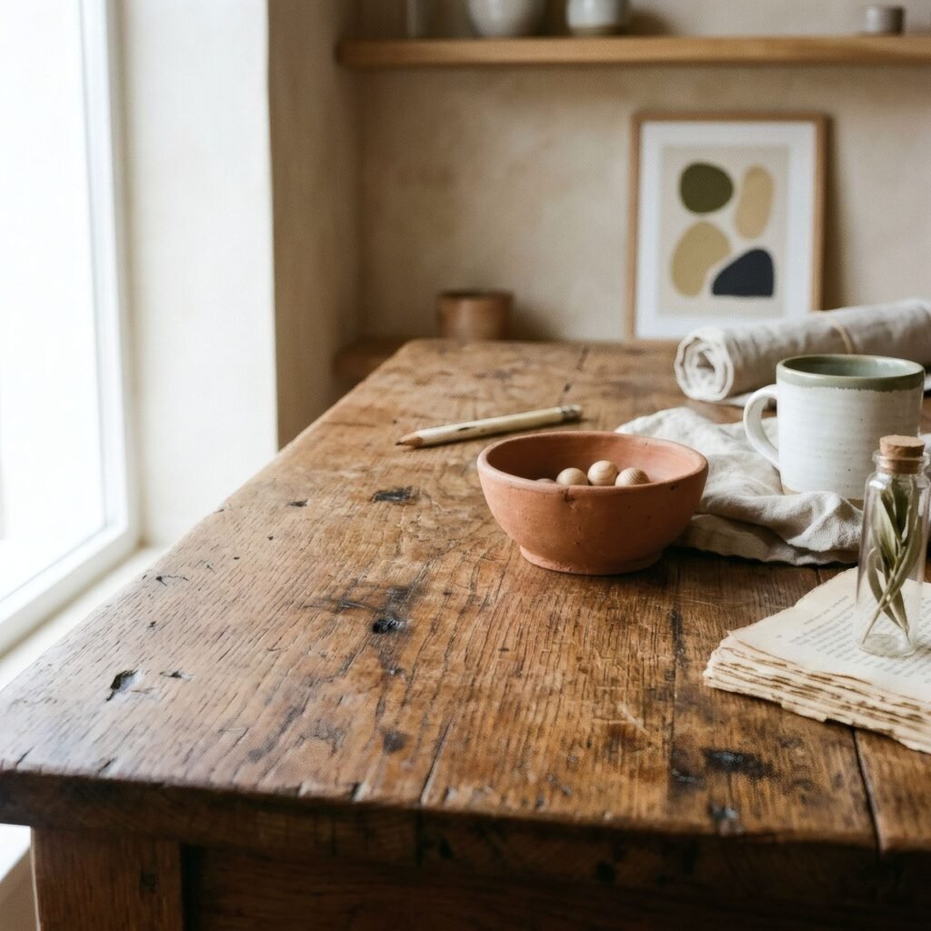
Minimalism seeks reduction and often flawless surfaces. Wabi-sabi accepts, even celebrates, imperfection, wear and irregularity. A wabi-sabi home need not be empty or immaculate; it can be full of used, mended objects with stories. We look at japandi in japandi wall art: what works best?.
What we can learn from it
More than an aesthetic to copy, wabi-sabi invites a change in how we look at what surrounds us. Accepting that things age and are no less beautiful for it. Valuing materials that show time passing: wood that darkens, metal that patinates, ceramics that chip. Preferring the simple and honest to the showy. Finding beauty in what is neither perfect nor finished.
That way of seeing can change many domestic decisions: keeping a marked piece of furniture rather than replacing it, mending a broken bowl, letting a print move from wall to wall over the years.
Printed art and wabi-sabi: an honest tension
This raises an interesting question. A printed artwork is, by definition, a reproduction: not a unique handmade object, and without the irregularity of a crafted piece. Can it belong in a wabi-sabi sensibility?
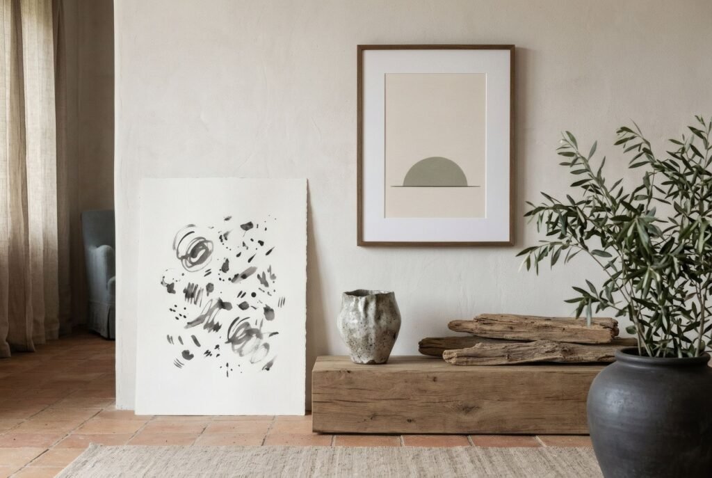
We believe it can, provided it does not pretend to be what it is not. A print cannot be wabi-sabi in the way a hand-made tea bowl is. But it can keep that sensibility company in several ways.
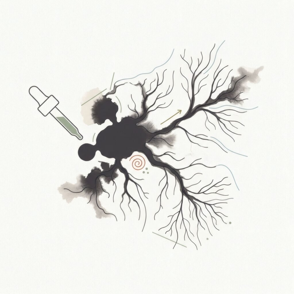
Through the image: loose marks, irregular forms, spreading ink, asymmetric and incomplete compositions, images that suggest rather than show.
Through the palette: muted tones, earths and warm greys, colours that look softened by time rather than brand new.
Through the paper: a textured matte paper, where the material can be felt, comes closer to that sensibility than a glossy, perfect surface.
And through our relationship with it: accepting that the print will change over the years, that its frame will mark, that one day we may take it down and hang it somewhere else. That acceptance of transience may be the most wabi-sabi thing of all.
Choosing art in this spirit
If this way of seeing appeals, look for works that convey calm and modesty rather than spectacle. Compositions with empty space, where what is missing matters as much as what is there. Marks that show the hand and accept imperfection. Colours that seem drawn from earth, stone and old wood. And simple natural wood frames that can age gracefully.
If Japanese art itself interests you, such as ink painting or ceramics, the best way in is to get to know specific works and artists and their context, rather than seeking objects «in Japanese style».
A way of seeing
Wabi-sabi cannot be bought; it is a way of seeing that is learned. It invites us to find beauty in the simple, the imperfect and the changing, and to live with things without demanding that they be perfect or eternal.
Bendíra’s Quiet forms collection includes prints of simple marks, irregular forms and plenty of empty space which, without claiming to be wabi-sabi, share something of that calm and modesty.
Keep reading: Mixing Contemporary Art with Traditional Interiors, Mustard Yellow Interiors: Choosing Complementary Art and Warm Minimalism: How to Decorate with Art.