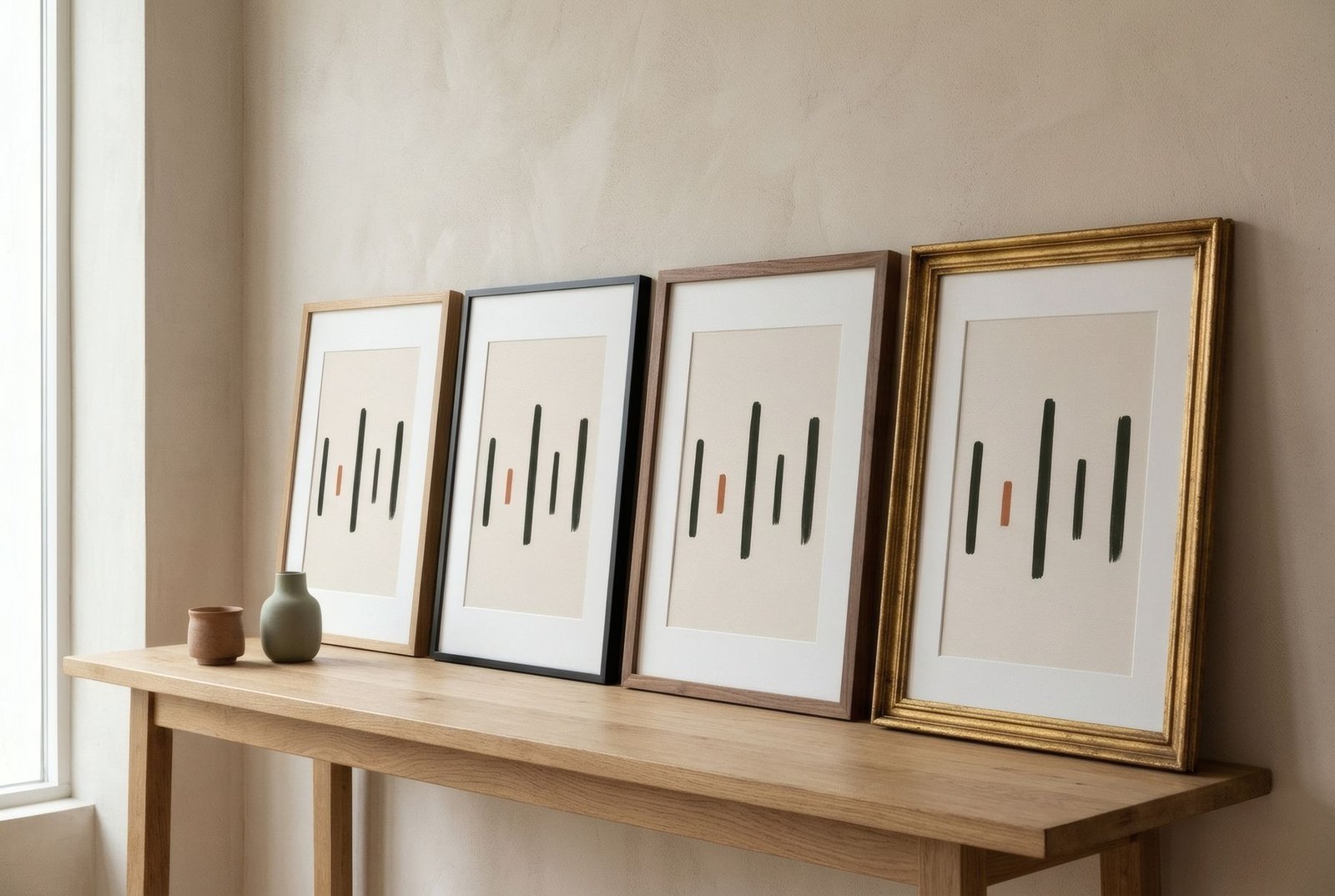
Many framers have a test that says a great deal about how much a frame matters. They place one print inside three different mouldings and ask the customer to choose. Almost always, the difference is so great it looks like three different works. A frame is not a neutral accessory. It changes the perceived size of an image, its temperature, its era and its relationship with the wall. Choosing well does not require expertise, but it does mean looking at three things at once: the work, the room, and what you want to happen between them.
Start with the work
The frame should begin with the image, not the sofa. Before thinking about the room, look at the print and ask what it needs.
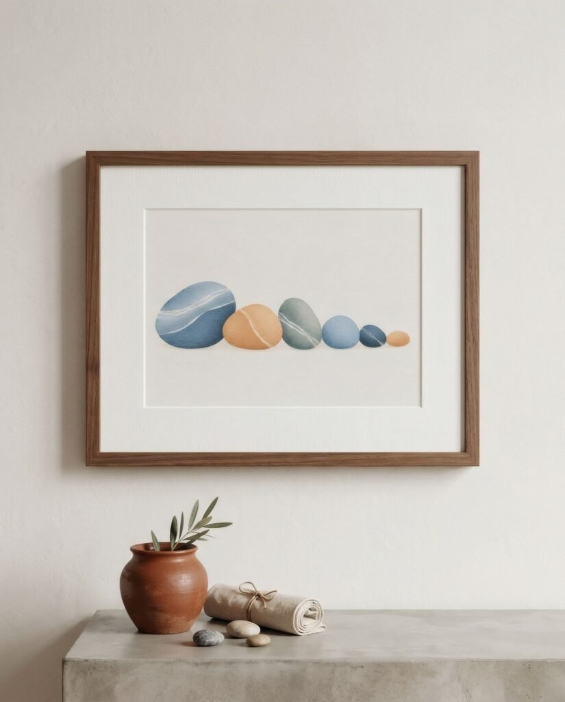
Notice its dominant colours. A frame that picks up one of them, such as warm wood for a work with ochres or black for one with charcoal lines, creates continuity. A contrasting frame, light around a dark work or the reverse, crops it and makes it stand out.
Notice its character too. A work of fine lines and lots of white space wants a delicate frame that will not crush it. One of bold forms or strong colour can take a profile with more body. A classically styled botanical sits happily in natural wood; a contemporary graphic composition in black or aluminium.
Materials
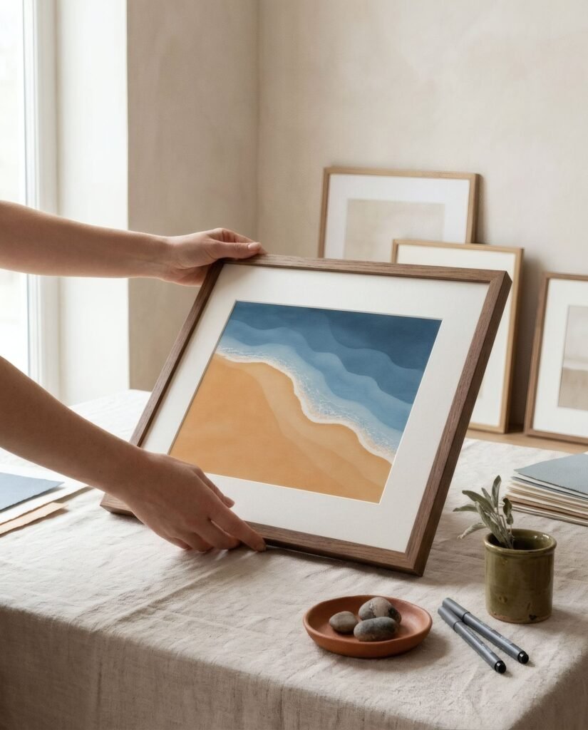
Natural wood is the most versatile choice. Pale oak, ash or beech bring warmth and suit almost any interior of natural materials. Walnut and darker woods add depth and a more sober or classic feel. Because wood is a living material, each moulding has its own grain, a subtlety you notice and enjoy up close.
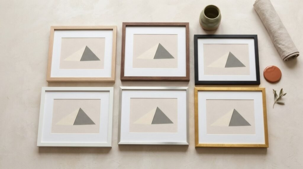
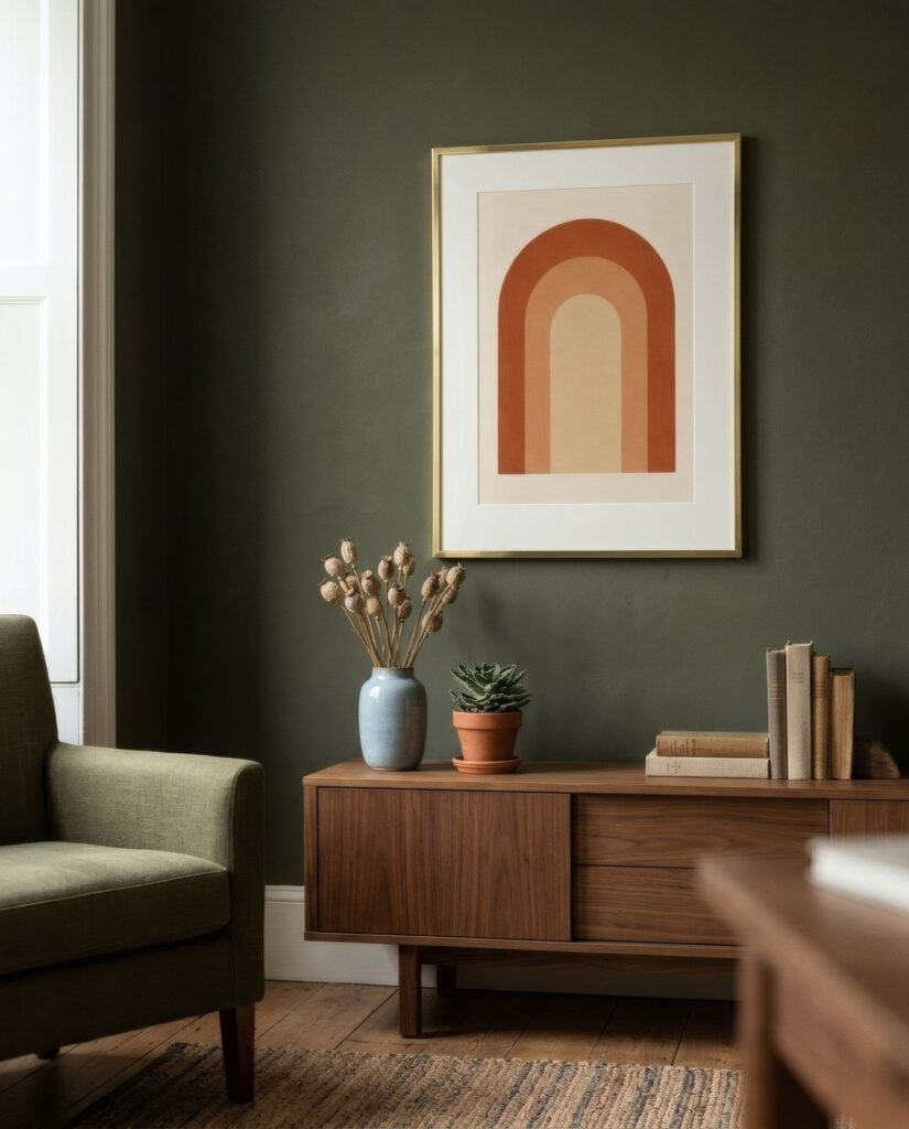
Painted or lacquered wood in black, white or a colour gives a more uniform, graphic finish. A thin black frame is probably the most widely used for graphic work and photography, because it crops the image so precisely. White works on pale walls when you want the work to float, though it can lose definition.
Metal, usually aluminium in black, silver, brass or bronze finishes, offers a very slim profile and a contemporary or industrial air. It is common for photography and clean-lined spaces.
Gilt or ornate frames have their place, especially with classically inspired works or as a deliberate contrast with a contemporary piece, but they need intention, because they easily take over.
Profile: width and depth
The width of the moulding changes how a work reads. A slim profile, around 1–2 cm (0.5–0.75 in), is discreet and modern and lets the image lead. A medium profile, 2–4 cm (0.75–1.5 in), adds presence without weight and is useful at medium and large sizes. A wide profile makes the frame an important part of the work and can lend gravity or character, but it is best kept for pieces that can carry it.
As a rough guide, the larger the print, the wider the profile can be without looking excessive. A small print in a very wide frame can look smothered, unless that is the effect you want, softened by a generous mount.
The mount
The mount, or mat, is the card surrounding the image inside the frame, usually in white, bone or cream. It has two jobs. Aesthetically, it gives the work air and increases its presence. For conservation, it separates the print from the glass and stops it sticking to the glazing in damp conditions.
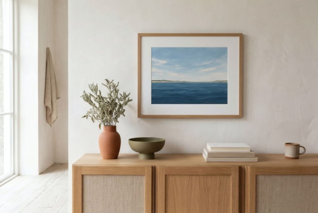
A mount of 5–8 cm (2–3 in) usually works very well with medium prints. A wider one, 10 cm (4 in) or more, gives a gallery feel and is very elegant with small works. If you want a work to look more visually settled, you can make the bottom margin slightly deeper than the others, a traditional framing convention. More in what is a mount board? matting art prints explained.
For works meant to last, choose a conservation-grade, acid-free mount so it does not yellow or affect the paper over time.
Relating it to the room
Once you know what the work needs, look at the room. If nearby furniture is wooden, you can repeat that wood in the frame or step away from it with black or white. What tends to jar is a wood that is almost, but not quite, the same. We explain this in how to pair wall art with wooden furniture.
If several prints will hang together, a single frame style is the simplest way to bring coherence, however different the images.
And on a coloured wall, a pale mount helps separate the work from its background and lets it breathe.
Glazing, briefly
The front of the frame counts too. Standard glass is affordable and clear but reflects light. Anti-reflective glass greatly reduces glare, and some glazing filters part of the ultraviolet light, which helps protect colour. Acrylic is lighter and does not shatter into sharp pieces, so it is preferable for large formats or children’s rooms. We compare them in glass vs acrylic for framing art prints.
Ready-made or bespoke
If the print is a standard size, such as A4, A3, 30 × 40 or 50 × 70 cm, you will find ready-made frames, with or without a mount, at reasonable prices. Bespoke framing costs more but lets you choose moulding, mount and glazing freely, and is worth it for the main piece in your home or an unusual format. Before buying, measure the print carefully: how to measure an art print before buying a frame.
The frame that disappears
The best frame, very often, is the one you do not notice. It suits the work and the wall so well that the eye passes straight through it to the image.
Bendíra prints are supplied unframed and in standard sizes, precisely so that you can choose the frame that suits your home, ready-made or bespoke.
Keep reading: Matte vs Satin Paper for Art Prints, Art Print Sizes: A Complete Guide and Framed vs Unframed Art Prints: Which to Choose?.