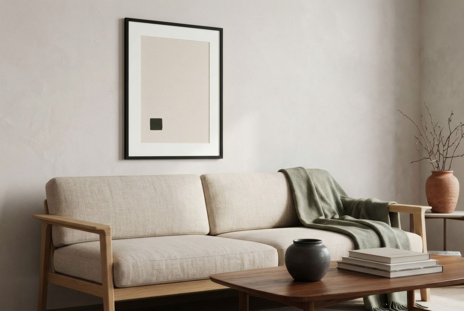
Walk into a few homes, cafés or shops and you will see it: old posters are back. Drinks advertisements with curling letters, 1950s exhibition posters, railway and travel posters of seaside towns under improbable skies, film festival programmes. They have an immediate pull, a mix of flat colour, characterful type and nostalgia for an era many of us never lived through. Their return to our walls is no accident, and understanding why they work helps you choose them well. It also helps you bring them into a modern home without creating a stage set, and tell a good reproduction from a careless copy.
Why they draw us in
Posters were designed for something very specific: to catch the attention of someone walking past, in a second, and deliver a message. That urgency forced them to be clear, direct and memorable, with flat, contrasting colour, bold composition, one strong central image and lettering legible from a distance. Everything we admire in them today grew out of that practical need.
Brought indoors, that clarity still works. A vintage poster fills a wall with an energy few artworks have, and its graphic character sits surprisingly well with clean-lined contemporary interiors. Posters tell a story too: a place, a period, a way of seeing the world. Some people choose the poster of the city where they were born, a festival from their youth, or a brand woven into family memory.
A little visual history
The modern illustrated poster owes a great deal to colour lithography, which in the second half of the nineteenth century made it possible to print large, vivid images affordably. In Paris, artists such as Jules Chéret, Henri de Toulouse-Lautrec and Alphonse Mucha turned the city’s walls into an open-air gallery.
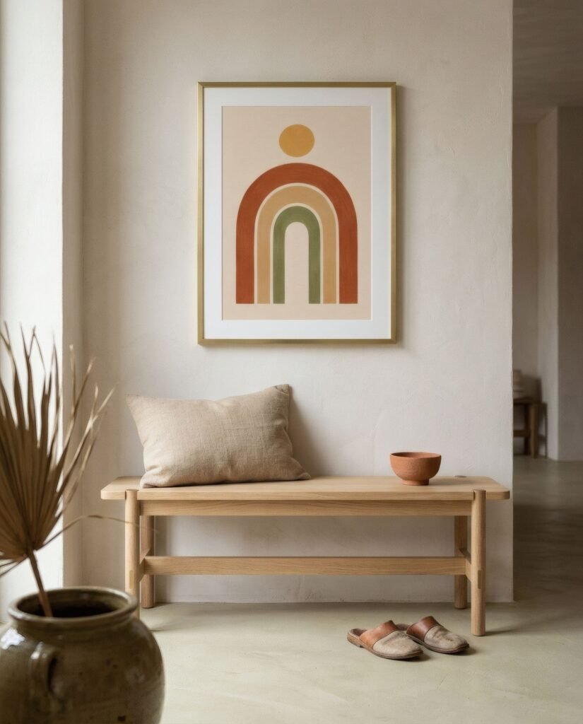
Then came Art Deco posters in the 1920s and 30s, with their elegant geometry and stylised type; the great railway and travel posters, which in Britain commissioned many notable artists; film posters; and the mid-century graphic renewal led by Swiss design and its rigorous grid. Each period left a recognisable language. We tell that story in more detail in a brief history of the European art poster.
Lettering takes centre stage
If one element defines a vintage poster, it is the lettering. Unlike most pictures, a poster contains text, and that text is integral to the composition. The hand-drawn letters of Art Nouveau, the geometric forms of Art Deco, the clean sans-serifs of modern design: each type style places the poster in its time and gives it character.
So when choosing a poster for home, look closely at the type. Elegant, well-drawn lettering may be what you enjoy most, day after day. Think about the words too. Do you want to read the name of that liqueur, that spa town or that exhibition every morning? If so, go ahead.
Styling without a theme-park effect
The risk with vintage posters is the themed look: a home that resembles a retro café or a period shop window. A few simple principles help avoid it.
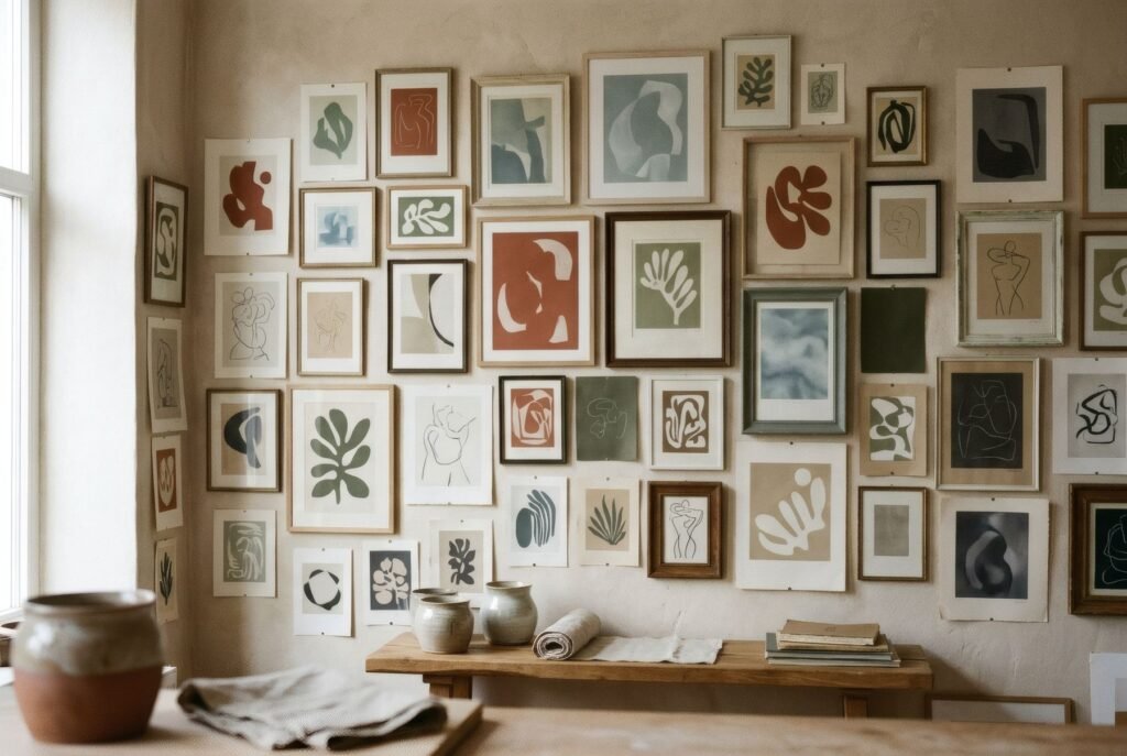
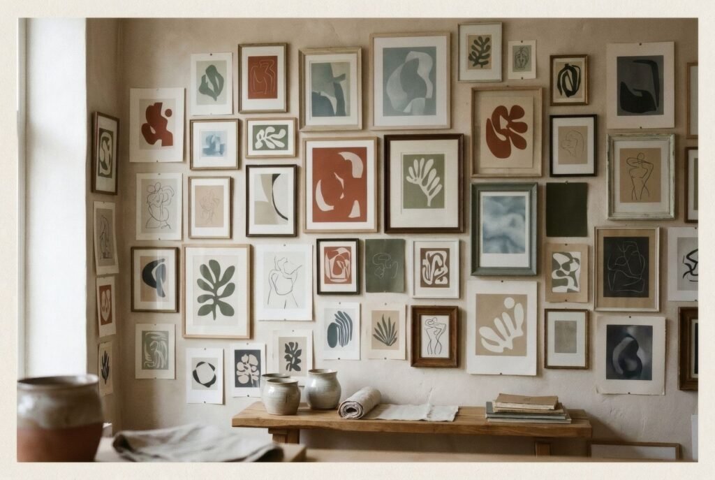
The first is restraint. One vintage poster on a wall, surrounded by contemporary furniture and calm, has real impact. Six in the same living room begin to look like a themed collection.
The second is contrast of era. A 1930s poster above a contemporary sofa, beside a modern lamp, looks fresh. The same poster in a room full of objects from the same decade tips into nostalgia. We explore this in how to style retro art in a contemporary home.
The third is the frame. A simple, slim, contemporary frame in black, pale wood or metal lets the poster read as graphic art. An ornate or faux-antique frame reinforces the period effect.
The fourth is palette. If the poster is very bright, keep the room more neutral so it can breathe. If its colours are faded, it can live with more colour around it.
Original, reproduction, reinterpretation
This deserves some care. «Vintage poster» in interiors can mean three very different things.
An original poster is a copy printed at the time. Some are sold through specialist dealers and auction houses, and their value depends on rarity, condition and artist. They are collectors’ objects and need specific conservation care.
A reproduction is a new print of an old poster, made from an original or a digitised image, and this is where responsibility comes in. Many old posters are in the public domain because, in the UK and EU, copyright generally expires seventy years after the author’s death. But not all of them are: a 1950s poster may still be protected, and some brands and logos carry rights of their own. A responsible reproduction starts from a public-domain or licensed original and takes care over the quality of the scan, so that detail is not lost and colours are not distorted.
A reinterpretation is a new work, made today, that draws on the language of old posters, their type, flat colour or composition, without copying any particular one. It is not a vintage poster, but it can carry the same appeal in a contemporary voice.
Knowing which you are buying matters, for price and out of respect for artists and their work.
One poster, one wall
Picture an entrance hall with off-white walls and a pale wood bench. Above it hangs a 50 × 70 cm Art Deco-inspired poster with a stylised sun and geometric lettering in ochre and petrol blue, in a slim black frame. Nothing else is on the wall. It is the house’s first greeting and, at the same time, a small window onto another era.
If you are looking for graphic pieces in that spirit, Bendíra’s collections include contemporary prints of flat forms and calm colour that converse with poster traditions without imitating them.
Keep reading: Minimalist Art: Less Is More, Botanical Art: From Scientific Illustration to Interior Design and Art Deco Posters: Visual Features and History.