
Some images take you somewhere before you’ve left the house. A train slicing diagonally across a landscape, a beach reduced to three bands of colour, an ocean liner seen from below like a building. Travel posters from the first half of the twentieth century had a very practical job, selling tickets, yet many ended up as collectors’ pieces and landmarks of graphic design. They still hang on walls all over the world, as reproductions, contemporary reinterpretations or carefully framed originals. Understanding where that look came from helps you see them better, and choose them more wisely.
Selling a place with a picture
The travel poster was born with modern tourism. As railways, shipping lines and later airlines competed for passengers, they needed more than timetables and fares: they needed to make people want a destination. Posters on station concourses, platforms and in booking offices became their best tool.
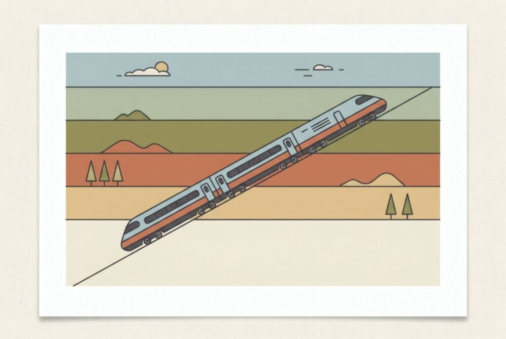
The challenge was considerable: convey, in an instant, to someone hurrying past, the promise of a place. That pushed designers towards a language of distillation: few shapes, flat colour, a clear message, lettering legible at a distance.
London: the Underground as patron
One of the most influential chapters was written below ground. In 1908, according to the London Transport Museum, Frank Pick took charge of publicity for the Underground. Until then its posters had been largely text-based, with little sense of identity. Pick changed the approach, commissioning established commercial artists and emerging designers in a wide range of styles, with a clear aim: to encourage Londoners to take the Tube to the countryside, the museums, the theatres.
Among the artists he championed was Edward McKnight Kauffer, whom he began commissioning in 1915 and who produced many of the network’s best-known posters up to the Second World War. Many historians see the 1920s and 1930s as the high point of London transport poster design.
The look of speed
On the Continent, railway and shipping companies also turned to great poster artists. In France, A. M. Cassandre took the travel poster towards a geometric synthesis close to Art Deco: his posters for long-distance trains, such as Nord Express (1927), and for the liner Normandie (1935) turned machines into icons of modernity. There’s more in Art Deco and graphic design.

What many of these posters share is a way of seeing: exaggerated perspective, diagonals that suggest movement, monumental machines, landscapes reduced to planes of colour. The printing method, largely lithographic, favoured the flat, saturated colours we now associate instantly with the period.
How to recognise the language
Look at a handful of interwar travel posters and patterns start to emerge. Simplification: mountains, waves or buildings pared down to geometry. A limited palette: few inks, often four or five, with strong contrasts. Integrated lettering: the destination or company name is part of the composition, not an afterthought. And a dramatic viewpoint: looking sharply up or down, horizons so low the sky becomes vast.
Those same qualities are why these posters work so well on a domestic wall: they read from across the room, have a clear palette and bring a note of nostalgia without fussy detail.
Before you hang one: originals, reproductions and rights
A note of caution here. Period originals are collectors’ objects, often fragile, and sell through specialist auctions. Reproductions are far more common, but not all are legitimate: many twentieth-century poster artists’ works remain in copyright, which in the UK and most of Europe lasts until seventy years after the artist’s death, and company names and logos may be trademarks. A poster being old doesn’t make reproducing it free.
If you’re buying a reproduction, look for ones published by museums or licensed collections, such as transport archives, which often sell official prints. And if it’s the look rather than a particular poster that draws you, there are contemporary illustrators working in that language, with their own destinations and their own eye. We discuss public-domain art and its limits in public domain art: what you can and can’t do.
A look that keeps travelling
The travel poster was made to sell tickets and ended up teaching us to see places differently: pared to essentials, turned into colour and shape. That’s why it still works on our walls. It doesn’t show a destination so much as the wish to go.
Bendíra prints aren’t travel posters, but some, such as Harbour or Late afternoon, share that way of reducing a place to a few bands of colour.
Keep reading: A Brief History of the European Art Poster, Minimalist Art: Less Is More and Photography as Wall Art.