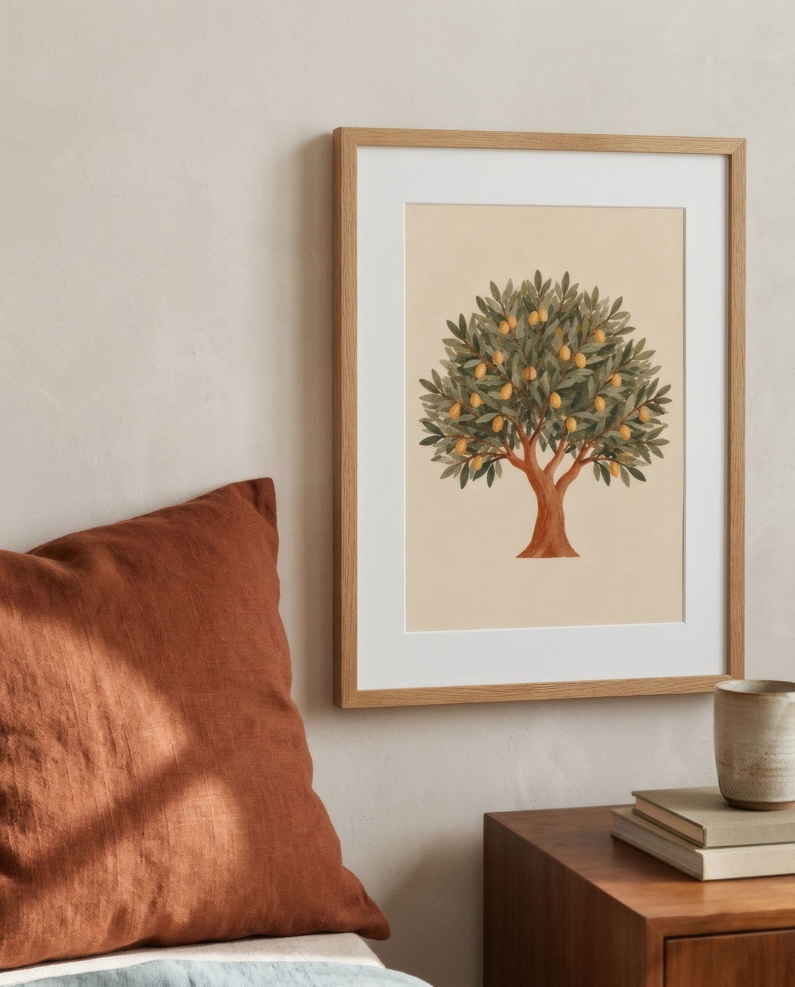
Patterned textiles are one of the quickest ways to bring a room to life. A geometric rug, floral curtains, striped cushions, an embroidered throw handed down through the family. They bring colour, movement and personality. But when it comes to hanging art in the same room, a reasonable worry creeps in: is it going to be too much? How does a print sit with everything already going on across the sofa and the floor? The answer isn’t to avoid pattern. It’s to understand how patterns talk to each other.
Scale: the rule that sorts everything
The single most useful tool for combining patterns, textiles with textiles or textiles with art, is scale. Two patterns of the same size compete: the eye doesn’t know where to settle and the whole thing gets noisy. Two patterns of very different scales coexist, because each occupies its own layer of attention.
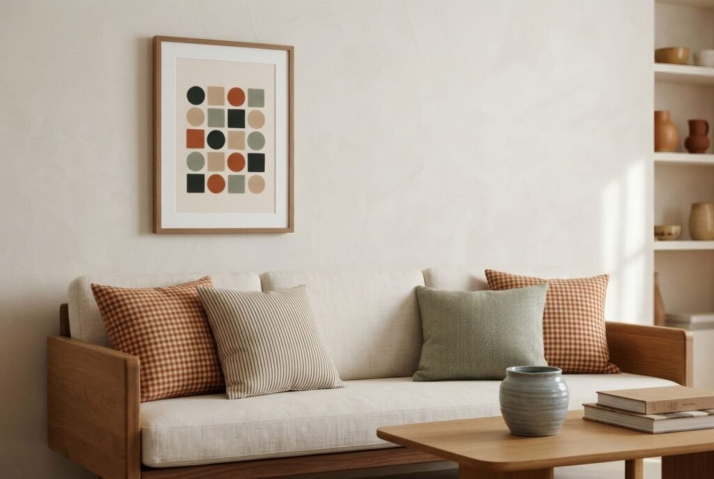
For art, that means if your textiles have a small, dense pattern, a gingham, a ditsy floral, a fine stripe, a print with large, simple shapes works beautifully. And the other way round: if the rug or curtains have a big pattern, bold leaves or broad geometric blocks, a piece with finer detail or a more restrained composition gives the counterpoint.
Colour as the thread
The second tool is colour. When the art shares one or two colours with the textiles, even in small amounts, an instant link forms. A terracotta cushion and a print with a touch of terracotta; a blue rug and a piece with muted blues. Everything doesn’t need to match, and it’s better if it doesn’t, because a room where everything is one colour feels flat. One connecting thread is enough.
What tends to work less well is bringing in a whole new palette through the art. If the sofa has ochre and green cushions and the print is fuchsia and turquoise, the room splits into two conversations that aren’t listening to each other. We look at building a coherent palette in how to match art colours to your room.
Give the eye a rest
In a room with several patterned textiles, art can play one of two roles. It can join the pattern, as one more element in the mix, or it can be the place where the eye rests.
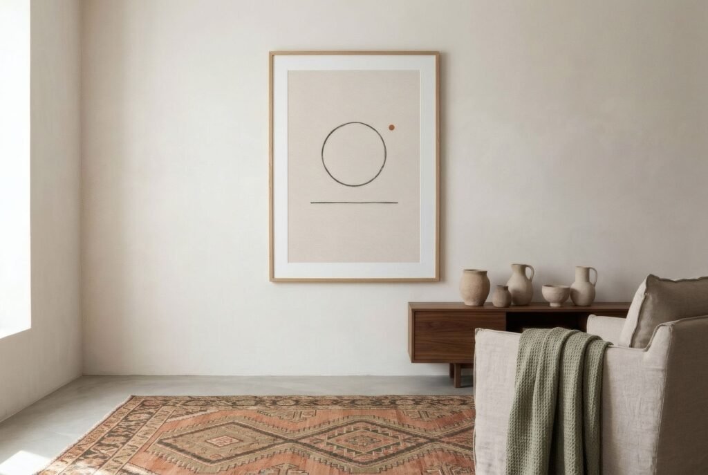
The second is usually the safer bet when there’s already a lot of movement. A calm piece, with plenty of empty space, simple shapes or a pared-back palette, framed with a generous mount, acts as a pause. It’s the same logic as leaving a plain wall between two patterns: the contrast with calm makes the pattern sing.
The first, joining in, works when the room has a neutral base and only a few textiles: a single patterned cushion, a quiet rug. Then a print with more rhythm, pattern or colour can become a point of energy without overloading the room.
What happens between the art and the nearest textile
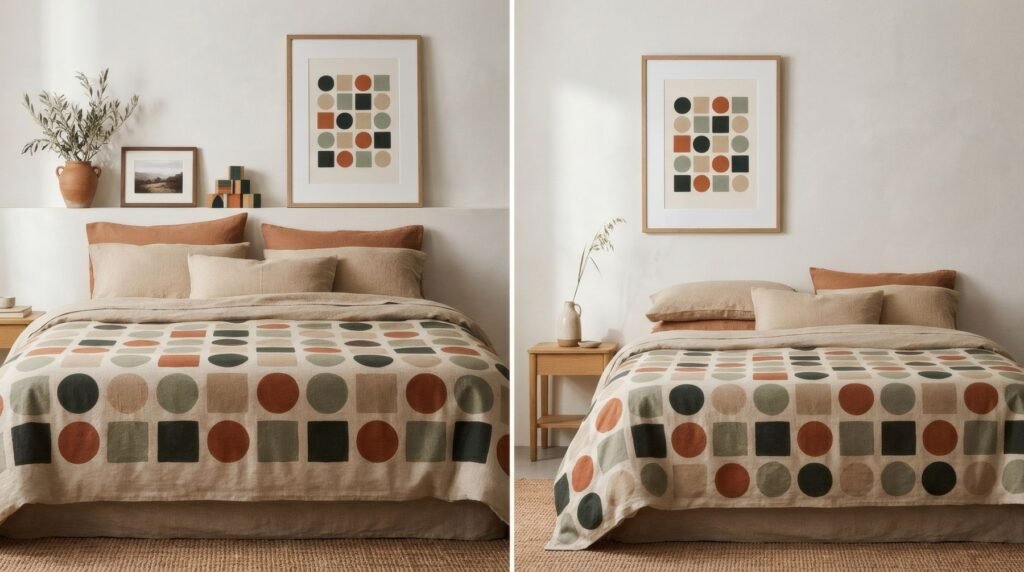
The relationship that deserves most attention is between the art and the textile closest to it. Above a sofa with patterned cushions, the print sits a few centimetres from them, and how they get on really shows. Above a bed with a busy bedspread, the same. A white or cream mount works as a border here, and a simple frame avoids adding yet another decorative element.
Curtains are usually on a different wall, so their relationship with the art is more about overall atmosphere than proximity.
Pattern on pattern
Can you hang a patterned print in a room full of patterned textiles? Yes, on two conditions: a clear difference in scale, and at least one shared colour. Maximalist homes do it all the time, and do it well. But it’s the option that needs the most testing: hold the print against the wall before hanging it, step back, and see whether your eye finds somewhere to land.
A conversation, not an argument
Textiles and art can live together quite naturally when each has its place: different scales, a colour that ties them together and somewhere for the eye to rest. Less a set of rules than a way of listening to what the room is already saying.
For rooms rich in textiles, the broad shapes and pared-back palette of the Quiet forms prints tend to provide that pause.
Keep reading: How to Choose Art for Maximalist Interiors, Wall Art Ideas for Rooms with a Colourful Sofa and How to Pair Wall Art with Wooden Furniture.