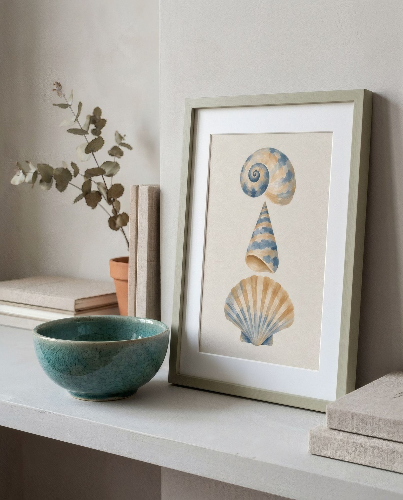
Some corners of a home look like living still lifes. A hallway console with an earthenware vase and a dried branch, an earthy print above it. A sideboard with three unevenly glazed bowls and, leaning behind them, a piece of soft shapes. These arrangements don’t shout, but they say calm and care. And they nearly always share something: a conversation between something flat, the paper, and something with volume, the pottery. When that conversation works, the corner becomes one of the loveliest spots in the house.
Flat and round
Prints and ceramics complement each other because they’re opposites in the essentials. A print is flat, seen face-on, telling you something through an image. A pot has volume; you walk round it, it changes with the light through the day, you pick it up. Together they create a depth neither has alone: the eye moves from the plane of the wall to the object in front and back again, like travelling across a small landscape.
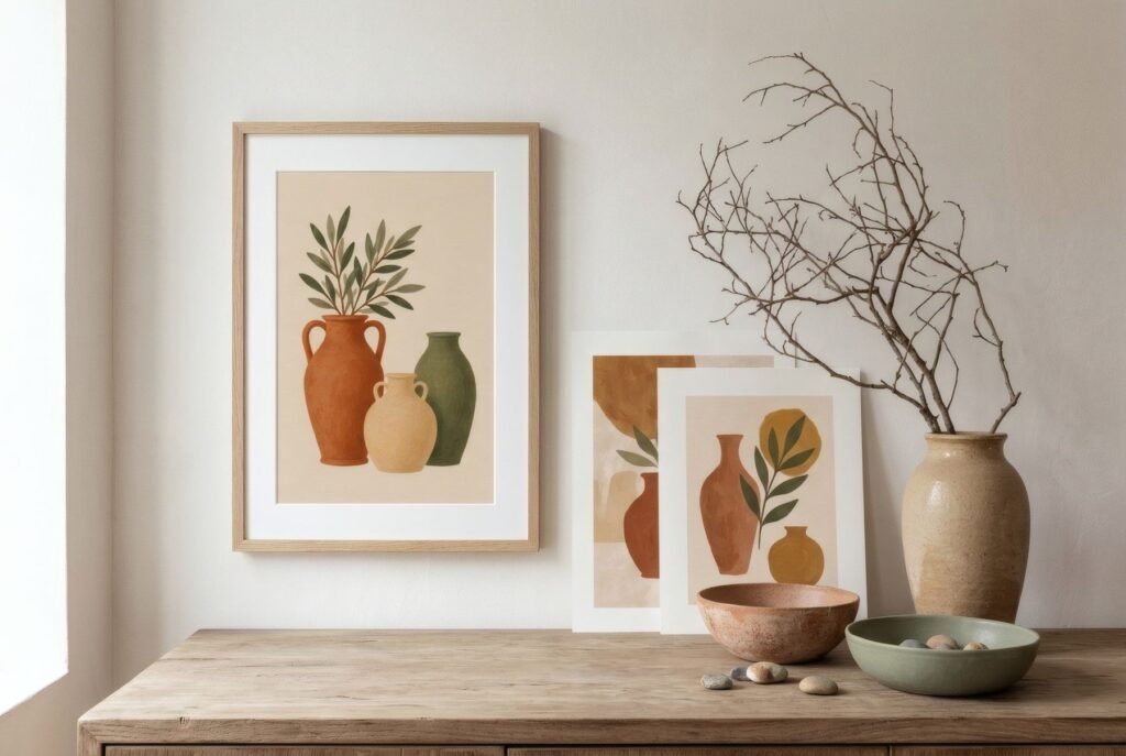
That’s why the best art-and-ceramics arrangements don’t treat the two separately, but as one scene.
Colour: family, not copy
The most natural link is colour. Handmade pottery tends towards earthy palettes: red clay, sandy stoneware, white glazes, celadon greens, cobalt blues, matt blacks. Many of the same palettes turn up in contemporary art with a Mediterranean or natural feel.
It works beautifully when print and pot belong to the same colour family without being identical. A terracotta vase with a print in terracotta and sand. A green-glazed bowl with a piece in sage and olive. White bowls with a bone-and-charcoal abstract. If the colours match exactly, it can look like a shop window; from the same family, it feels natural.
Shape with shape
Beyond colour, shape offers another conversation. Rounded pottery, full-bellied vases, bowls, jars, talks to art with organic forms, curves, soft silhouettes. Straight-sided or cylindrical pieces, to geometric compositions.
Contrast works too: a print of straight lines with a very organic vase creates a pleasing tension. What matters is that the relationship looks intended.
Heights and scale
In practice, the arrangement comes down to heights. A few pointers that tend to work.
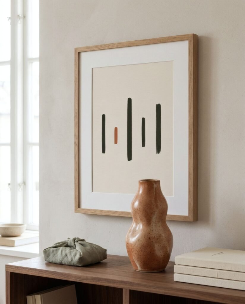
One tall piece, a vase with branches or a large jar, to one side, rising in front of the edge of the print without covering its centre. One or two low pieces, bowls, a small bottle, on the other side or in front, for balance. Odd numbers, three objects rather than two or four, usually make livelier groupings. And always leave some clear surface: if the furniture is crowded with pots, the print loses its presence.
On scale, the print and the tallest object should be in proportion. A tiny vase beneath a huge print looks lost; a huge vase in front of a small print eclipses it.
Hang or lean
With ceramics, leaning the print rather than hanging it makes for particularly lovely arrangements, because art and objects sit in the same layer of depth and can overlap slightly. A vase in front of one corner of the print creates a natural layer. If you do hang it, keep it low, 10–15 cm (4–6 in) above the surface, so it reads together with the objects. There’s more in how to lean art on ledges and furniture.
The light
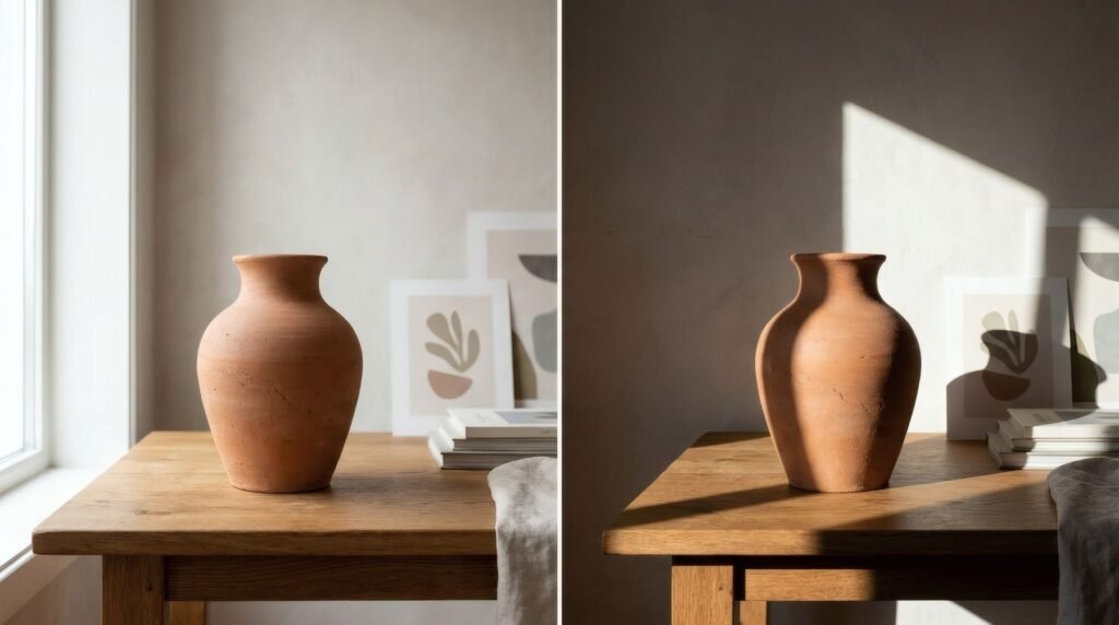
Pottery changes a lot with light: a glossy glaze reflects, matt clay absorbs, an uneven surface throws little shadows. Side light, from a window or a table lamp, brings out the volume of the ceramics and the texture of matt paper at the same time. It’s the light of still-life painting, and not by accident.
A still life of your own
Arranging art and ceramics is a way of composing a still life in your own home, out of things you love. Colours from the same family, shapes in conversation, balanced heights and a little space: with that, a simple piece of furniture becomes a small stage.
Southern light prints, in terracotta, sand and olive, share a palette with most earthenware and stoneware; Terracotta sun, leaned behind a vase, is a good example.
Keep reading: Modern Mediterranean Interiors and Wall Art, Styling Landscape Art Prints Above a Sideboard and The Contemporary Still Life in Painting and Photography.