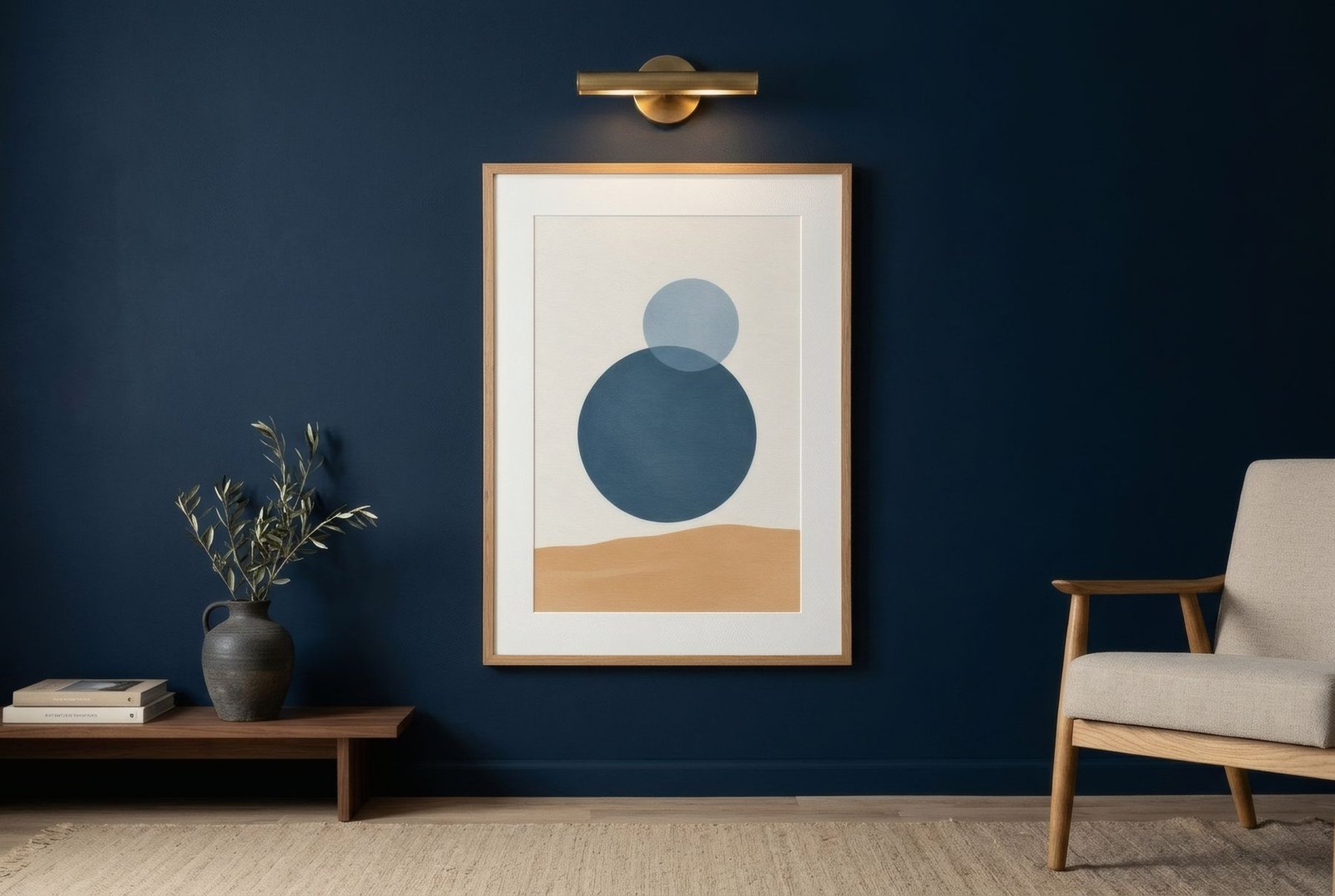
Painting a wall a colour is one of the most transformative decisions you can make at home. Sage green, navy, terracotta, deep charcoal: suddenly the room changes temperature, character, almost size. Then it is time to hang art, and the doubts begin. On a white wall almost anything works; on a coloured one, the work enters a far more intense conversation with its background. Well chosen, it can glow as never before. Badly chosen, it can vanish, or compete until the room feels overloaded. The key is to decide what relationship you want between the work and the colour: contrast, harmony or a bridge.
The wall is already a lead
The first thing to accept is that a coloured wall already has plenty of presence. It is not a neutral backdrop but an element of the composition in its own right. So art hung on it does not need to bring as much colour as it would on a white wall. Often what it needs most is light, contrast or a point of calm.
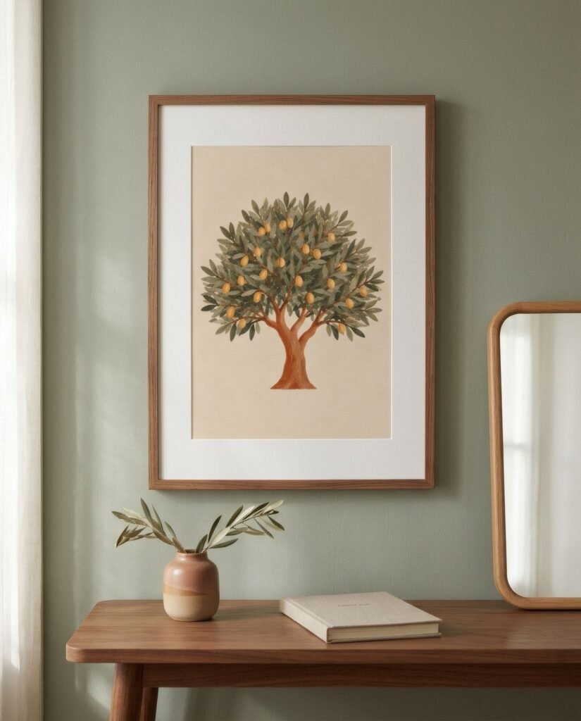
That has a practical consequence. On strongly coloured walls, less art usually works better than more. One well-chosen work, or a pair, lets wall and work show each other off. An abundant gallery on a coloured ground can feel overwhelming.
Strategy one: contrast of value
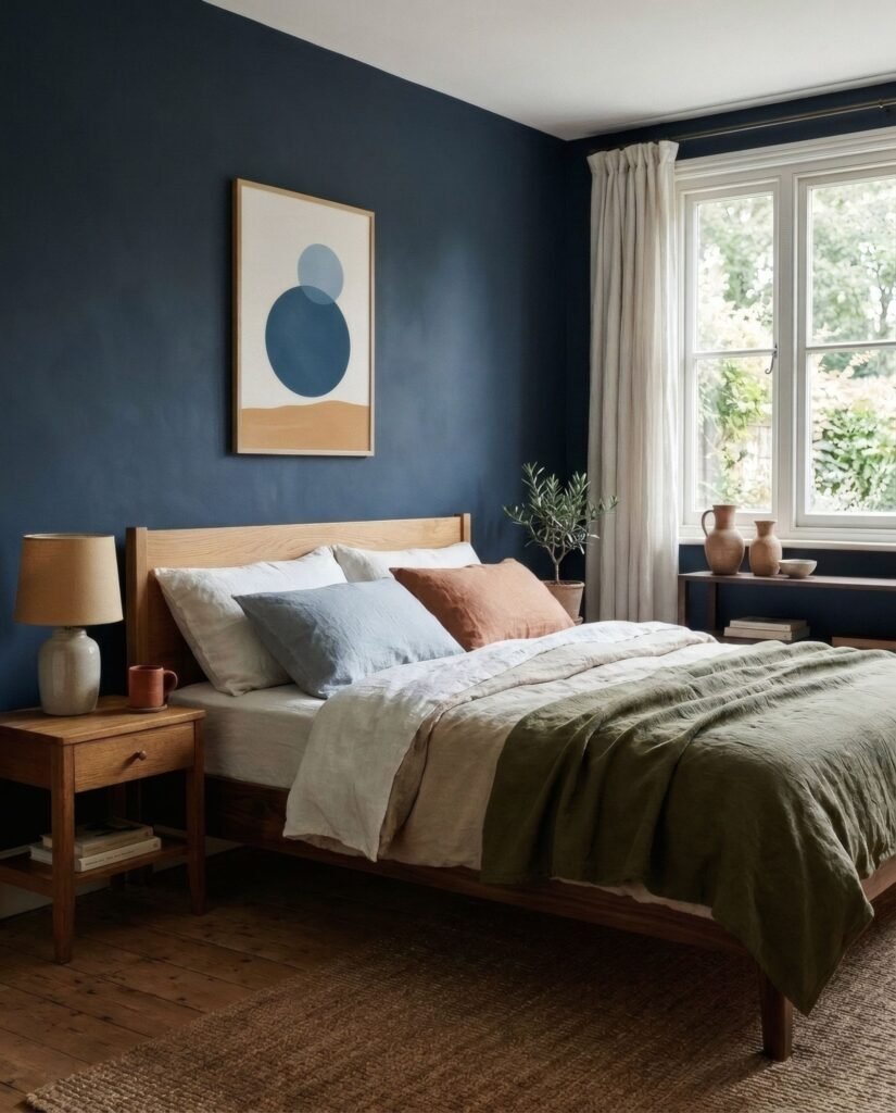
The most effective way for a work to stand out on a coloured wall is for it to have a very different tonal value. On a dark wall, such as navy, forest green or charcoal, works with pale grounds in cream, bone or off-white seem to light up, almost like windows. On a pale coloured wall, such as soft sage or dusky pink, works with darker areas add depth.
This is the safest strategy, because it works with almost any wall colour.
Strategy two: tonal harmony
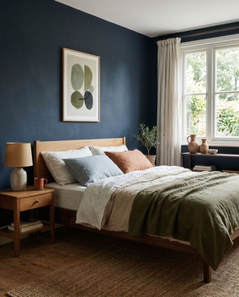
Another option is to choose works from the same colour family as the wall, but in other tones. On a sage wall, a print in deeper greens with some cream; on a terracotta wall, a work in sands, ochres and some brown. The result is enveloping, almost monochrome, with a sophisticated calm.
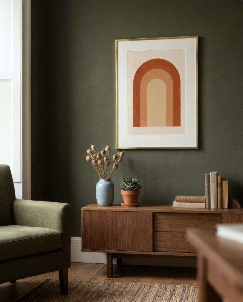
The risk is that the work merges into the wall and loses presence. To avoid that, make sure it has enough internal contrast, with some lighter or darker areas, or let a mount separate it from the background.
Strategy three: a complementary accent
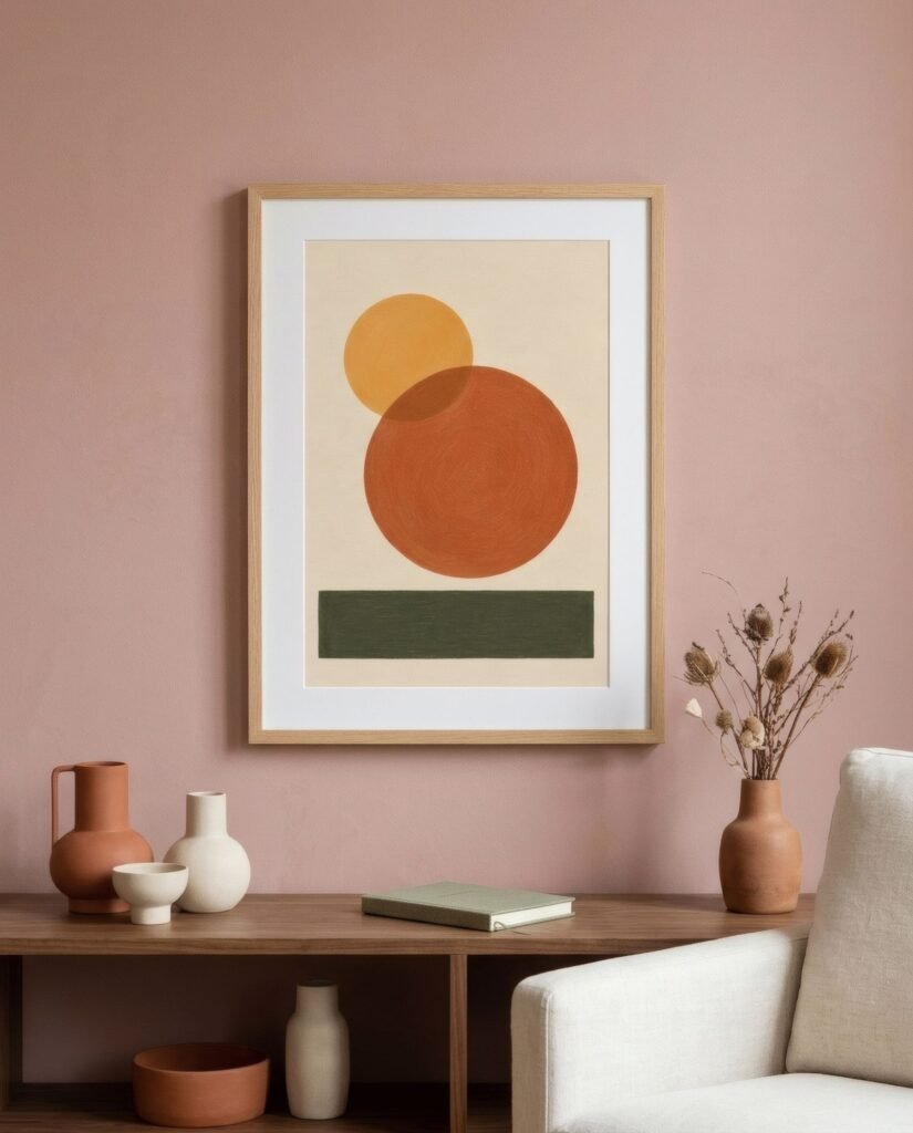
A third, bolder route is to choose a work with an accent in the colour complementary to the wall. On deep blue, a touch of terracotta or ochre; on green, a dusky pink or soft terracotta; on terracotta, a blue. That contrast makes both colours sing.
It works best when the accent occupies a small part of the work, on a more neutral ground. A work entirely in the complementary colour can be too much.
The mount, your great ally
On a coloured wall, a mount becomes invaluable. A wide white or bone mount creates a frame of light around the work, separating it from the wall and making it stand out whatever its palette. It is almost foolproof on dark walls and helps greatly when the work shares colours with the wall.
Frames
Frames change a lot on coloured walls too. A white frame on a dark wall crops the work crisply and gives it a luminous feel. A natural wood frame adds warmth and suits almost every colour, especially greens, blues and terracottas. A black frame works well on pale coloured walls and adds structure, though it can get lost on very dark ones. A gold or brass frame on deep blue or dark green creates an elegant, warm contrast.
Dark walls
Dark walls deserve a special note. They can make art glow in a very particular way, especially when well lit. A wall light or spotlight aimed at a pale-ground work on a navy or charcoal wall creates an almost gallery-like effect. Take care with lighting, though. In dim conditions a dark wall can swallow the work into shadow.
Soft coloured walls
Walls in soft colours, such as pale sage, dusky pink, sky blue or pale yellow, are easier to work with. They accept pale-ground works with colour accents and also more intense pieces, provided these do not fight the wall’s tone. Here, tonal harmony often gives lovely results.
Choosing without overloading
A coloured wall and a work of art can enhance each other, provided they do not compete. Decide whether you are after contrast, harmony or a complementary accent, lean on the mount and frame, and you can dress the wall without overloading the room.
If you have a coloured wall, Bendíra’s pale-ground prints, in bone, sand or mist with a single accent of colour, stand out especially well against strong tones such as green, blue or charcoal.
Keep reading: How to Style Retro Art in a Contemporary Home, Using Wall Art to Connect Open-Plan Rooms and How to Match Wall Art with Your Colour Palette.