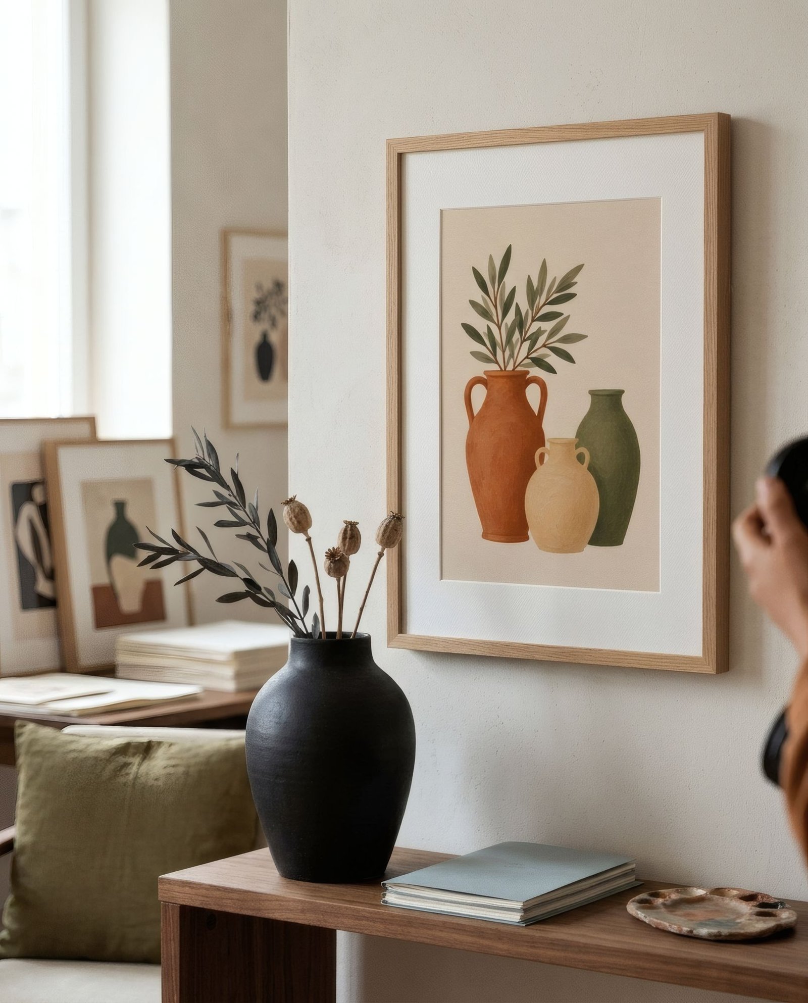
There is something about black-and-white images that always seems elegant. Perhaps it is because, with colour taken away, what remains is essential: light, form, contrast and composition. A black-and-white photograph of a façade, an ink drawing, a graphic print of black shapes on white: all have a clarity that suits almost any home. That is exactly why they are so easy to combine, though not quite as easy as it looks. Well chosen, they bring structure and sophistication; poorly placed, they can feel cold or disconnected from the rest of the room. The key lies in the kind of contrast, the frame, and the relationship with the furniture and colours around them.
Not all black and white is the same
Before combining, it helps to distinguish. Black and white covers very different registers.
High-contrast images, with deep blacks, clean whites and few mid-greys, are graphic and bold. They have strong presence and work as accents.
Images with a wide tonal range, spanning a whole scale of soft greys, are more delicate and atmospheric, like a photograph of mist over the sea or a pencil drawing. They settle more easily into calm spaces.
Then there is temperature. Black and white can be cool, with bluish whites and neutral blacks, or warm, with creamy whites and slightly brown blacks, sometimes described as sepia or charcoal. Paper tone matters a lot: on a natural white paper, black and white becomes warmer and more welcoming.
With frames
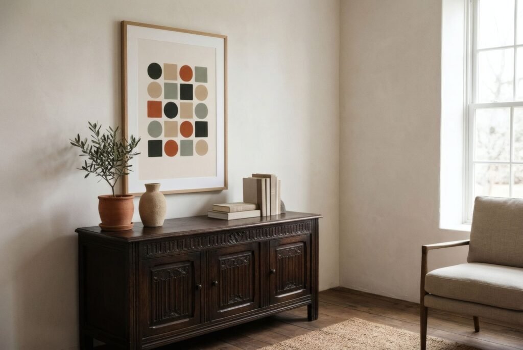
Black and white accepts almost any frame, and each gives a different character. Thin black is the classic: it crops the image precisely and reinforces its graphic side. White merges the work with a pale wall for a contemporary gallery feel. Natural wood, in oak or ash, is perhaps the most interesting option in a warm home: the contrast of material softens the severity of black and white. Dark wood such as walnut adds depth and a classic air.
A wide white mount is almost always right with black and white. It gives the image air and heightens its elegance.
With furniture and materials
The main risk with black and white is coldness, especially in rooms with lots of grey, metal or white. To avoid it, surround it with warm materials: wood, linen, wool, leather, ceramics, plants. A black-and-white photograph above an oak sideboard, beside a ceramic lamp and a plant, looks sophisticated and welcoming at once.
In an industrial or very contemporary home, on the other hand, black and white can underline the character of the space, sitting naturally with metal, concrete and glass.
With colour
One of black and white’s great virtues is how well it lives with colour. In a colourful home, a black-and-white work offers a point of calm, a visual breather among many tones. In a gallery of works in different colours, one or two black-and-white pieces act as a bridge, with a neutral tonal value that competes with none of them.
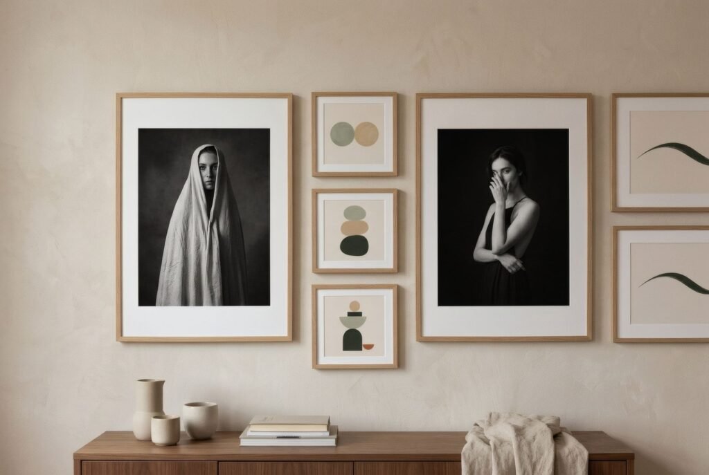
It works the other way too. In a neutral room, a wall of black and white can feel too austere, and a small accent of colour in a cushion, a nearby work or an object balances it. We look at mixing styles in how to mix and match wall art.
Black-and-white arrangements
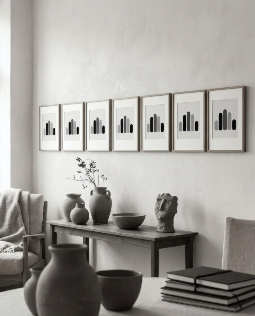
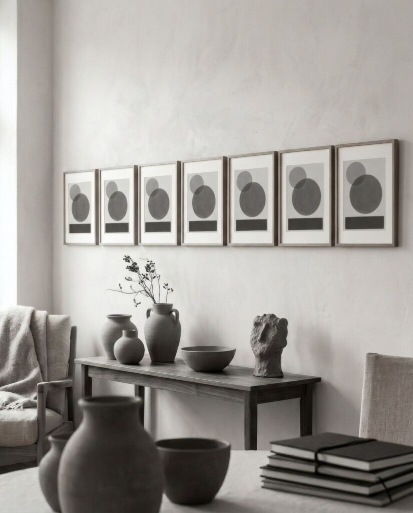
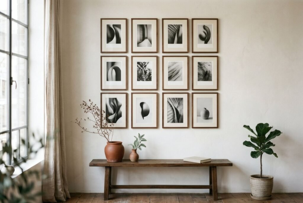
Gallery walls of black-and-white works have natural coherence, because they share a palette. That lets you mix techniques, such as photography, ink drawing, printmaking and graphic prints, and eras freely without losing unity. Matching frames strengthens that coherence further.
A grid of identical black-and-white photographs is one of the most elegant arrangements there is; a free-form group of drawings and photographs in black and white, one of the most personal.
Where it works best
Black and white works in almost any room, but it shines in hallways and entrances, where it brings character in low light; in studies and libraries, where its sobriety suits work; and in clean-lined living rooms, where it adds structure. In bedrooms, gentler versions with a wide tonal range tend to feel calmer than extreme contrasts.
Clarity without coldness
Black and white is one of the most versatile ways to decorate with art: elegant, timeless and easy to combine. To keep it from feeling cold, choose its temperature, surround it with warm materials and give it a frame that speaks to the home.
Bendíra’s prints are not strictly black and white, but the Quiet forms collection works in charcoal and bone, a closely related palette that shares that clarity with a touch more warmth.
Keep reading: Beige Wall Art: How to Add Depth to Neutral Rooms, Green Wall Art: Ways to Use It in Interiors and How to Add Personality to Neutral Interiors.