
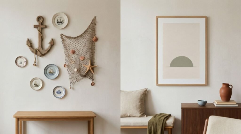
We’ve all seen that seaside cottage. The anchor on the wall, the ship’s wheel over the door, Breton stripes on every cushion, the driftwood sign announcing «Beach», the fishing net strung with starfish. It’s charming the first time, but it rarely survives a second summer. And yet the wish behind it is entirely reasonable: wanting a home to carry the calm of the sea, the light of the coast, that sense of slower time. You can have all of that without any of those objects. In fact, it works better without them.
Evoke, don’t illustrate
The difference between clichéd coastal and contemporary coastal lies in the verb. The first illustrates the sea: it brings in objects that literally represent it. The second evokes it: it gathers the sea’s colours, light, textures and rhythm, and lets the home carry them without spelling it out.
A contemporary coastal home might not contain a single nautical object, and still make you feel close to the sea from the moment you walk in.
The coastal palette
The first tool is colour, and the coast has a far richer palette than navy and white. Blues in every variation, from the washed-out pale of a summer sky to the grey-blue of a winter sea, by way of the green-blue of shallow water. Sands, the full range of warm neutrals, from the off-white of fine sand to the ochre of dunes. The grey-greens of coastal plants, marram grass, sea holly, pines. And the whites of limewash and surf.
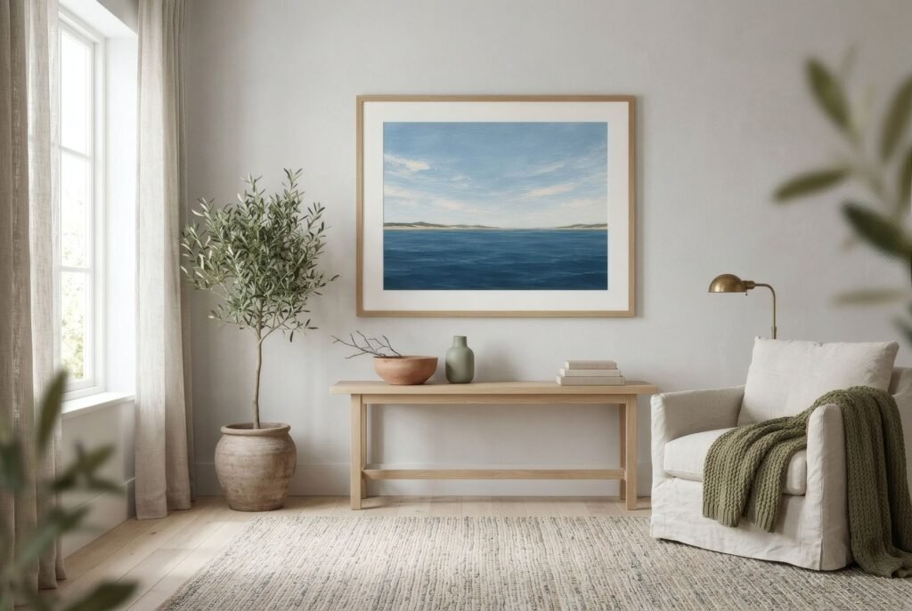
A home in that palette, across walls, textiles and art, feels coastal without anything else.
Art: horizons and abstraction
Art is where the difference between cliché and evocation shows most. Instead of the sailing boat or the lighthouse, there are far more suggestive ways to bring the sea to the wall.
Abstract horizons, a single line dividing two fields of colour, are perhaps the purest way to evoke the sea: the eye fills in the rest. Tidal abstracts, with undulating shapes, layers and shifts of colour, recall moving water without depicting it. Minimal coastal photography, a strip of sand, a wave in the foreground, the waterline, works when it’s restrained. And coastal botanicals, seaweeds, dune grasses, shells drawn with scientific precision, bring a cultured, delicate reference.
What tends to detract is the literal and decorative: boats, lighthouses, anchors, cartoon fish, slogans about the beach.
Texture and materials
The coast is texture too. Washed linen, heavy cotton, sun-bleached wood, natural fibres, unevenly glazed pottery, stone. A contemporary coastal interior leans on those materials, which are what really carry the feel of a slow summer. Art on matt paper in pale or natural wood frames sits with that materiality quite naturally.
Not just for homes by the sea
This approach isn’t only for seaside houses. A city flat can take on a coastal palette and coastal-inspired art to feel brighter and calmer, especially in rooms with good natural light. And in a home that really is by the sea, art can act as an extension of the view from the window, picking up its colours without repeating it.
It’s really about the light
In the end, what makes a home feel coastal isn’t the sea, it’s the light. That bright, clear light bouncing off water and sand, bleaching everything. Pale walls, light fabrics and softly coloured art all help that light move around and stay. The most coastal thing a home can do is let the light in.
The sea, unspoken
A contemporary coastal home doesn’t need to announce the sea: it brings it in through colour, texture and calm. Art that evokes rather than illustrates is one of the most effective ways to get there.
Bendíra’s Coastline collection grew from exactly that idea: blues, sands and horizons that recall the sea without drawing a single boat. Tide and Blue hour are good examples.
Keep reading: Modern Mediterranean Interiors and Wall Art, Choosing Art for Deep Blue Interiors and Analogous Colours in Art: How Harmonious Palettes Work.