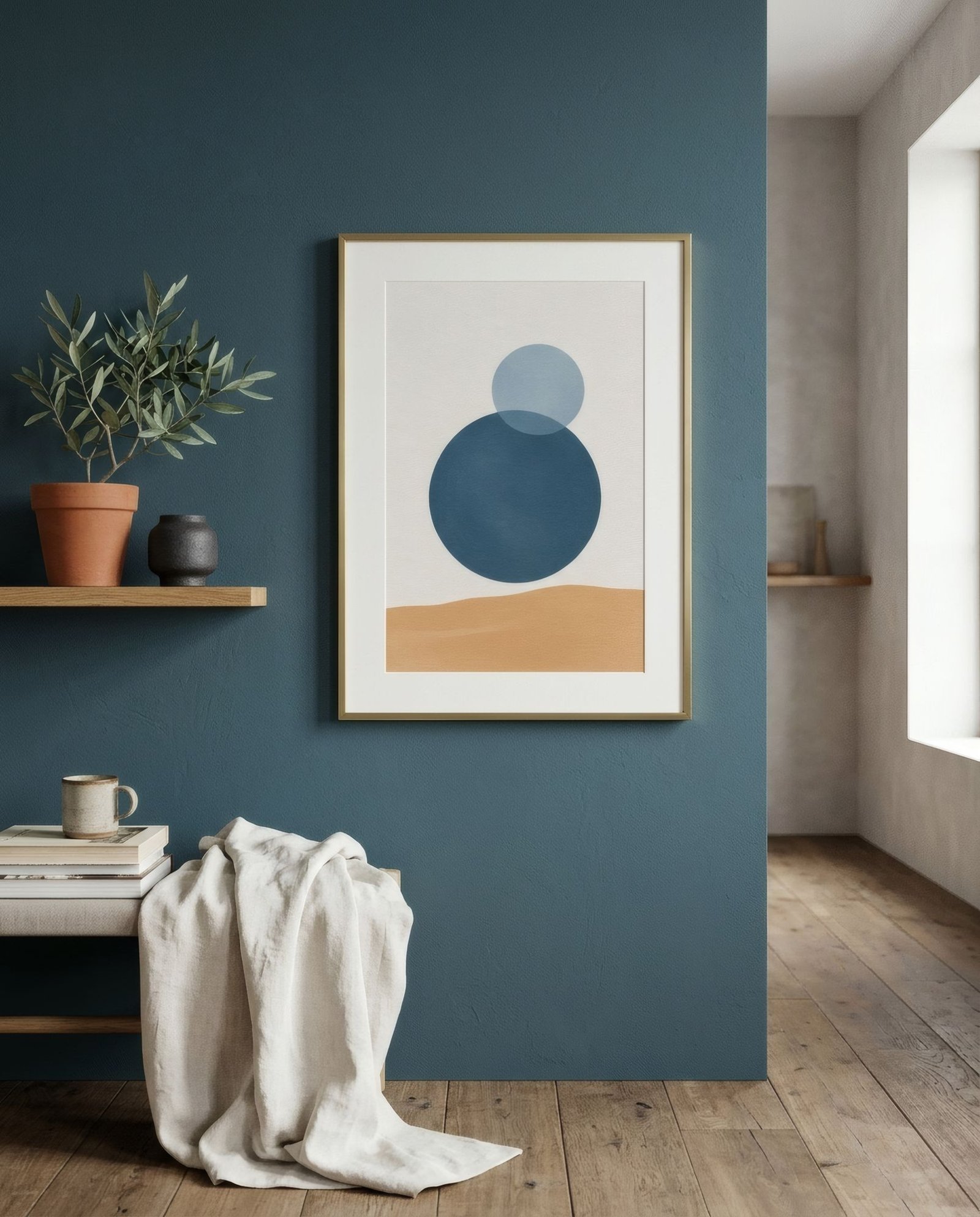
Of all the dark colours you can put on a wall, deep blue is perhaps the most rewarding. Navy, petrol, ink, a muted cobalt: these are colours that give depth without the heaviness of black, that feel elegant by day and enveloping by night, and that have a long history in libraries, dining rooms and bedrooms. If you’ve already painted a wall blue, or you’re about to, the good news is that few surfaces make art shine quite like it. The question is which colours to choose so the conversation works.
Know your blue
Not all deep blues are equal, and the difference matters. Some lean green, like petrol or peacock, with a warmer, slightly mysterious character. Some lean grey, like slate or certain muted navies, more sober and calm. And some are pure or lean violet, like cobalt or indigo, more intense and saturated.
Look at your wall at different times: in the morning, in daylight, and in the evening, under warm artificial light. A blue that seems neutral by day can turn almost black at night, and that affects which art will look good.
Blue’s best partners
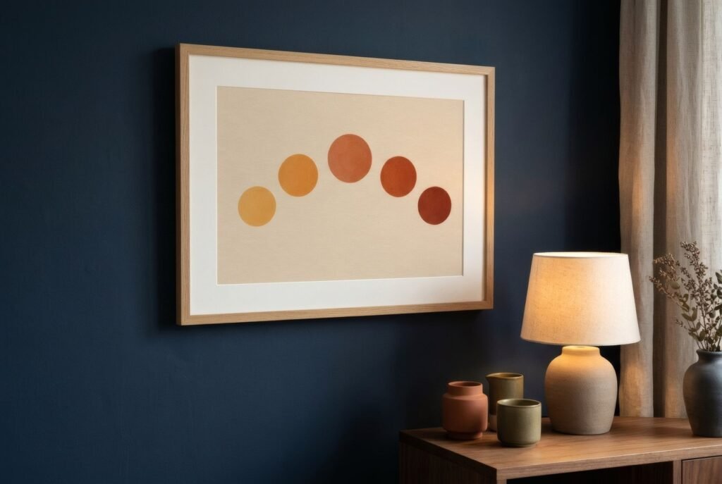
Terracotta, rust and burnt orange. The most vibrant pairing, and almost foolproof. Orange is blue’s complement, and in its earthy, muted forms it creates a warm contrast that intensifies both colours without shouting. A terracotta print on a navy wall looks lit from within.
Ochre, mustard and gold. Close to the above, but more luminous. Ochre on deep blue has a classic air, almost like an old mosaic or a starry night sky. Gilt or brass frames reinforce the effect.
Sand, cream and bone. The calmest choice. Pale, warm tones stand out softly against blue, and the whole feels coastal or Mediterranean. A wide cream mount heightens that brightness.
Other blues. A print in paler blues, blue-greys or sky tones on a deep blue wall gives a very elegant tonal effect, like water at different depths. It works best if the piece has some light point to separate it from the wall.
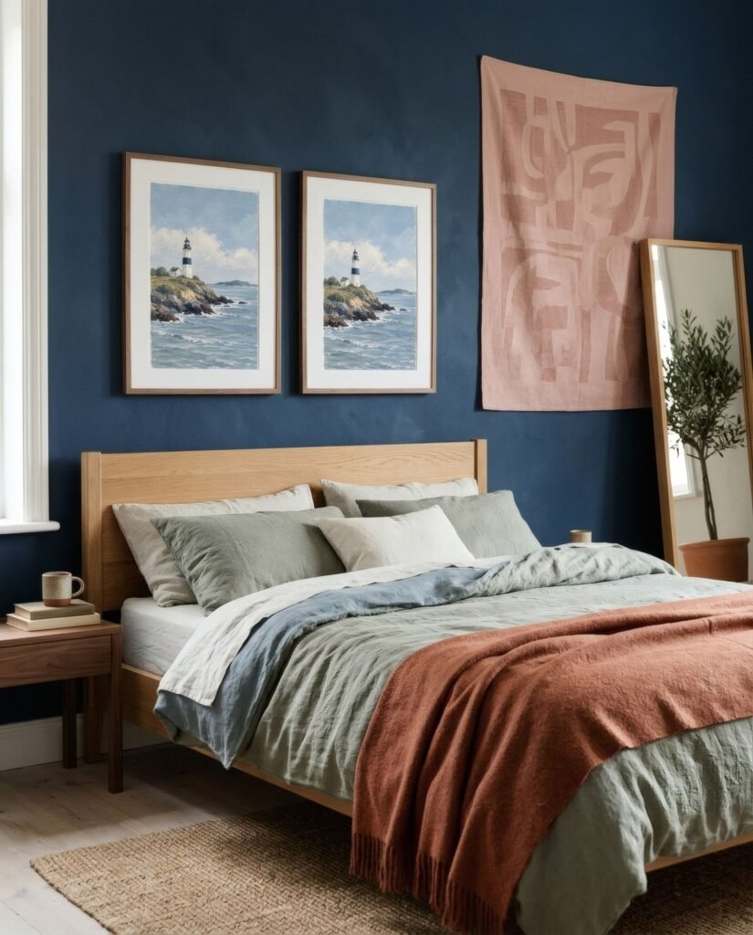
Dusty pink. A less obvious and very contemporary pairing. Muted pink on navy is soft and sophisticated, and especially lovely in bedrooms.
What tends to work less well is intense colours of the same cool temperature, a saturated violet or a bright teal, which can merge with blue or clash without adding contrast. We explain complementary colours in how to use the colour wheel to choose art.
Frame and mount
On deep blue, the mount is a powerful tool. White or cream creates a window of light; a blue mount matched to the wall makes the piece float. Natural wood frames bring warmth, especially welcome on cool blues; brass or gilt, a classic, faintly festive air; slim black, a graphic edge that works better on mid blues than very dark ones, where it almost disappears.
Light
As with all dark walls, lighting is key. Warm light, around 2,700–3,000 K, makes deep blues look rich and enveloping and makes earthy art glow. Very cool light can make blue look gloomy. There’s more in choosing art for dark-coloured walls.
A starry night
A deep blue wall with the right art has something of a night sky about it: an immense backdrop against which light stands out. Glowing terracottas, ochres like gold, calming sands: blue welcomes many companions, as long as there’s contrast.
On navy or petrol, the terracottas of Southern light, such as Terracotta sun, meet their natural complement; for a tonal option, Blue hour from the Coastline collection.
Keep reading: How to Match Wall Art with Your Colour Palette and Modern Coastal Interiors Without Nautical Clichés.