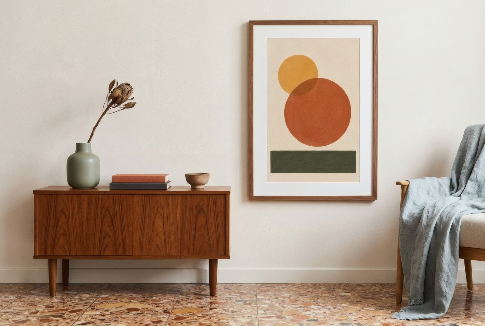
Terrazzo has a long history. Across southern Europe it’s the floor of mid-century apartment blocks and shared stairwells, of grandparents’ flats: cement tiles set with fragments of marble and stone that, once polished, reveal a little universe of flecks. For a while it was hidden under laminate. Now it’s being restored, polished and shown off, and new terrazzo, with big chips and bold colours, has become a designer material in its own right, turning up on floors, worktops and even side tables. But a surface with that much character shapes everything around it, including what you hang on the walls.
The floor already has a pattern
The first thing to recognise is that terrazzo is a pattern. A small, repeating one, sometimes discreet when the chips are fine and similar in tone, sometimes very present when they’re large and contrasting. It covers the entire floor, which gives it a lot of visual weight in the room.
So the art on your walls enters a conversation with a pattern that’s already there. As with patterned textiles, scale and colour are the keys.
Don’t repeat the motif
The most common temptation is to look for art that «goes with» the terrazzo: speckles, splashes, dotted patterns. In practice it tends to work less well than you’d hope. Two surfaces with a similar-scale pattern compete, and a speckled wall above a speckled floor can be exhausting.
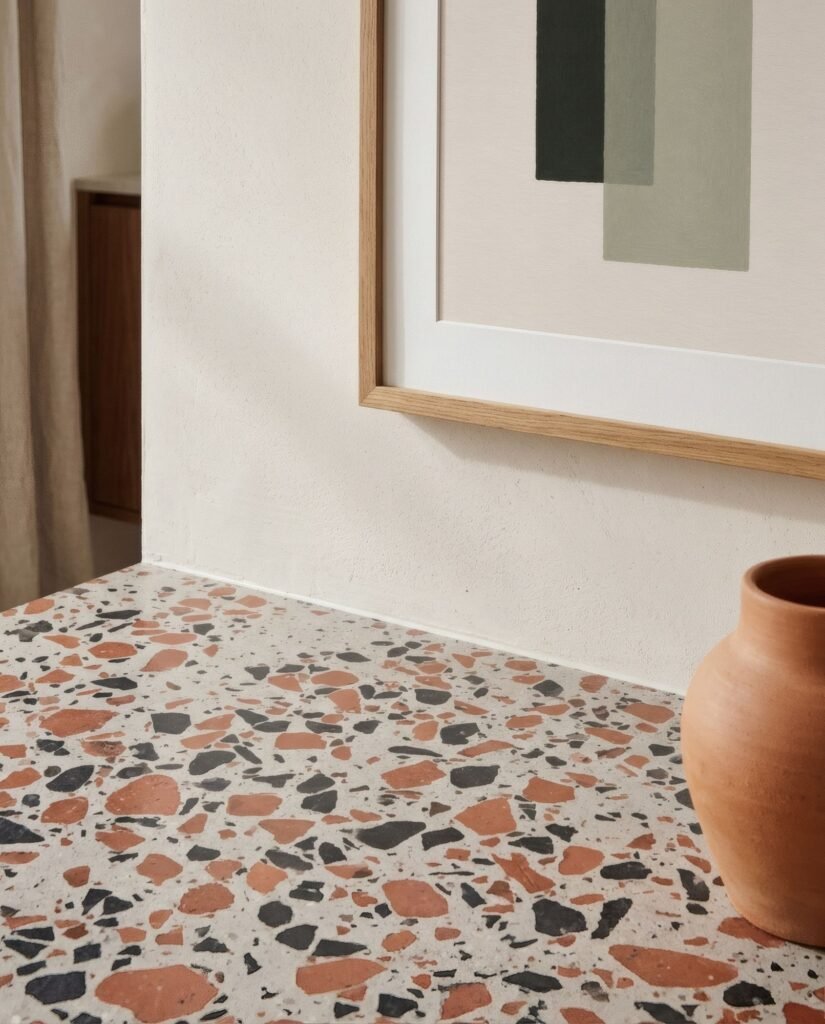
Contrast of scale works better: if the terrazzo has small chips, choose art with large shapes, broad planes of colour, clean lines. If it’s a contemporary large-chip terrazzo, go for calmer pieces with plenty of empty space. The wall gets a rest from the floor, and the floor looks better by contrast.
Pick up a colour
Look closely and terrazzo contains several colours: the cement ground, white, grey, cream, pinkish, and the stones, which might run from black to red, green to ochre. That’s your home’s palette, waiting to be read.
Choosing art that picks up one of those colours, especially one of the rarer ones, makes a subtle, elegant link. A cream terrazzo with reddish and black chips invites terracotta, or black and bone. A grey one with white and green chips suggests muted greens or a greyish blue. Visitors don’t need to notice it consciously; the room will simply feel coherent.
Classic and contemporary
There’s a difference in character between the two kinds. Classic terrazzo, the mid-century sort, usually has small chips in warm or grey tones, and sits well with mid-century interiors, teak and simple lines. Geometric abstracts, organic shapes or soft landscapes suit that era without becoming pastiche.
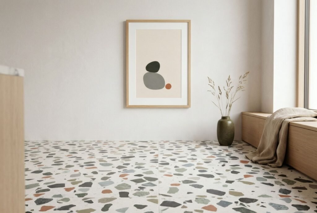
Contemporary terrazzo, with big chips and eye-catching colours, is a design statement in its own right and asks for more restrained art: pared-back palettes, monochrome pieces or a single accent, so as not to add noise.
The distance between them
Terrazzo and art are rarely close: one on the floor, the other at eye level. What connects them, besides colour, is the furniture in between. A plain rug over a very present terrazzo creates a visual pause in the middle of the room and lets the walls breathe. A neutral sofa acts as a bridge. If the terrazzo is the star, keep the layers between calm.
A floor with a memory
Terrazzo is one of those materials that tells the story of a house. Choosing art that respects it, without imitating it or competing with it, is a way of continuing that story. Contrast of scale, a colour picked up, walls that breathe: that’s all it takes. We look at combining colour and pattern more broadly in how to match art colours to your room.
On a warm terrazzo with reddish chips, the terracottas of Southern light tend to find their echo; on a greyer one, the Coastline palette.
Keep reading: How to Pair Wall Art with Patterned Textiles, Wall Art for Monochrome Interiors and Mixing Abstract Art with Vintage Interiors.