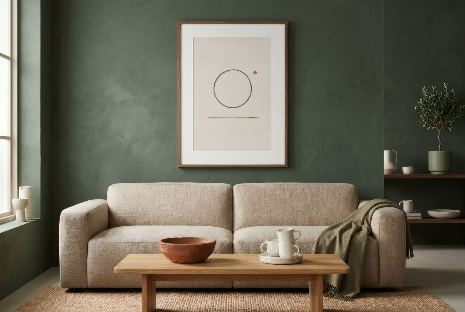
Painting a single wall in a strong colour is one of the most effective things you can do to a room. A tin of paint and an afternoon, and the space changes character: suddenly there’s a backdrop, a direction, somewhere for the room to face. And almost at once comes the question of what to hang on it. The temptation is to fill it, because a wall that special seems to deserve a lot. But a feature wall is already talking. Most of the time what it needs isn’t a crowd, it’s one good conversation partner.
The wall is already the star
A feature wall, whether painted, papered or clad in wood or tile, does the job that art does in other rooms: it draws the eye. Hang a lot of pieces on it and the two start competing, and you usually end up with a busy wall where neither the colour nor the art quite comes through.
So in most cases the answer is less: a single, well-sized piece that uses the wall colour like an enormous mount. It’s the idea we explore in one large artwork: when it works best, applied to a wall that already has a voice of its own.
When one piece is enough
A single piece works especially well when the wall is a saturated colour, a forest green, a terracotta, a deep blue; when a substantial piece of furniture anchors the composition, like a sofa, a headboard or a sideboard; or when the wallpaper is patterned, because then the art needs breathing room to avoid disappearing.
In each case the wall becomes the ground and the art a window within the colour. It’s rather like the galleries that paint their rooms red or green so the paintings can breathe: the colour wraps around and the picture stands out.
Making them work together
The relationship between wall and art comes down to three things.
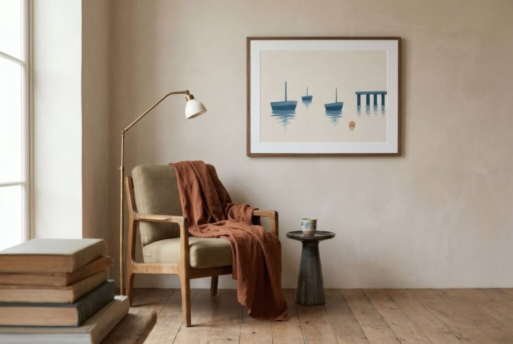
The first is contrast. A light-ground print on a dark wall, or one with a wide white mount, separates cleanly and gains presence. A print in tones close to the wall gives a subtler, almost tonal effect, very elegant but less visible. Neither is better; it depends on whether you want the art to leap forward or melt in.
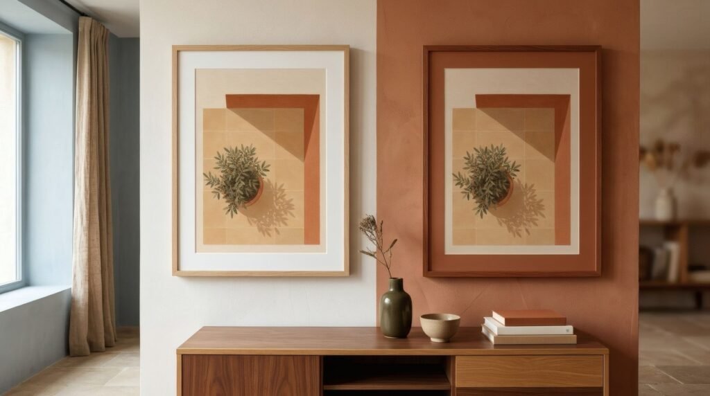
The second is echo. A print that contains a touch of the wall colour, however small, creates an immediate link between the two. A flash of green in a print on a green wall, a terracotta edge on a terracotta one. It’s the simplest way to make the whole thing look intended.
The third is the frame. On strong colours, a slim frame in natural wood or matt black usually works better than gilt or anything ornate, which brings a third character into the scene. A white mount acts as a pause between wall and art; without one, the print meets the colour head-on, which is bolder.
When to add more
There are exceptions. A very long feature wall, down a corridor or across a living room more than four metres wide, can take a row of two or three pieces, provided they share a frame and a palette. And a feature wall in a soft shade, a dusty pink or a pale sage, behaves almost like a neutral and accepts a gallery wall quite happily.
The test is whether you can still see the wall. If the colour is disappearing behind frames, something needs to come down.
And when to hang nothing
Sometimes the best thing is to leave the wall alone. A richly patterned wallpaper, timber cladding with a lot of grain, or handmade tiles are works in their own right. In those cases the art can live on another wall, and the accent can be just that.

A conversation for two
A feature wall and a piece of art are a bit like a good conversation: they work when each one listens. A single well-chosen piece, with an echo of colour and a quiet frame, lets the wall glow and the art be seen.
On green or terracotta walls, the earth and olive tones of the Southern light collection tend to find that echo easily.
Keep reading: Choosing Wall Art for Coloured Walls, Choosing Art for Dark-Coloured Walls and How to Add Personality to Neutral Interiors.