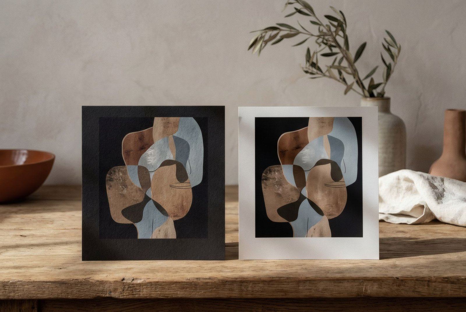
Picture the same image printed twice, once on matte paper and once on satin. Hung side by side, they look almost like different works. On the matte print, colours feel soft and velvety, the paper reads as a material, and there is no glare even with a window opposite. On the satin print, blacks are deeper, colours more intense and the image crisper, but a gentle sheen appears and changes as you move. Neither finish is better in absolute terms. Each favours a kind of work, a kind of light and a way of looking, and knowing the differences helps you choose, or at least understand what you are buying.
What each finish means
The difference lies in the surface. Matte paper has a surface that scatters light in every direction, so it produces no specular reflections, those mirror-like highlights. Satin paper, sometimes called semi-gloss or lustre depending on the maker, has a smoother top layer that reflects some light more directly, giving it a soft sheen halfway between matte and the high gloss of a traditional photograph.
Between the two lie many nuances: smooth mattes and textured ones that recall cotton or watercolour paper; satins with a pearl or silk finish. Trade names vary hugely between manufacturers, so pay attention to the effect, not just the label.
Colour and depth of black
One of the most visible differences is in the dark tones. Satin papers usually reproduce deeper blacks and more saturated colour, because their surface lets ink sit in a way that keeps more intensity; technically, they reach a higher maximum density.
Matte papers tend to give slightly softer blacks, which can look closer to a very dark grey, and colours that are less vibrant but more delicate. For many works that is not a flaw. It is exactly what gives them their warm, almost painterly character.
Glare
Here matte has a clear advantage. Because it produces no highlights, it can be seen well from almost any angle and in almost any light. It is very forgiving in rooms with large windows, in hallways with spotlights, or wherever you cannot control the angle of view.
Satin, with its soft sheen, may reflect a window or lamp if light strikes it head on. With careful placement this is rarely a problem, but it is worth bearing in mind. If the print also sits behind glass, the reflections of the glazing add to those of the paper, and anti-reflective glass can make a real difference. More in how to reduce glare on framed art.
Touch and the presence of paper
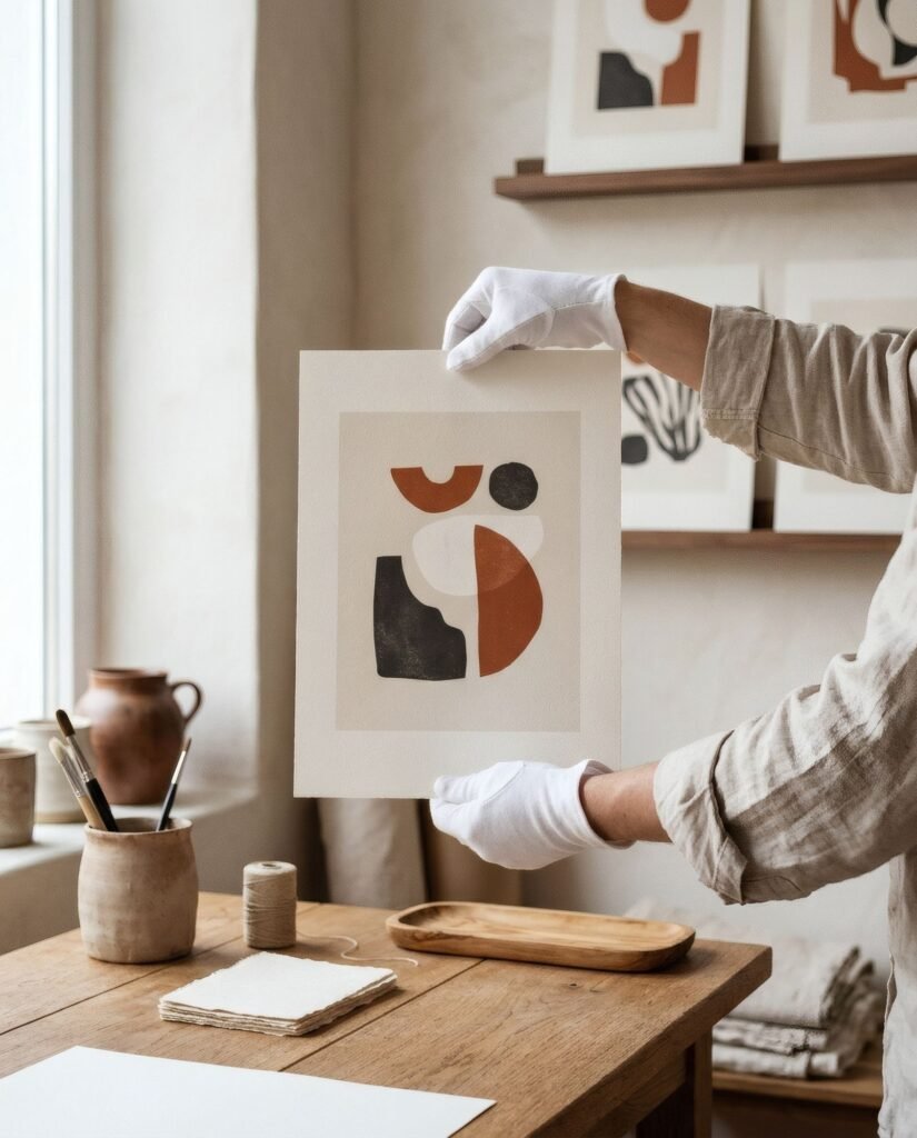
Matte paper, especially with some weight or texture, reads as a material. Up close you notice its grain, and that brings a tactile warmth that suits interiors of natural materials such as wood, linen, ceramics and limewash. In an illustration or an earth-toned abstract, the presence of the paper is part of the experience.
Satin reads more as an image surface than as a material. It recedes a little and lets the image speak, which makes sense for photography. It is also more prone to showing fingerprints, so handle it carefully or with cotton gloves.
Which finish for which work
As a general guide, not an absolute rule, matte tends to suit illustration, watercolour and drawing; abstraction in soft colours and earth tones; classically inspired graphic work; and botanical prints. It also suits any work hung in a bright spot or without glass.
Satin tends to suit photography, especially landscapes with deep skies or black-and-white images with strong contrast, and works of intense colour that need all their saturation.
And the light in your home
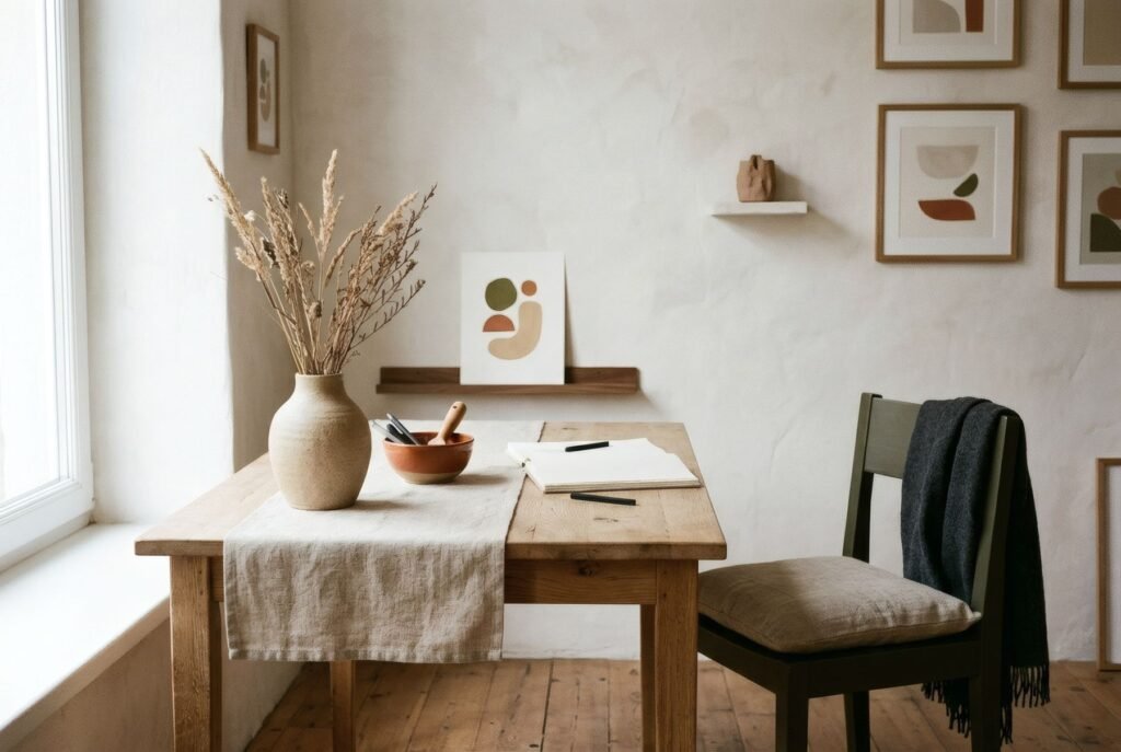
Before choosing, think about where the print will hang. In a bright living room with large windows, or a hallway with spotlights, matte will give fewer surprises. In a softly lit bedroom, or on a wall at right angles to the window, satin can look lovely. And if you are framing behind glass, the choice of glazing matters as much as the paper.
What to ask
As with so much in art printing, names are not always reliable. If the finish matters to you, ask exactly which paper is used: matte or satin, its weight, whether it is textured and whether it is archival. That information, more than the trade name, tells you how the work will look on your wall. We go deeper in how paper changes the look of an art print.
Two finishes, two ways of looking
Matte invites you to come close and feel the work as an object; satin lets the image shine at full intensity. Choosing between them is really choosing which part of the experience you want to bring forward.
Bendíra prints are produced on matte fine-art paper, chosen so the work can be seen without glare and with the warm presence of the paper. You will find the details on each product page.
Keep reading: What Is an Art Print? Art Prints vs Posters and How to Choose a Frame for an Art Print.