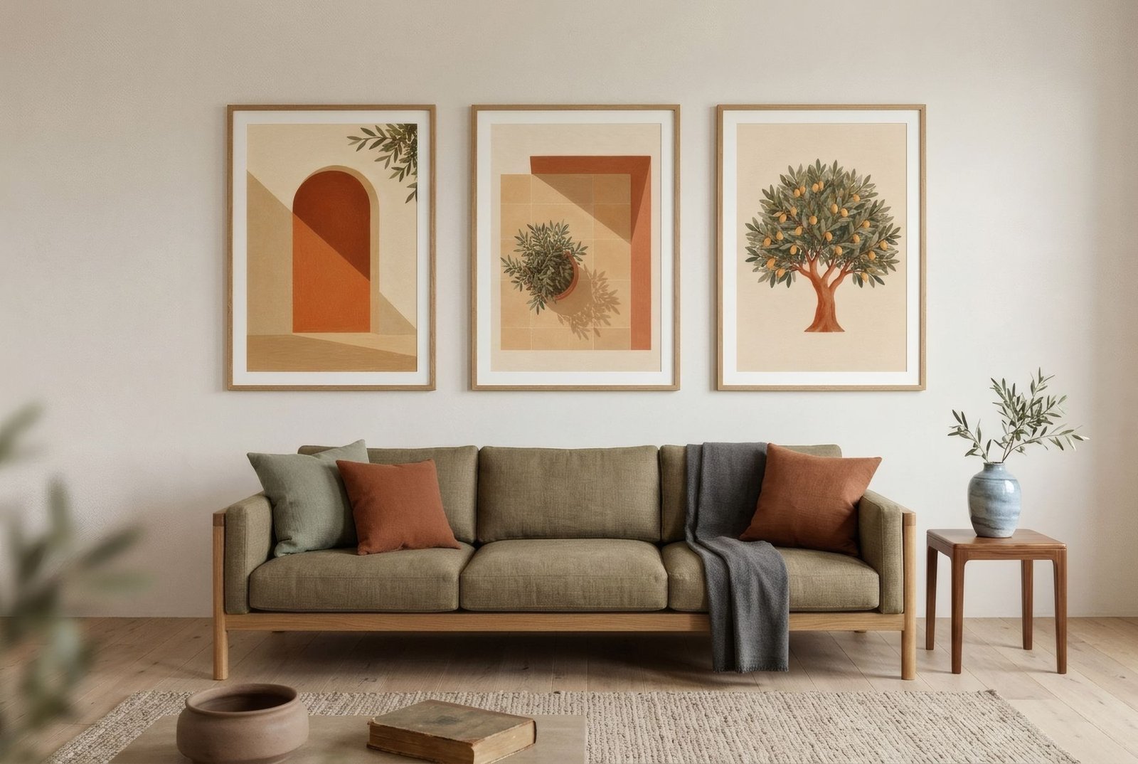
Concentrate rather than scatter. Big walls are best served by one large-format work, a compact group that reads as a single block, or an arrangement that fills one clear zone and leaves the rest of the wall to breathe. What almost never works is spreading medium-sized pieces across the whole surface. It ends up looking like a noticeboard rather than a considered wall.
What makes a wall «large»
It is not only about square metres. A wall 4 m wide and 2.5 m high needs something different from one 3 m wide and 3.5 m high, and both change if furniture sits in front of them. Measure three things:
- Usable width and height, leaving out doors, windows, radiators and tall furniture.
- Viewing distance: where people usually see the wall from. In an open-plan room, it can be 5–6 m (16–20 ft).
- What is in front: a sofa, a dining table, a bench or nothing.
With those three figures, the choice narrows quickly.
Three strategies
1. One oversized piece
A single work that claims a meaningful part of the wall. It is the calmest option, and the one with the most architectural presence.
When to choose it: when the room already has plenty going on, such as full shelves, patterned textiles or lots of objects, or when you want an unmistakable focal point.
Rough proportions: above furniture, half to two-thirds of its width. On an empty wall, a third to a half of the wall’s width. On a 4 m (13 ft) wall with nothing in front of it, that means a piece 130–200 cm (51–79 in) wide. Common print sizes such as 50 × 70 cm or 70 × 100 cm often fall short on their own at this scale. A wide mount and a substantial frame help, but sometimes the answer is a different strategy.
2. A compact group
Several pieces close together, 5–8 cm (2–3 in) apart, forming a clear rectangle. From a distance it reads as one block; up close, as several images.
When to choose it: when you do not have, or do not want, one enormous piece, or when the works form a series.
Formats that work:
- A diptych or triptych of matching large prints. Three framed 50 × 70 cm portrait prints with 6 cm gaps cover roughly 175 × 80 cm (69 × 31 in).
- A 2 × 3 or 3 × 3 grid of identical prints. Very ordered, and striking on dining room walls and in wide corridors.
3. A zoned arrangement
A gallery that occupies a deliberate part of the wall, such as the central third above a sofa or the end of the wall you see on entering, while the rest stays empty on purpose. The blank space is part of the design.
When to choose it: on very wide walls, where covering everything would feel overwhelming.
Common mistakes on big walls
- Scattering pieces everywhere. The hierarchy disappears and the wall fragments.
- Hanging higher to fill the space. On tall walls, going higher does not fill the wall better. It takes the art away from the eye. Keep the centre around 145–155 cm (57–61 in), or keep the relationship with the furniture, and gain height with taller formats or groups.
- A small image in a huge frame. A frame can help, but it cannot stand in for the scale of the image itself.
- Ignoring viewing distance. A fine line drawing at the far end of a 6 m room loses all its detail.
Very tall walls and double-height spaces
Ceilings above 3 m (10 ft), or double-height rooms, call for specific approaches:
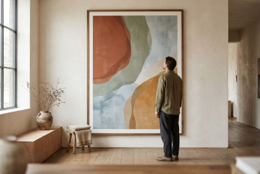
- One large portrait piece at eye level, which lengthens the wall without leaving the viewer behind.
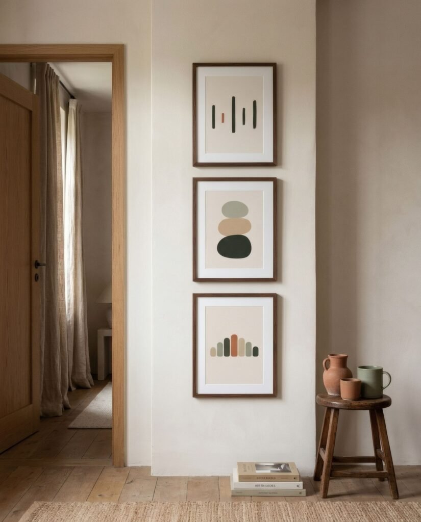
- A column of two or three pieces stacked on a central axis, climbing in an orderly way.
- A salon-style hang, dense and tall, but only if the collection justifies it and the gaps stay consistent.
In every case, the bottom of the arrangement should still relate to life in the room, meaning the furniture and eye level, not to the ceiling.
Hanging large pieces safely
Large frames are heavy, and glass adds both weight and risk.
- Fixings suited to the wall: cavity fixings for plasterboard, appropriate plugs or anchors for masonry and hollow brick. Check the rated load and leave a margin.
- At least two hanging points for big frames. The piece stays level and the load is shared.
- Acrylic instead of glass above a certain size, especially over sofas, beds and busy walkways. It is lighter and does not shatter into sharp fragments.
- Two people to hang it. Not a small detail with anything over a metre wide.
If you are unsure what your wall is made of, or the piece is especially heavy, ask a professional.
A worked example
A living room wall of 420 × 270 cm (about 13 ft 9 in × 8 ft 10 in), with a 230 cm sofa centred against it:
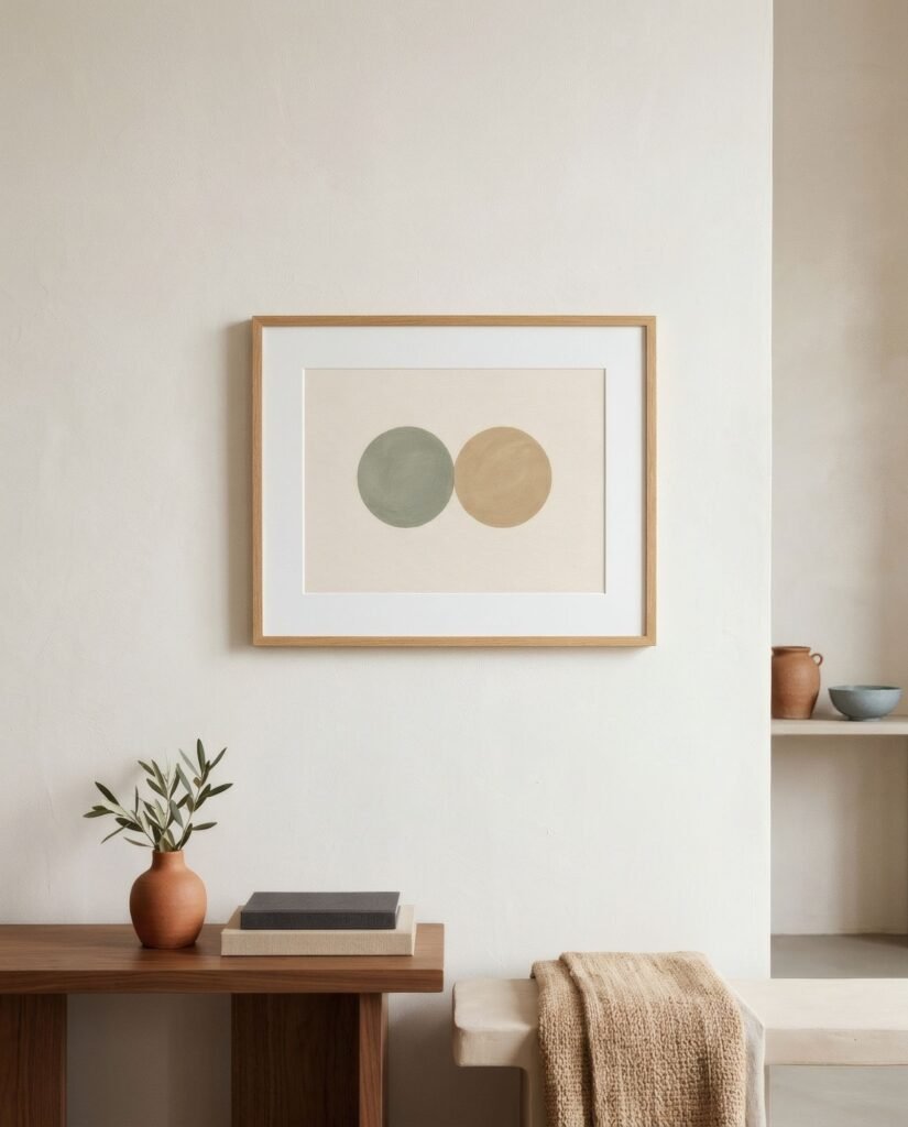
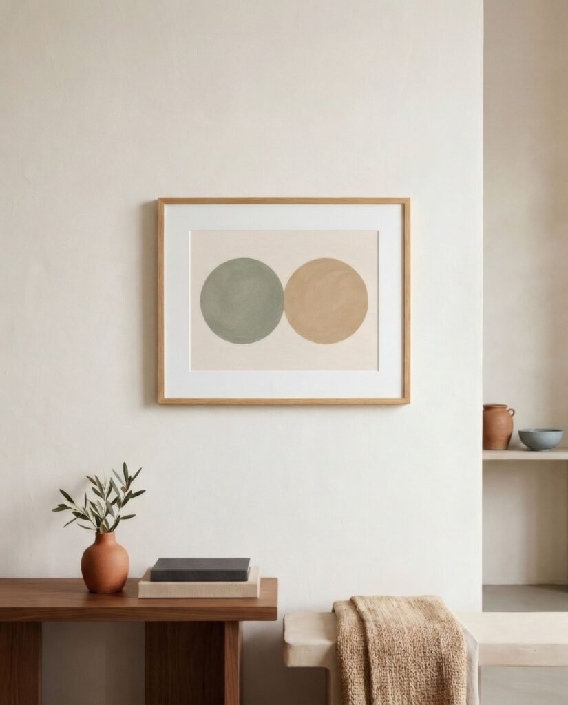
- Option A: a single 140 × 100 cm piece above the sofa, 20 cm from the back. Calm, with the rest of the wall left free.
- Option B: three framed 50 × 70 cm portrait prints with 6 cm gaps, about 175 × 80 cm overall, aligned along their bottom edges.
- Option C: a compact gallery of roughly 150 × 100 cm, with one 50 × 70 anchor and four 30 × 40 prints, 6 cm apart.
All three work. The choice depends on the character you want the room to have.
To finish
On a large wall, emptiness is not the enemy. It is the context that lets the art be seen. Settle the strategy first (one piece, one block or one zone), then the proportions, and only then the images.
If a set of matching large prints appeals, some Bendíra works are offered at 50 × 70 cm, a size that suits diptychs and triptychs on generous walls.
Keep reading: How to Style Large Wall Art in a Living Room, One Large Print or Several Small Prints? and Triptych Wall Art: When and How to Use It.