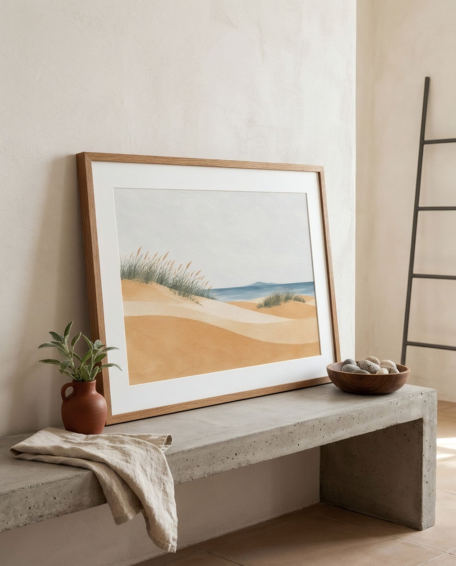
Brutalism has a reputation for being harsh, and not without reason. The name comes from the French béton brut, raw concrete, the unclad material that mid-twentieth-century architects left exposed with every mark of its making. Massive buildings, heavy volumes, grey surfaces, emphatic geometry. For decades it was widely unloved; now it’s enjoying a reappraisal, and many contemporary interiors borrow its material honesty and sense of scale. Choosing art for a space like that is a different challenge from any other style, because here art can’t simply decorate. It has to match the architecture.
A style of volume and shadow
First, it’s worth understanding what makes a brutalist interior special. It isn’t only the concrete; it’s how it’s used. Broad planes, volumes that push out or recess, deep openings, light arriving from above or from the side and carving out strong shadows. It’s sculptural architecture, perceived almost more through its shadows than its surfaces.
In that setting, a small, delicate print vanishes. And something too decorative looks frivolous. What works is art that shares something of that character: presence, form, weight.
Not the same as industrial
Brutalism and industrial style can seem to ask for the same thing, since both involve concrete. Not quite. In an industrial loft, art usually seeks warmth to offset the materials, as we explore in wall art for industrial interiors. In a brutalist space, the aim is subtler: not to soften the architecture until it disappears, but to engage with its austerity without betraying it. Too much decorative warmth can look like an apology for the concrete.
Emphatic forms
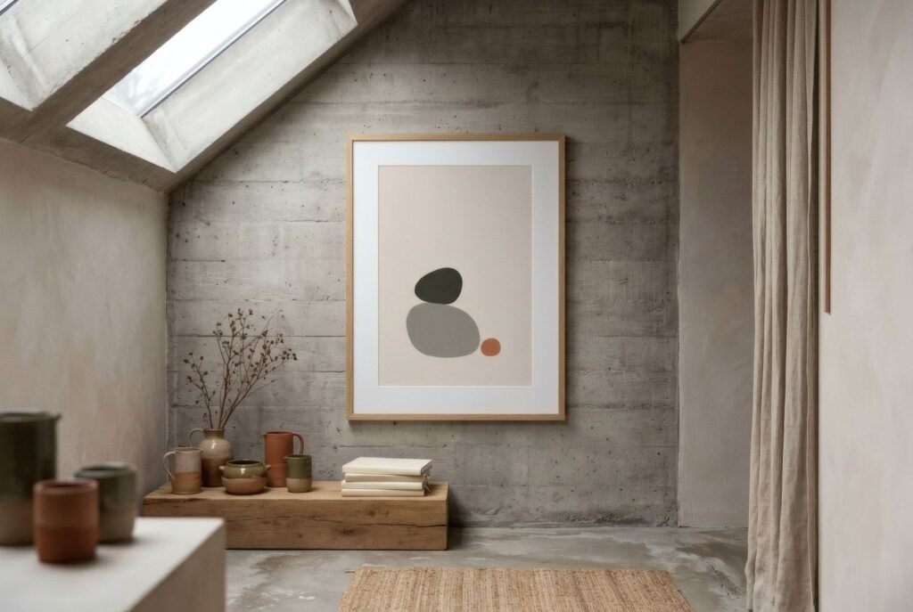
The pieces that sit best with brutalism have clear, emphatic shapes. Geometric abstracts, with solid planes of colour, blocks and circles, echo the architecture’s volumes and bring them onto the flat. Large-scale organic forms, heavy rounded silhouettes, offer a curved counterpoint to straight geometry without losing weight, much like the mid-century sculpture that so often accompanied this architecture. And black-and-white graphic work, with strong contrast, shares the concrete’s restrained palette.
The counterweight: colour and matter
That said, brutalism does welcome some counterweight. Concrete is grey and cool, and a well-chosen touch of colour can be extraordinary. The colours that work best tend to be earthy and mineral: ochre, terracotta, rust, moss green, deep blue. They seem to belong to the same material world as concrete and stone. A single plane of intense colour on a grey wall can have the force of a window.
What tends to jar is very sweet pastels or highly decorative palettes, which seem to come from another world.
Scale and space
In these interiors, scale is fundamental. A large piece, or a group that reads as one broad unit, can measure up to the architecture. So does emptiness: brutalist spaces tend to be restrained, with few objects. A single piece on a concrete wall, with plenty of space around it, has an almost monumental effect.
Frames and display
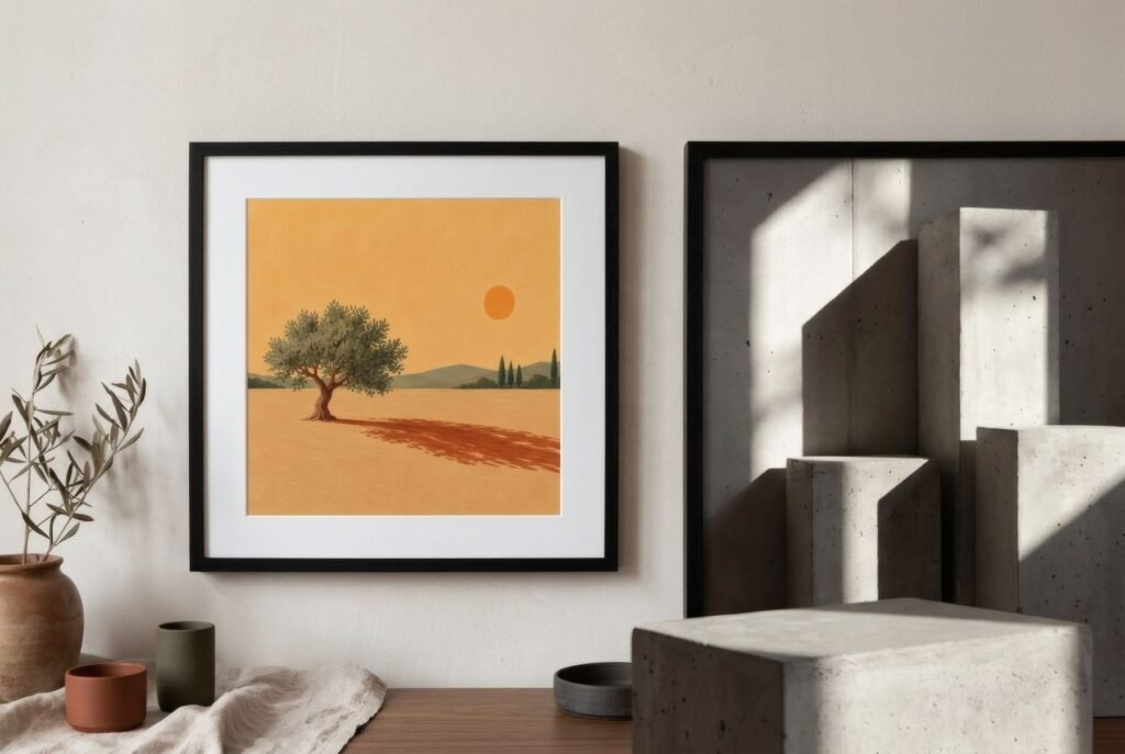
Simple frames, slim black or metal profiles or dark wood, let the art speak. Ornate frames are almost always a mistake. And leaning, a large piece on the floor against the wall or on a low concrete bench, suits the sculptural character of the space beautifully.
On exposed concrete, use fixings designed for the material, and in listed or shared buildings, check before you drill.
Equal to the architecture
Art in a brutalist space can’t be timid or ornamental. It works when it shares the architecture’s conviction, with clear forms, generous scale and mineral colour. Then concrete stops being a cold backdrop and becomes the stage for a dialogue between two ways of thinking about volume. We look at art and modern architecture in art and modern architecture.
The emphatic shapes of Quiet forms, such as Stacked or Quiet form I in charcoal and bone, share that restraint.
Keep reading: Geometric Art: Shapes, Colour and Composition, One Large Print or Several Small Prints? and Wall Art for Monochrome Interiors.