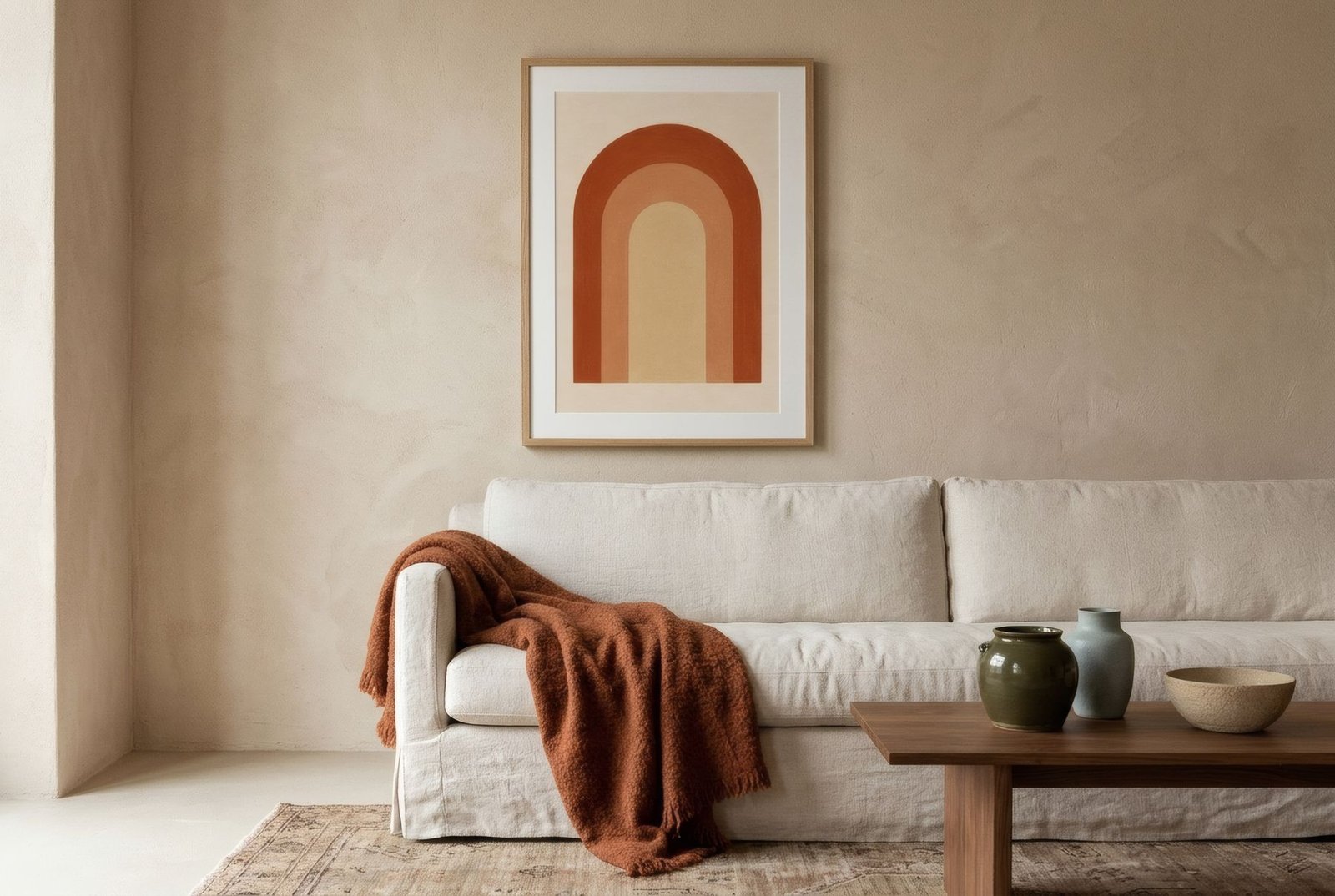
White is the most common choice for walls, and for good reasons. It reflects light, makes rooms feel larger, goes with everything and lets furniture and objects speak. Plenty of people live with white walls they never chose: it’s the colour of the rental, the new build, whatever was there already. The trouble starts when white, instead of bright, feels cold. A white-walled home with little on the walls can look like a waiting room, a show flat, a place where nobody has quite decided to stay. Art is the most direct way to change that.
Not all whites are the same
Before choosing art, it’s worth looking at the white you’ve got. There are cool whites, with a blue or grey cast, which feel clean but a little clinical, particularly in north light. And there are warm whites, off-whites with a hint of yellow or pink, which feel softer and more welcoming.
On a cool white, art in warm tones, earth, terracotta, ochre, wood, balances the temperature and adds instant warmth. On a warm white, almost any palette works, and cool tones, blues and greens, can bring freshness without chilling the room. There’s more in how to choose art for your wall colour.
Warmth lives in materials
What makes a white wall feel cold isn’t only the colour; it’s the lack of texture. That’s why art on white walls works best when it brings materiality with it.
The matt paper of a fine art print has a visual softness that contrasts with flat paint. Natural wood frames, oak, walnut, ash, bring grain and warmth in a way white or metal frames don’t; on white, a wooden frame is almost always right. An ivory or cream mount, rather than brilliant white, softens the step between art and wall. And textiles and objects nearby, a wool throw, a basket, a ceramic, complete the effect.
Hierarchy: don’t spread it evenly
Another reason white-walled homes can feel impersonal is that the art gets spread too evenly: one small print on every wall, all the same size, all at the same height. The result is tidy but flat, with no centre.
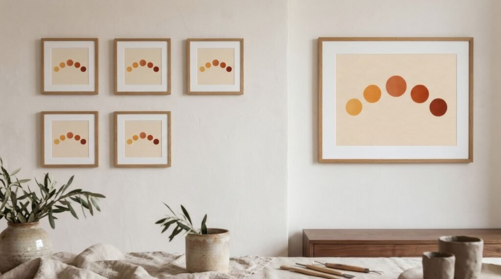
It works better to set up a hierarchy. One main wall, usually the one behind the sofa or the one you see as you walk in, with a piece of some scale or a grouping that becomes the focal point. Secondary walls with smaller, quieter pieces. And some walls left empty, giving the eye a rest and making what’s hung count for more. Hierarchy gives a home an order and intent that white, on its own, doesn’t.
Colour, yes, with a thread
On white, the colour in art really stands out. That’s an opportunity: a single print with colour can transform a whole room. But it’s also a risk if every piece brings its own palette. In a white-walled home, it helps if the pieces share two or three colours with each other, or with the textiles and furniture, so the whole feels considered rather than a collection of strays.
Scale: be brave
White walls make spaces look larger, which makes small pieces look smaller still. Often the coldness comes from art that’s simply too modest for the wall. A 50 × 70 cm (20 × 28 in) print above a sofa, or a group of three, fills the wall with a presence a lone A4 never will.
White, lived in
A white-walled home can be bright and warm at once. The key is what hangs on those walls: pieces with materiality, wooden frames, a clear hierarchy and a colour that ties it together. Then white stops being an absence and becomes a generous backdrop.
All three Bendíra collections find their place on white walls; the warmth of Southern light is particularly useful when your white leans cool.
Keep reading: How to Add Personality to Neutral Interiors, One Large Print or Several Small Prints? and How to Choose a Frame for an Art Print.