There’s something honest about an industrial interior. Exposed brick showing how the wall was built, steel beams, bare concrete, pipework on display, big windows in metal frames. The style grew out of old factories and warehouses turned into homes, and it keeps that frankness about materials. But what looks spectacular in a photograph can feel a little hard to live with. Cold surfaces, echoes, a palette of greys and rust. Art is one of the most effective ways to balance it, as long as it’s chosen with the character of the space in mind.
What the space is already saying
Before choosing anything, listen to the materials. Brick brings warm colour, reddish or toasted tones, but also plenty of texture and pattern. Concrete is grey, smooth or marked by its shuttering, calm but cool. Steel, black or rusted, draws strong lines. And high ceilings with big windows bring scale and light.
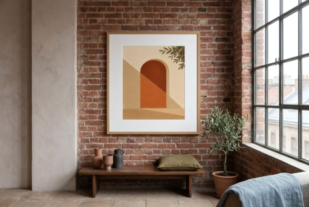
All of that carries visual weight. A piece that’s too small or too timid disappears; one that’s too delicate looks lost. Art in an industrial space needs some presence to hold up its end of the conversation.
Scale: think big
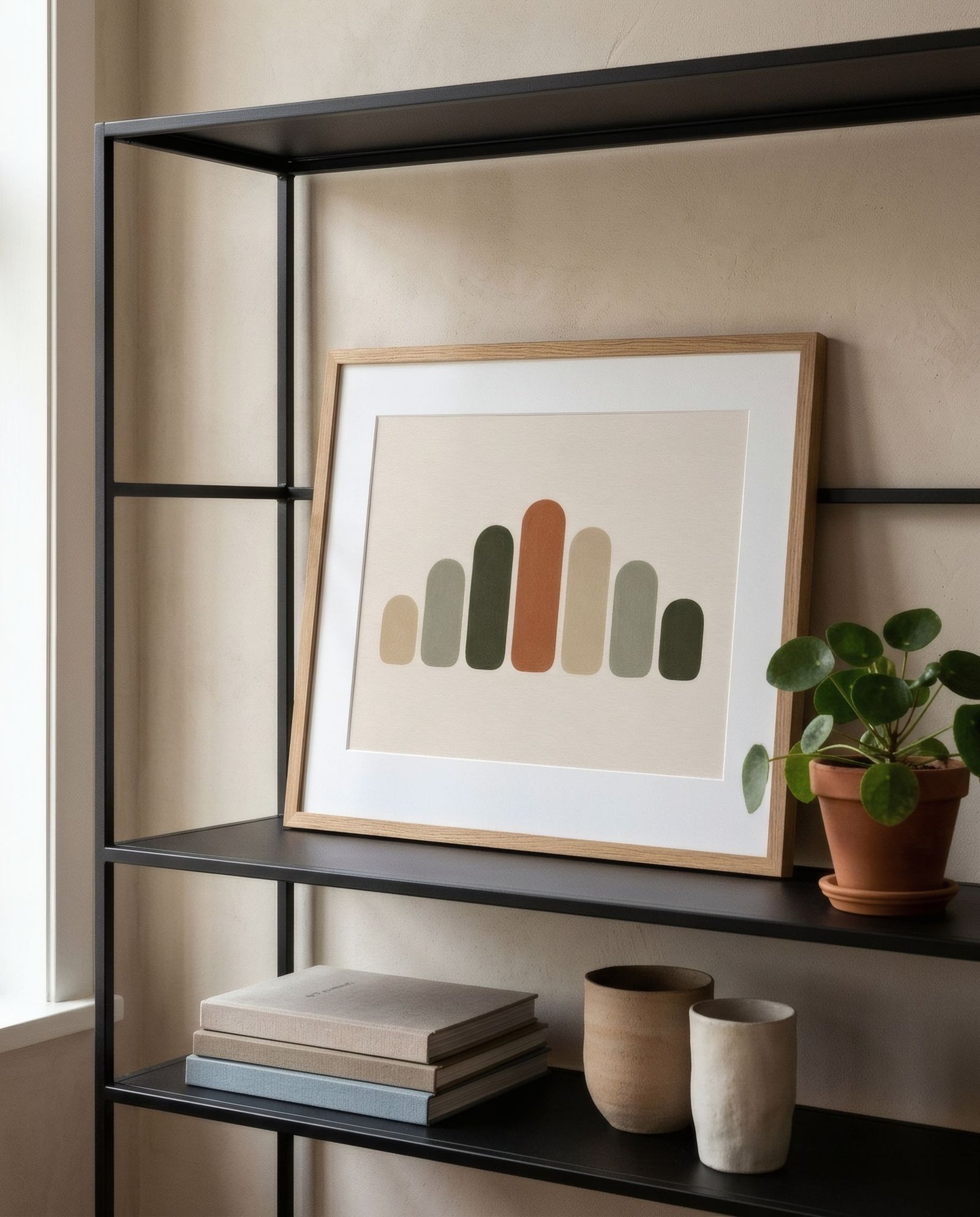
The high ceilings and broad walls of a loft call for pieces of a certain size. A lone A4 print on four metres of brick simply vanishes. Better a single large piece, a 50 × 70 cm (20 × 28 in) print with a wide mount, say, or a group that reads as one unit. Another option very much in keeping with the style is to lean a large piece on the floor against the wall, or on a metal shelving unit, with a workshop feel.
Counterweights: what softens
The key to art in an industrial interior is counterweight: bringing in what the materials don’t have.
Warm colour. Against grey concrete and black steel, earthy tones, terracotta, ochre, sand, olive, bring instant warmth. On brick, which is already warm, cooler or neutral tones such as a muted blue or a stone grey sit alongside the red without fighting it.
Curves and organic shapes. An industrial space is all straight lines: beams, gridded windows, pipes. Organic forms, curves, botanical silhouettes or soft abstracts break that rigidity and add a human feel.
Matt surfaces and paper. Against the sheen of steel or the hardness of concrete, a matt paper print has a softness you can sense even from across the room.
Hanging on brick
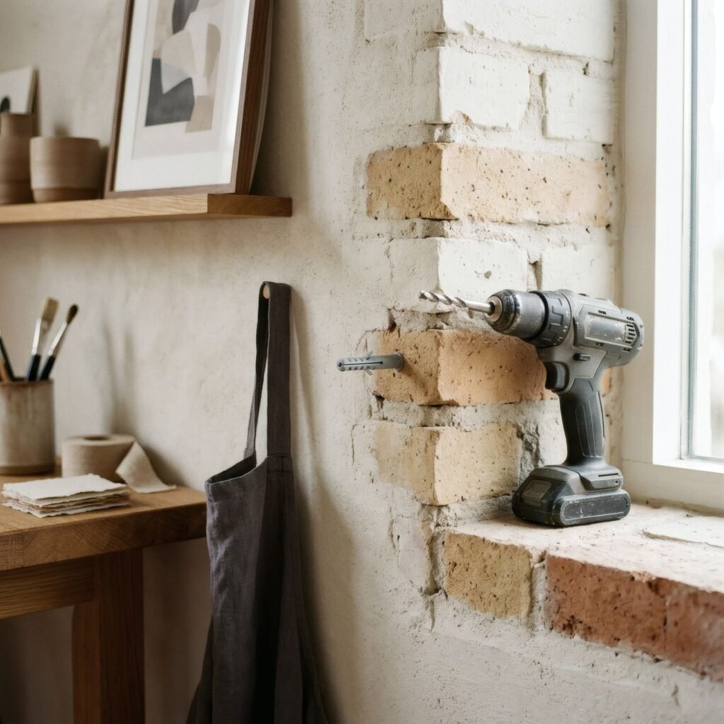
Hanging on exposed brick takes a little technique. Brick is busy with pattern, so a piece with a wide white mount or a light ground stands apart better than a very dense image, which can merge into the mortar lines. A slim frame in black or natural wood suits the space. And in practice, it’s usually easier to drill into the mortar joint than the brick itself, and easier to make good if you ever take the picture down.
Frames: continuity or contrast
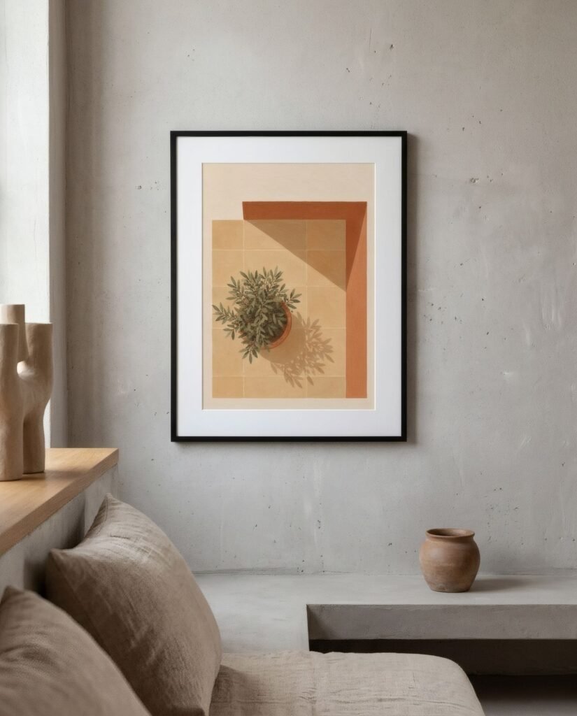
Slim black metal frames are almost the natural frame for an industrial room: they echo the window frames and create continuity. But natural wood frames, oak or walnut, bring exactly what’s missing: warmth and organic texture. Mixing the two, metal on one wall and wood on another, tends to work very well. We cover it in mixing metal and wooden frames.
What to avoid
Two common temptations. The first is the style’s literal iconography: posters of cogs and factories, reproduction metal signs. They can work in a themed bar, but at home they reinforce the hardness instead of balancing it, and they date quickly. The second is grey on grey: black-and-white art on grey concrete in black frames can be elegant, but also very cold if nothing else warms the room.
Strength and warmth
A well-balanced industrial interior keeps the honesty of its materials and adds the warmth of the people living in it. Art with enough scale, earthy colour and softening shapes is what stops a loft looking like a warehouse and starts it looking like a home. We explore this balance of materials further in interior styles and art.
The terracotta, sand and olive of the Southern light collection make a natural counterpoint to grey concrete and black steel.
Keep reading: Mixing Abstract Art with Vintage Interiors, Wall Art for Brutalist-Inspired Spaces and One Large Print or Several Small Prints?.