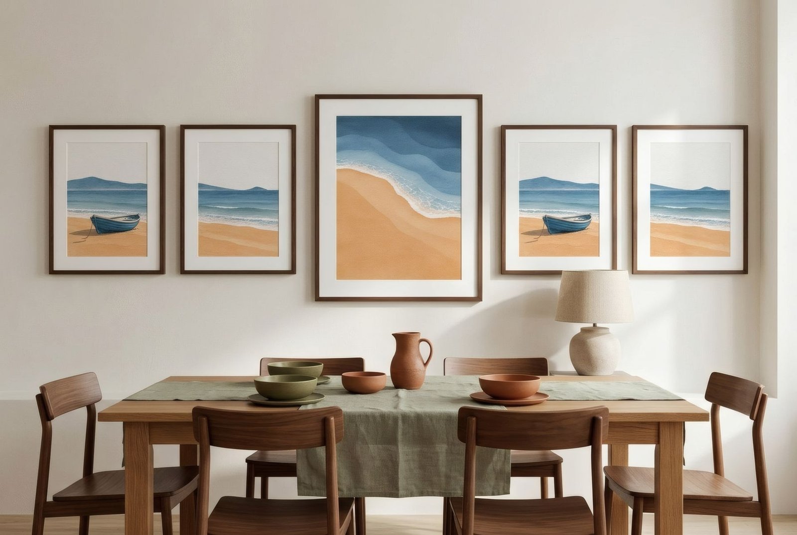
Picture six prints laid out on the table and an empty wall in front of you. You could hang them in two rows of three, lined up to the millimetre, with identical gaps. Or you could spread them more loosely: one large piece as the anchor, the others around it at different heights, with a balance you can feel but not measure. Same prints, same wall. Yet the two results say quite different things. Understanding what each approach communicates is the best way to choose the one that belongs in your home.
Symmetry: order, calm, architecture
A symmetrical arrangement distributes pieces evenly around an axis: a grid, a row, two matching columns. It usually uses works of the same size and frame, with identical spacing.
What it communicates is order. A symmetrical wall reads as a single block, almost like part of the architecture. It settles the eye, because the rule is obvious at a glance, so you can rest on each piece without being distracted by the whole. That makes it ideal for formal or quiet spaces, a dining room, a hallway, above a headboard, and for homes with classical or very minimal lines.
What it asks of you is precision. A centimetre out on a grid shows, so measure carefully, use a spirit level and, ideally, paper templates before you drill. It also needs works that speak to one another: in a grid, one print that’s very different from the rest breaks the spell.
Freeform: movement, story, personality
An asymmetrical, freeform or salon-style arrangement mixes sizes, formats and sometimes frames, with no visible rule. But freeform doesn’t mean random. Good freeform walls have a balance you can sense: larger or more intensely coloured pieces offset several small ones on the other side, the gaps between them are similar, and an invisible line, often the bottom edge or a central axis, holds everything together.
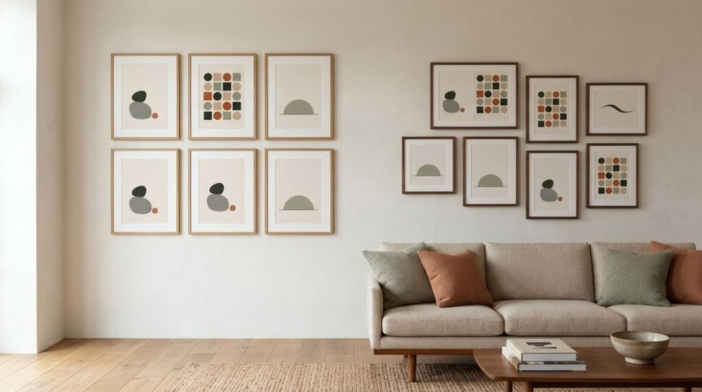
What it communicates is movement and biography. A freeform wall looks as though it has gathered over time, like a growing collection. It invites you to wander across it and discover things, and suits living rooms, hallways, studies and homes with an eclectic streak.
What it asks of you is balance. It’s easier to change and extend than a grid, but also easier to tip off-kilter. The usual technique is to compose on the floor first, starting with the largest piece, then transfer the arrangement to the wall.
The same six prints, two walls
Back to those six prints. Symmetrically, if they’re all one size, a two-by-three grid above a sofa makes a calm block with gaps of 5–8 cm (2–3 in). If the sizes vary, you can still mirror them: the largest in the centre, matching pairs either side.
Freeform, the largest goes slightly off-centre, and the rest gather around it with similar gaps, their bottom edges kept at a constant distance from the sofa, or sharing a common inner edge that pulls them together.
| Symmetrical | Asymmetrical | |
|---|---|---|
| Feeling | Order, calm | Movement, personality |
| Pieces | Same size and frame | Mixed sizes and frames |
| The challenge | Precise measuring | Visual balance |
| Adding later | Tricky | Easy |
How to choose
Your room usually has the answer. A space full of objects, textures and colour benefits from the calm of symmetry, which brings order. A very clean, minimal room can come alive with a freeform wall, which adds character. The reverse can work too, but know that the effects add up: symmetry in an already orderly room deepens the stillness; freeform in a busy room adds to the energy.
The pieces matter as well. A series, prints by one artist or from one collection, practically asks for a grid. A collection gathered over years, of very different things, finds its place in a freeform wall. There are more techniques in how to create a gallery wall.
Two ways of looking
Symmetry isn’t dull and freeform isn’t chaos. They’re two ways of putting the world in order, one architectural, one narrative. Choosing between them comes down to how you want the wall to feel when you look at it every day.
If you lean towards symmetry, prints from a single Bendíra collection, such as Coastline, share a palette and sit happily in a grid.
Keep reading: How to Mix and Match Wall Art, Visual Rhythm in Art: Repetition Without Monotony and How to Choose Wall Art for a Dining Room.