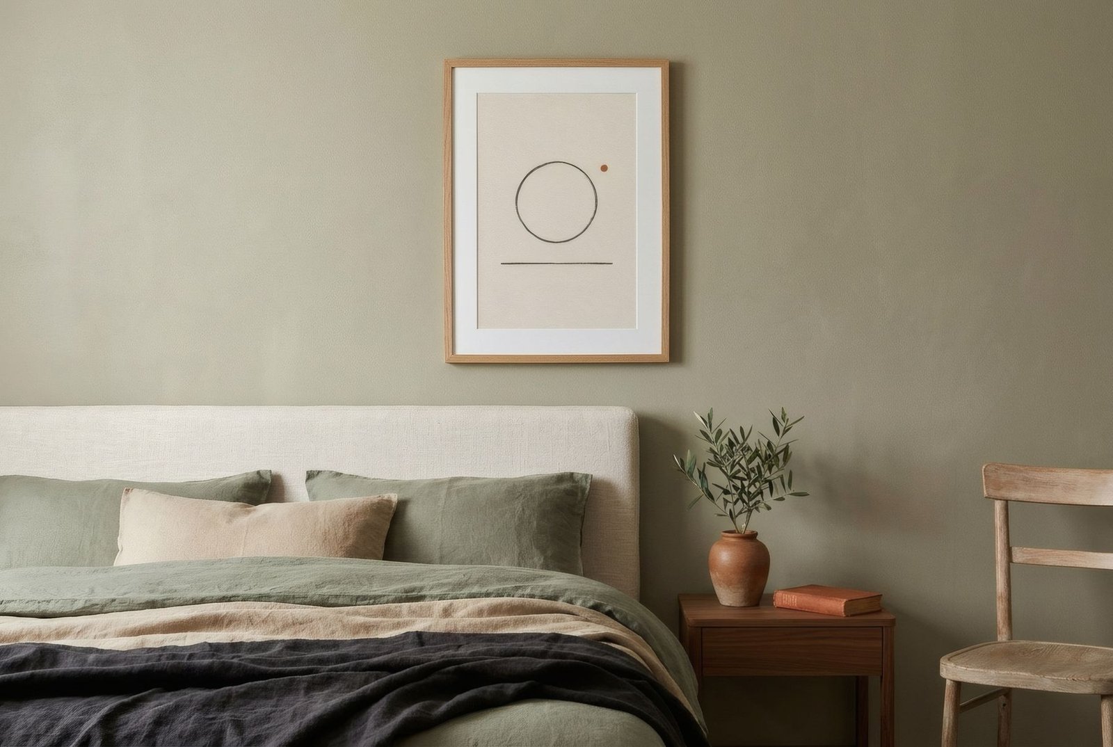
Green is perhaps the colour we most readily associate with nature. It is in leaves and fields, in moss on stone, in the still water of a river. Perhaps that is why, in recent years, it has become one of the best-loved colours in interiors: sage walls, bottle-green velvets, olive kitchens. In art, greens have a great advantage. They bring colour without shouting and sit beautifully with natural materials. But not all greens are alike, and choosing the right one for each room, and knowing what to pair it with, is the difference between a calm home and one that looks like a seasonal catalogue.
A family of greens
Green covers a vast family. There are soft, greyed greens such as sage, eucalyptus and stone green, with plenty of grey in them and a very serene feel. Earthy greens such as olive, moss and khaki, with a yellow or brown base, are warm and natural. Deep greens such as bottle, forest and dark emerald are intense and enveloping. And fresh greens such as mint and aqua are lighter and brighter.
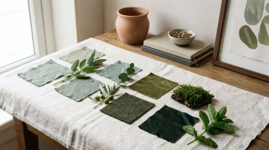
Each branch conveys something different, and knowing them helps you choose. In a single room, greens from one family usually work better than a mixture of all of them.
Which materials
Greens sit especially well with natural materials, because they share the same roots. Wood, in almost any tone, is perhaps their best companion: pale oak with sage, walnut with bottle green, pine or teak with olive. Undyed linen and cotton, irregularly glazed ceramics, rattan and plant fibres complete the picture.
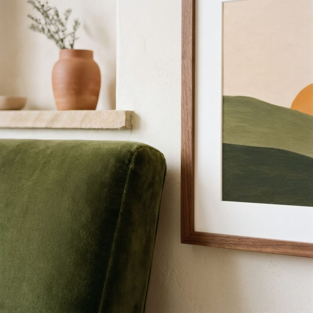
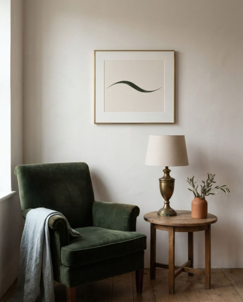
Warm metals such as brass and bronze also suit deep greens, adding a touch of elegance. Chrome and steel, by contrast, tend to cool them.
Which colours
Some colour pairings work especially well with green.
With earth tones such as terracotta, ochre and sand, green finds its natural partner, the palette of Mediterranean or rural landscape. Terracotta is also close to the complement of some greens, which creates a lovely tension.
With warm neutrals such as cream, bone and flax, green becomes calm and luminous.
With blues, especially soft or sea blues, green creates fresh palettes of coast or woodland by water.
With dusky pinks, another near-complementary pairing, the result is delicate and a little unexpected.
Room by room
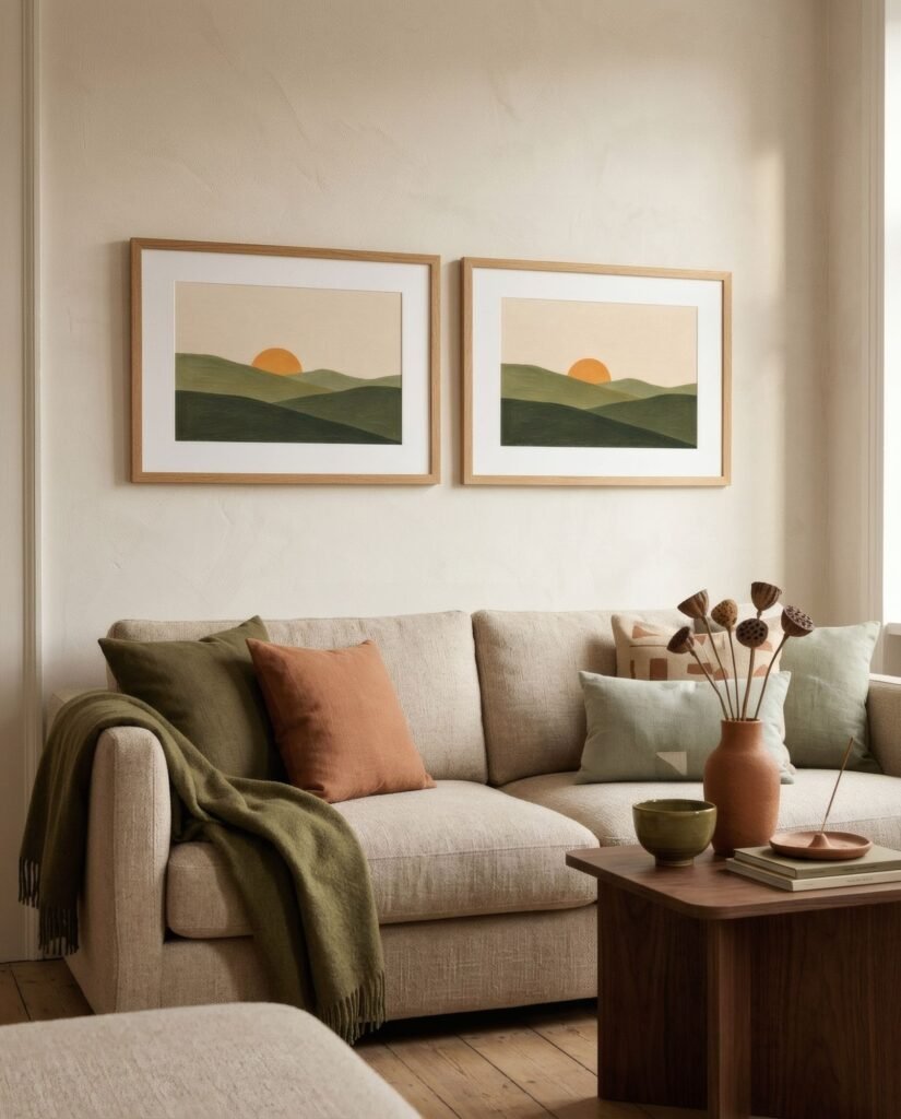
In the living room, earthy and deep greens bring warmth and character. A print in olive and terracotta above a linen sofa, or a bottle-green work beside a velvet armchair, can become the centre of the room.
In the bedroom, soft greyed greens such as sage or eucalyptus are among the calmest. A sage and cream print above the headboard settles in with linen bedding and conveys calm.
In the kitchen, fresh greens and olives suit wood, ceramics and pots of herbs. A small green botanical print is almost a classic.
In the bathroom, aqua and sage evoke freshness and sit well with white tiles and wood, provided the work is well protected from damp.
In the hallway, a deep green gives character from the first moment, especially in a space with good light.
If the wall is already green
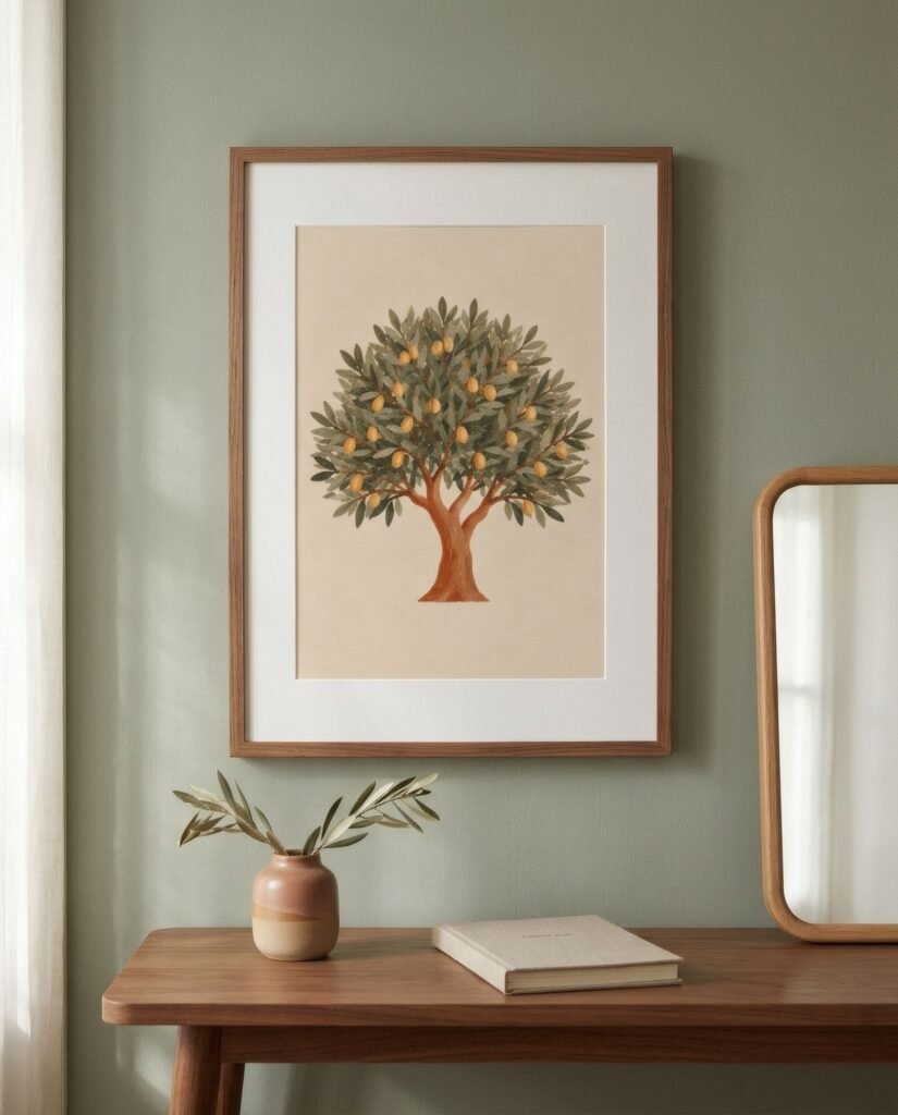
Green walls are increasingly common. In that case, art works best when it brings contrast: pale-ground works in cream or bone that stand out against the green, or pieces with terracotta or pink accents that converse with it. A wide white mount helps separate the work from the wall. We look at this in choosing wall art for coloured walls.
Light changes greens
Few colours change with light as much as green. In warm evening light, greens turn yellower and softer; in cool north light, greyer and bluer. Before deciding, look at the print in the real light of your home at different times of day. What looked a perfect sage in the shop may look quite different in your bedroom.
A colour that breathes
Green brings something of the calm of the outdoors indoors, especially alongside wood, linen and daylight. Choosing the right green for each room, and pairing it with earth tones, neutrals or blues, lets you enjoy its freshness without falling into the obvious.
If greens draw you, Bendíra’s collections include prints in sage, olive and sea green, from olive hills to sea grass, made to live alongside wood and linen.
Keep reading: Black and White Wall Art: Styling Ideas, Terracotta Wall Art for Warm Interiors and Earth-Toned Interiors: Choosing the Right Art.